Ben Myers Web developer. Accessibility advocate. Human T-rex. 2025-03-21T00:00:00Z https://benmyers.dev Ben Myers https://benmyers.dev /logo.png Tag, You’re It: Blog Questions 2025 Eric tagged me in to answer ten questions about how and why I blog. Ben Myers https://benmyers.dev 2025-03-21T00:00:00Z https://benmyers.dev/blog/blog-questions-2025/ A few weeks ago, Ava started a tagging game for Bearbloggers, challenging them to answer some questions about how and why they blog. Then Kev adapted Ava’s questions for non-Bearblog users. Since then, these questions have been making the rounds from blog to blog. Recently, Eric tagged me in his answers.

I’m tagging in Evan, Aleksandr, and Ashlee. If y’all are comfortable with it, I’d love to learn how you got your start with blogging.


Why did you start blogging in the first place?

Broadly, I enjoy writing. Essays, for instance, were a schooltime forte of mine. I cut my teeth on technical writing during my internship at USAA, where I wrote wikis that were among the company’s earliest internal documentation for React and Redux, the web stack the company had recently pivoted to.

My time at USAA also led to my public-facing writing here on the blog in a few ways. The first was an assignment my manager gave my team to try our hands at writing whitepapers, topics of our choice. I decided to read up on U.S. case law surrounding digital accessibility. I later adapted parts of that whitepaper into my first post, as well as my first meetup talk.

One of my favorite parts of my USAA tenure was getting to be one of the instructors for USAA’s season-long new-hire web development training. There, I (re-)encountered the questions, challenges, and misconceptions that new web developers face… and occasionally, I found established resources unhelpful or unsatisfactory. I ended up writing the resources I wish I had been able to find.

That training program followed a React video course that today boasts hundreds of thousands of participants. I’d taken that course myself during my internship, and it was interesting to revisit with more experience while the students took the course fresh. To my surprise, the course was riddled with a pattern I’d since unlearned: using <div> with click handlers instead of <button>s. I took that and wrote my second blogpost: How (Not) to Build a Button. More and more blogposts came out of resources I needed for the training, such as my ARIA explainer or an introduction to lexical and dynamic scope.


What platform are you using to manage your blog and why did you choose it?

This site is built with the Eleventy static site generator. I switched to Eleventy in after taking Andy Bell’s Learn Eleventy From Scratch course.

Eleventy is refreshingly focused on static pages, which has helped keep my blog lightweight and performant like I would like a blog to be. Any perf hurdles have been my mistake, rather than set by some minimum viable bundle size. I’ve found Eleventy to be neatly extensible where I’ve needed it to be. The focus on Markdown over more involved templating like MDX or Astro makes me feel more comfortable with the idea of being able to move away from Eleventy at some point in the future if I ever need without needing to totally rewrite old posts, but also, after almost five years (!!!) of this Eleventy-ified setup, I feel like my blog setup is only getting better and better, and I’m in no rush to move away from that for the time being.


Have you blogged on other platforms before?

I built the first version of this blog with Gatsby, and specifically, the gatsby-starter-blog template which I very poorly attempted to restyle. I moved away from Gatsby in large part because I felt like I was wrangling needless complexity any time I wanted to write a new post, especially any posts that required extending the site in some way. The tooling felt like overkill, and it was overkill that felt like it was getting in the way of writing.


How do you write your posts?

For example, in a local editing tool, or in a panel/dashboard that’s part of your blog?

All in Markdown, all in my site’s repo, all in VS Code, all with Git.

I’ve never been particularly great at expressly writing and rewriting drafts for the sake of being drafts. Instead, I self-edit heavily as I go. As a result, I end up writing in what will be the end format and location for the posts anyways: Markdown files in my site’s codebase.

Writing within my codebase and running it locally gives me a better sense of what the post will look like in the end. Are my paragraphs running long? Am I mixing too many kinds of elements or styles too closely together? Additionally, I can go ahead and start embedding code demos (courtesy of Aleksandr Hovhannisyan’s eleventy-plugin-code-demo plugin) from the get-go, and edit it as I edit the post.

This said, I very rarely write linearly from the start of the post to the end. Instead, I often stub out the headings I think I’ll need, and then skip around from section to section to flesh them out as the mood hits. For instance, this is the first answer I actually completed.


When do you feel most inspired to write?

Blogging inspiration tends to come more freely to me when I’m already teaching people, as a result of the questions or misconceptions that come up. Teaching new web developers at USAA was great for this, as was answering questions when I was streaming. My (now a little outdated) post about skip links came out of a question I was asked on stream! These days, I’m not really doing anything like that, so I don’t quite have my finger on the pulse of which questions need answering anymore.

In other cases, I’ve seen something get shared, and feel a need to correct the record. My most recent post, Don’t Use aria-label on Static Text Elements, was an example of this. In these cases, I try not to call out the original source, especially since by the time I’ve written something about it, the particular catalyst is usually just one example of many.

I know in the past, I’ve used this blog as a worry stone in times where I’ve felt more anxious about work. As I’ve progressed in my career, I’ve felt much less like I “need” to spend extracurricular time thinking and writing about web development, and I’ve replaced that time with more reading and spending time with friends (as an aside: I highly recommend seeking out your local theaters). Feeling less compelled to write as often is probably a good thing, then.


Do you publish immediately after writing, or do you let it simmer a bit as a draft?

For some of my bigger accessibility posts, I will hold off on publishing for a day or two while some friends look it over and provide feedback. By the time people are reading it over, however, the bones of the post feel pretty set in stone for me, and I’m not likely to make substantial changes. I’m also just anxious to get the thing out — so drafts likely won’t simmer any longer than two days.


What are you generally interested in writing about?

As will likely come as a surprise to no one, I mostly write about web accessibility. In particular, my hope is that I can provide accessibility guidance that feels tangible and applicable, and that readers can see their projects and scenarios represented in the guidance.


Who are you writing for?

The most straightforward answer is that I’m writing for any web developer who wants to learn more about accessibility and inclusive design.

I also often feel like I’m writing for fellow accessibility advocates. This is in part because one outcome of writing about any technical niche is that the folks who find said writing are most likely to already be involved in that same niche. That’s okay because time and time again, I’ve experienced just how useful it is to be able to link to just the right post from another writer in my team review comments, chats with coworkers, documentation, new-hire training, and my own blogposts. Not only is it a huge time-saver, citing others from the within the industry can also lend an accessibility advocate some extra credence. Part of why I write is because I hope someone will be able to share something I’ve written as they make their case for more inclusive design.


What’s your favorite post on your blog?

At the moment, On the <dl> tops the list for me. It was a very fun exercise to showcase the versatility of a fairly simple, straightforward markup pattern. I don’t think any of my other posts have really given me the same kind of chance to just let loose with my examples, and I think demonstrating UI patterns that people have definitely seen in the wild goes a really long way towards making the post’s point.

I’m a Spotless Giraffe. is also up there for me, in that I put myself out there personally in a way that I don’t usually on this blog.


Any future plans for your blog?

Maybe a redesign, a move to another platform, or adding a new feature?

I’d love to add some good search functionality; navigation feels like the site’s weakest spot right now. I know others in the Eleventy space have been toying with Pagefind as of late, and I should sit down sometime and figure it out.

I’ve quietly been adding some pages here and there that reflect more and more of my non-work, non-webdev interests (can I interest you in a catalog of my tabletop roleplaying game campaigns, perhaps?), and I’d like to keep making this site reflect more of me like that.


Originally posted on my blog, , as Tag, You’re It: Blog Questions 2025

]]>
Don’t Use aria-label on Static Text Elements Don’t use the aria-label or aria-labelledby attributes on divs, spans, or other elements representing static/noninteractive text-level semantics, unless you’re also updating roles. Ben Myers https://benmyers.dev 2024-12-07T00:00:00Z https://benmyers.dev/blog/dont-use-aria-label-on-static-text-elements/

Too Long; Didn’t Read

Don’t use the aria-label or aria-labelledby attributes on <div>s, <span>s, or other elements representing static/noninteractive text-level semantics, such as <p>, <strong>, <em>, and so forth, unless those elements’ roles have been overridden with roles that expect accessible names.

That’s a bit of a mouthful, and I couldn’t fit it all in the title.

The Antipattern

A very common accessibility bug involves applying the aria-label or aria-labelledby attributes to static, text-level semantics, especially <div>s and <span>s.

<!-- 🚨 The following examples are all invalid 🚨 -->

<span aria-label="Vegetarian">
	🌱
</span>

<div aria-labelledby="about">
	<h2 id="about">
		About
	</h2>
</div>

<div tabindex="-1" aria-label="Draggable item. Click, tap, or press Space to select. Drag, or use arrow keys to move.">
	<!-- … -->
</div>

However, aria-label and aria-labelledby aren’t permitted on these elements — at least, not without also changing those elements’ roles. This means that in most browser/screenreader combinations (we’ll get to a notable exception shortly), users generally won’t receive invalidly applied aria-labels or aria-labelledbys, making these accessibility “fixes” anything but.

The short, rule-of-thumb-friendly explanation here is that aria-label and aria-labelledby are generally intended for interactive elements (buttons, links, form controls) and landmark regions.

The longer, more precise explanation is that HTML elements are mapped to roles, which specify which kind of thing the element represents. Certain ARIA attributes are only permitted on certain roles. aria-label and aria-labelledby replace an element’s accessible name, which only some roles are permitted to have in the first place. The way aria-label and aria-labelledby are defined in the ARIA 1.2 spec, they are permitted on any role except the following: caption, code, deletion, emphasis, generic, insertion, paragraph, presentation, strong, subscript, and superscript — generally, your static, noninteractive, text-level semantics. At time of writing, the ARIA 1.3 draft spec, which browsers have taken a headstart in supporting, also prohibits aria-label and aria-labelledby on the definition, mark, none, suggestion, term, and time roles. This means that, per the specs, the following elements aren’t allowed an aria-label or aria-labelledby out of the box, until you start overriding roles:

Here there be chonky tables

The following tables were assembled by crossreferencing the ARIA 1.2 spec and ARIA 1.3 draft spec with the HTML Accessibility API Mappings 1.0 draft spec. These tables almost certainly aren’t perfect, but should hopefully be complete enough for most scenarios.

Roles Prohibited from aria-label or aria-labelledby in ARIA 1.2
Role HTML Elements with Default Role
caption
  • <caption>
  • <figcaption>
code
  • <code>
deletion
  • <del>
  • <s>
emphasis
  • <em>
generic
  • Custom elements
  • <a> without an href
  • <area> without an href
  • <b>
  • <bdi>
  • <bdo>
  • <body>
  • <data>
  • <div>
  • <footer> (when scoped to <main> or other sectioning content)
  • <header> (when scoped to <main> or other sectioning content)
  • <i>
  • <pre>
  • <q>
  • <samp>
  • <small>
  • <span>
  • <u>
insertion
  • <ins>
paragraph
  • <p>
presentation None.
strong
  • <strong>
subscript
  • <sub>
superscript
  • <sup>
Roles Newly Prohibited from aria-label or aria-labelledby in ARIA 1.3 Draft
Role HTML Elements with Default Role
definition
  • <dd>
mark
  • <mark>
none None.
suggestion None.
term
  • <dt>
time
  • <time>

This matters because browsers adhere to these specs when assembling accessibility trees for screenreaders to consume, and screenreaders are generally built around supporting these specs. It’s less that aria-label doesn’t “work” on static, text-level semantics, but that it’s not even intended to.note 1

If a browser/screenreader combination does handle aria-label and aria-labelledby on static elements like it does permitted roles, that’s an exception to the rule. Which brings us to a common source of confusion:

But VoiceOver…

It’s important to test changes with actual assistive technologies like screenreaders, but this can cause a footgun of its own if we test just one tool and assume that its behavior is representative of all similar tools.

We can see a solid example of this with the VoiceOver screenreader built into macOS. When it comes to aria-labels on generic elements, VoiceOver generally does announce the contents of the aria-label. If that’s the behavior you were expecting, then testing with VoiceOver alone would seem to suggest that this is a condoned, functioning pattern. In actuality, VoiceOver is doing what many user agents do in the face of invalid code: compensating for developers’ misguided intent so as to not penalize users. That aria-label “works” on generic elements in VoiceOver is a nonstandard remediation of noncompliant code, not an endorsement of a technique working as intended.

As WebAIM’s surveys of screenreader users have borne out, VoiceOver for macOS is severely overrepresented by developers and site/app testers compared to disabled day-to-day screenreader users.note 2 When relying on solely VoiceOver for macOS when testing, developers and testers are optimizing for a platform that few disabled users are actually on, with no sense of the expense caused to users on other platforms.

This isn’t to say you shouldn’t test on VoiceOver or consider the VoiceOver user experience… just that it should be one tool of many in your accessibility testing toolkit.

Alternatives

If we can’t put aria-label or aria-labelledby on static text elements, what should we do instead? It depends, but here’s how I’d approach a few different scenarios:

Was the Label Addressing a Problem Worth Solving in the First Place?

aria-label is a code smell — not necessarily inherently wrong, but often a sign that we might be going off the beaten path. In some cases, the aria-label might have been put in place to address a perceived problem that might not have been worth solving in the first place, or for which a solution could make things worse in other ways.

For instance, sometimes developers will attempt to use aria-label to micromanage screenreaders’ pronunciations of words. In attempting to fix pronunciations, the resulting markup hacks can often make the text completely inscrutable in braille output,note 3 and can complicate voice control usage as well. Meanwhile, pronunciation depends heavily on which text-to-speech engine is in use, and we’re assuming the mispronunciation is even a real, blocking problem in the first place.

On a similar token, sometimes aria-label is used to provide verbose, redundant, potentially off-base control hints, which we could opt to rip out.

These kinds of techniques often arise from incomplete understandings of how screenreader users navigate the web as well as unvalidated assumptions about how they would prefer to receive information, and so the best alternative just might be removing those aria-labels and aria-labelledbys.

Use Visible Text

In some cases, the aria-label was intended to serve as a sort of alternative text.

In the case of iconography, oftentimes we can opt to rework the design in favor of exposing the information as raw, visible, universal text. After all, if blind readers would benefit from some extra context or clarity, who’s to say sighted readers wouldn’t benefit from the same?

<!-- Instead of… -->
<span aria-label="Vegetarian">
	🌱
</span>

<!-- Try… -->
<span>🌱 Vegetarian</span>

<!-- Or maybe… -->
<span>
	<span aria-hidden="true">🌱</span>
	Vegetarian
</span>

Use Visually-Hidden Text

Ah, the design remains firm, unbudging. We can’t clutter the experience with visible text, it would seem.

Another thing we could do then is a one–two punch of marking the visible contents as aria-hidden, and then using visually-hidden styles to provide an alternative for screenreaders to expose:

<!-- Instead of… -->
<span aria-label="Vegetarian">
	🌱
</span>

<!-- You could do… -->
<span aria-hidden="true">🌱</span>
<span class="visually-hidden">Vegetarian</span>

Use More Semantically Applicable Elements

<div> doesn’t accept an aria-labelledby, but if we’re trying to apply one pointing it to a heading, then chances are good that we’re trying to mark out a region of the page, and what we really want is something more like a labeled <section> or <article> element instead.

<!-- Instead of… -->
<div aria-labelledby="about">
	<h2 id="about">
		About
	</h2>
	<p></p>
</div>

<!-- Let’s make a useful landmark -->
<section aria-labelledby="about">
	<h2 id="about">
		About
	</h2>
	<p></p>
</section>

This is especially true for interactive elements — reverse-engineering all of the accessibility requirements for interactive elements often just isn’t worth it.

Add an Applicable Role

In some cases, we actually might want to keep the aria-label or aria-labelledby, and just add an applicable role.

<!-- Instead of… -->
<span aria-label="Vegetarian">
	🌱
</span>
<span aria-label="Kaomoji table flip">
	(╯°□°)╯︵ ┻━┻
</span>

<!-- It might be more appropriate to expose these like images… -->
<span role="img" aria-label="Vegetarian">
	🌱
</span>
<span role="img" aria-label="Kaomoji table flip">
	(╯°□°)╯︵ ┻━┻
</span>

Footnotes

  1. I often see discussions around aria-label on static elements get framed as whether it “works” in a given browser/screenreader combination or not. That said, whether something “works” is often more of a value judgment based how a developer expects things to behave based on their understanding of the world, with little consideration given that the developer could be misguided and their expectations misplaced. If something behaves like a developer expects, but that behavior goes against what’s been spec’d out… is it really fair to call that “working”? | Back to [1]

  2. In the 2023–2024 screenreader user survey, just 8.2% of disabled respondents reported using VoiceOver for macOS as their primary screenreader, whereas 23.7% of nondisabled respondents (generally understood to be developers, testers, and other accessibility professionals) reported using VoiceOver for macOS as their primary screenreader. This jives with the note further down that nondisabled users were nearly three times likelier to use macOS than disabled users were. | Back to [2]

  3. In the same 2023–2024 screenreader user survey, 38% of disabled respondents reported that they use their screenreader with braille output. Assuming this survey is representative (which, as with any survey, is its own can of worms), this means that pronunciation-tackling markup hacks have the potential to confuse about 2 out of every 5 screenreader users, rather than (potentially) clarifying things for those users. | Back to [3]


Originally posted on my blog, , as Don’t Use aria-label on Static Text Elements

]]>
Subtitles, Closed Captions, and Open Captions: What’s the Difference? A lay of the land of the different kinds of synchronized transcription, featuring a creature with atom rays of superhuman strength. Ben Myers https://benmyers.dev 2024-03-12T00:00:00Z https://benmyers.dev/blog/captions-and-subtitles/

Captioning’s Moment

I’m profoundly deaf. I rely heavily on my hearing aid, and every time I can watch something with captions, I will without a second thought.

Anecdotally, it feels like captions have been having a moment the past few years, as awareness of them — and the expectation of their presence — grows. In a few short years, we’ve gone from Rikki Poynter’s No More CRAPtions campaign, a plea for YouTubers to invest in their videos’ closed captions at all, to the more recent breathless reporting over the evocative captioning in Stranger Things and the news that more than half of Gen Z and millennial viewers prefer to watch TV with subtitles.

Meanwhile, Ubisoft found that in Assassin’s Creed: Odyssey, which has captions on by default, 95% of players leave those captions on. This suggests, at minimum, that most of those players aren’t finding the captions intolerable and outright rejecting their presence. At A11yTO Conf 2023, I heard from several folks in the game development industry who said that this very revelation has absolutely emboldened accessibility efforts in many game studios, leading to better, more usable defaults for games going forward.

One throughline I’m seeing in the reporting about captioning’s current trendiness is that TikTok may have played a big part in normalizing the use of captions and subtitles for younger viewers. Again anecdotally, this would make sense to me. While I’m sure there’s plenty of algorithmic self-selection bias at play here, it seems like many videos come across my For You Page where the creator has done the work to burn in their own subtitles, even alongside TikTok’s own built-in closed captions feature. It’s pretty commonplace to see those burnt-in subtitles prefixed with [CC] — short for closed captions. This is technically inaccurate in several ways, as we’ll see pretty shortly, but I still think it’s really useful shorthand nonetheless. Even if it’s not technically right (and, honestly, saying anything in language is technically right is pretty fraught, given semantic drift), it absolutely signals the intent clearly enough.

In everyday language, terms like captions, closed captions, and subtitles all get used pretty interchangeably — and the [CC] abbreviation stands as shorthand for all of them. Within the professional transcription industry and amongst many deaf and hard-of-hearing consumers, however, these terms often have very particular meanings. Knowing the differences between them can help you pick, and better understand, the access tool that’s right for your content and your viewers.

Broadly speaking, the differences here fall along two axes:

  • The difference between captions and subtitles is what I’d call the content axis.
  • The difference between open and closed captioning is the technology axis.

The Content Axis: Captions or Subtitles

While captions and subtitles are both transcriptions displayed synchronously with the audio, the difference between them is what content gets transcribed.

  • Subtitles are synchronized transcriptions of just the dialogue.
  • Captions are synchronized transcriptions of all meaningful audio — dialogue, laughter, applause, music, slammed doors, and more.

If a given video doesn’t really have any non-dialogue audio, then the captions and the subtitles would be one and the same.

Subtitles generally assume a user can hear, and thus make out any laughter, applause, music, slammed doors, and so forth, but for whatever reason, need a hand in making out specifically what’s being said. The most common use case for this is translation, although I also see subtitles crop up as a way to supplement poor audio. Because subtitles generally assume the user can hear, they might also omit elements that are more common in captions, such as speaker labels.

Captions, meanwhile, assume that the viewer can’t hear as well, and thus seek to transcribe any audio that the viewer would find meaningful for understanding the video. They often follow conventions for helping the viewer better make sense of the transcription, such as labelling when different people start speaking, and they might use certain formatting standards to indicate when speakers are off-screen or when the speech is provided as a voiceover.

To see the difference, check out these two versions of the movie trailer for the film Creature with the Atom Brain:note 1

Trailer with (open) captions
Trailer with (open) subtitles

Here, both the captions and the subtitles are implemented as open captions, which we’ll get to shortly. If the videos didn’t load, or if you couldn’t watch the videos for any reasons, feel free to check out the captions’ text file and the subtitles’ text file instead.

When it comes to the dialogue, the two versions are identical. Where they differ is that the captions include notes about the background music, gunshots, choking sounds, mysterious bubbling substances, miscellaneous explosions, and inaudibly mouthed words, whereas these cues would instead be considered superfluous in the subtitles.

The Technology Axis: Open or Closed Captioning

If you’ve ever wondered what makes closed captioning closed, or if there’s also an open captioning, then the technology axis is for you. The difference between open captioning and closed captioning comes down to how the synchronized transcription is provided/associated with the video:

  • Open captioning is when the synchronized transcription is burned into the video — i.e., added to the actual pixels of the video using some video-editing software.
  • Closed captioning is when the synchronized transcription is supplied as metadata for the video or sent as an additional file, which allows the captions to be turned on and off.

We can see the difference by revisiting our favorite creatures with atom rays of superhuman strength. In the second demo, you should be able to go into your video player’s controls and turn the captions on and off.

Trailer with open captions
Trailer with closed captions

Between the two, closed captioning generally affords the viewer much more flexibility:

  • Toggling them on/off: Any viewer can opt into captions if they find them helpful, or opt out of them if they find them distracting.
  • Controlling their visual presentation: Depending on the video player, viewers may be able to select the fonts, colors, backgrounds, sizes, and placements that work best for their needs (whereas with open captioning, you might get stuck with captions that are incredibly small, tucked out of the way, placed against busy backgrounds, or which have horrendous color contrast — I’ve seen tiny captions in white text on a soft pink background on TikTok before, for instance)
  • Switching languages: Multiple tracks for different languages’ subtitles can be provided via closed captioning technologies, letting users opt into the language they want.

Additionally, closed captions won’t fall victim to overzealous video compression, and video players can nudge the captions around to accommodate things like hiding and revealing other controls, ensuring the captions don’t get covered up. From a creator standpoint, closed captions are also generally easier to update after the fact, since updating them usually doesn’t require editing and reuploading a whole new video.

Open captions, edited into the pixels of the video itself, have their benefits, too, however:

  • Necessary for platforms which don’t support closed captioning: Open captioning works anywhere that videos do, whereas not all platforms support uploading closed captions.
  • Reshareability/portability: When viewers save videos, closed captions aren’t always guaranteed to save as well. If there’s a chance that the saved video gets reuploaded somewhere else, it would then be missing its captions — whereas open captions are guaranteed to remain part of the video, save for some serious editing out.
  • Fault tolerance: If a platform supports closed captions but the support is particularly unreliable (such as during TikTok’s rollout of closed captions, where users’ ability to see or add captions regularly broke) or where added captions are somehow prone to disappearing, then it’s probably best to treat the platform like you would a platform that doesn’t support closed captioning in the first place.
  • No tech know-how required to use: Since open captions don’t need to be turned on, viewers don’t have to navigate their video player or app to take advantage of them. This is especially helpful when your target audience is less comfortable with technology, or when your video player is more of a one-time experience rather than a regularly returned-to app.
  • Mitigating poor audio quality: In some cases with poor audio quality where everyone would struggle to make out what’s being said, including many people who wouldn’t necessarily already have captions turned on, open subtitles can momentarily pop in to clarify the dialogue for everyone.

Closed and open captioning look a little different in the world of movie theaters. Deaf and hard-of-hearing patrons can request closed-captioning peripheral devices, such as glasses or readouts you stick in your cupholder. In practice, patrons often find these devices unreliable, poorly synchronized, connected to the wrong film, uncharged, or difficult to arrange in their field of view. Meanwhile, while such showings are rare, open-captioned showings of films project the captions along with the rest of the movie for everyone in the theater to see without needing any extra devices.

Learning More

Ideally, don’t use this article as an excuse to start reaching out people who have prefixed their open subtitles with [CC] or anything like that. I don’t think that’s particularly helpful.

Instead, my hope for this article is to spark more curiosity and understanding for the world of captions, subtitles, and other transcription, as well as for the needs of deaf and hard-of-hearing viewers. If you’re creating videos, please transcribe them! Even in the midst of the generative AI hype cycle, manually curated transcriptions are still the best, most accurate experience, and they are invaluable for folks who need them.

If you’d like to learn more about making the best captions and subtitles for your viewers, here are some of my favorite resources:


Footnotes

  1. This trailer was not released with a copyright notice, as was required of the time, and is therefore in the public domain. Retrieved on Wikimedia Commons. | Back to [1]


Originally posted on my blog, , as Subtitles, Closed Captions, and Open Captions: What's the Difference?

]]>
Lost in Translation: Tips for Multilingual Web Accessibility Practical tips I wish I’d had for navigating the intersection between web accessibility and internationalization/localization. Ben Myers https://benmyers.dev 2023-11-11T00:00:00Z https://benmyers.dev/blog/multilingual-web-accessibility/

Bienvenue!

Internationalization and localization efforts have a lot in common with web accessibility. Both are domains of usability with the express goal of ensuring audiences are included by an interface, rather than excluded from it. Both benefit heavily from forethought and careful strategy, rather than attempts to retrofit improvements after the fact. Both are often worked on by people who are building outside of their own lived experiences.

At the intersection of internationalization/localization and web accessibility, we find multilingual web accessibility: ensuring disabled users can use a multilingual site regardless of which supported languages they speak. This entails preserving content clarity and approachability across languages, localizing interfaces to follow language/locale-specific conventions predictably, and ensuring that the site continues to support assistive technologies robustly across languages. At its core, multilingual web accessibility is about making sure that our accessibility efforts and internationalization/localization efforts alike don’t leave out disabled speakers of other languages than our own.

I’ve personally found it really difficult to find practical, useful guidance for multilingual web accessibility specifically — so let’s change that! Here are a few tips for multilingual web accessibility that I’ve picked up so far, largely from my experience as a developer. For these tips, I’m generally assuming you have a fair amount of control over, or input into, your site’s design, markup, styles, and scripts. Content management systems and site builders are their own cans of worms that I don’t have a lot of experience with, so I’ve opted not to cover them in this post. I’m also sure this won’t be a complete list, so please reach out on Mastodon if you think of something I’ve missed!


Declare the Content Language

The lang attribute is used to specify the human language of a given element. It takes an ISO-defined code for the primary language, which can then be followed by additional subtags for specifying region and other possible variations — though to maximize compatibility with clients and assistive technologies, W3C recommends keeping your language tags as broad as possible, only using regional subtags or other variant subtags when they’re absolutely necessary to understand the content.

Declaring content’s language is especially useful for screenreaders and text-to-speech software, which use the lang attribute as a cue to load the right pronunciation rules. lang can improve the braille display experience, too; the JAWS screenreader uses language detection to load users’ language-specific braille profiles, for instance.

There are two main times we need to set the lang attribute: once when establishing the page’s primary language, and then again whenever elements or bits of text are set in some language other than the page’s primary language.

Setting the Page’s Primary Language

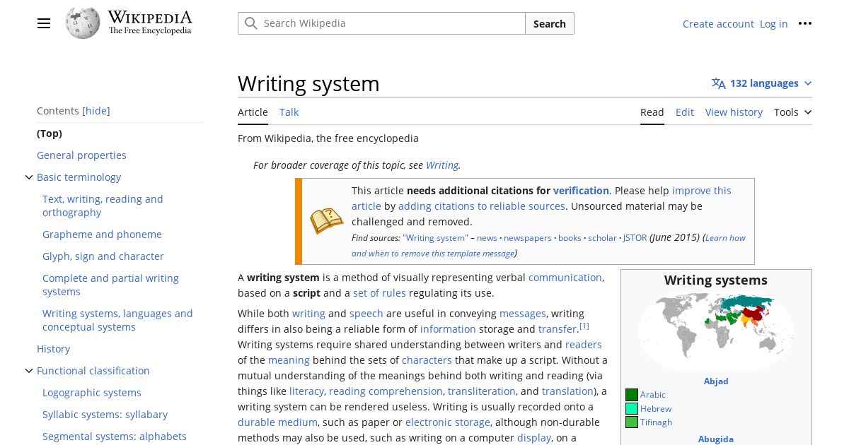
To set a page’s primary language, specify the lang attribute on your <html> element. For instance, this blog has <html lang="en"> to mark it as English. Specifying the correct language this way is incredibly low-hanging fruit and yet, it consistently shows up as a prevalent issue in WebAIM’s yearly report of the million most popular homepages’ accessibility.

One thing to watch out for: some site generators or boilerplate projects will prefill the page language with "en" by default, so if you’re using one of these tools to build your own site in some language other than English, be sure to update that, as leaving an inaccurate lang can have unfortunate consequences. Automatic accessibility scanners are just looking for the existence of a page-level lang attribute, so they’re not likely to flag inaccurate lang values for you.

For those playing WCAG Bingo at home, specifying the page’s primary language with <html lang> is pretty much the technique for meeting Success Criterion 3.1.1: Language of Page, which is a Level A requirement.

Phrases in Secondary Languages

If the page contains a word, phrase, section, whatever in some language other than its primary language, then that secondary-language content should be wrapped in an element that has its own lang attribute. The cheerful Bienvenue! heading earlier has lang="fr" to mark it as French, for instance.

<h2 lang="fr">
	Bienvenue!
</h2>

Screenreaders and text-to-speech software that support the appropriate languages should switch between languages fairly seamlessly, adopting the right pronunciations at the right time.

Additionally, supplying the lang attribute is useful even when the screenreader or text-to-speech doesn’t support that language. For instance, if it doesn’t have a particular language installed, JAWS will announce the language name before garbling secondary-language text. This gives JAWS users a kind of troubleshooting step to remedy the situation; if they had wanted to read that secondary-language text as it was, they would need to install the appropriate language. If they opt not to (say, not downloading a language they don’t already understand), then at very least, they have context as to why their screenreader couldn’t announce certain content.

Don’t go overboard with this markup power, however. Well-understood loanwords, for instance, have become part of the primary language, and thus don’t need to be specially marked up. You wouldn’t need to mark up the word rendezvous as French, for example, because the word has already become pretty integrated into English.

Marking up phrases and elements in secondary languages with their own lang attributes is pretty much the way to meet Success Criterion 3.1.2: Language of Parts, which is a WCAG Level AA requirement.


Support Alternate Writing Directions

A language’s writing direction has knock-on effects for the page layout as a whole. If you compare left-to-right site layouts with right-to-left site layouts, for instance, they’ll typically be horizontally mirrored inverses of each other. The stuff that was on the top left in one layout will usually be in the top right, and vice versa, when the writing direction is flipped.

This is especially noticeable in alternate language versions of the same site. Take Wikipedia, for example. Where English Wikipedia aligns navigational elements like the site logo and the table of contents to the left side of the page, Arabic aligns those elements to the right. Similarly, the supplemental infobox found on the right side of the English article is instead found on the left side of the Arabic article.

The English Wikipedia article about writing systems. With the site logo and a table of contents on the left, and account management, search, and an infobox on the right, the Wikipedia article follows left-to-right layout conventions.
An Arabic Wikipedia article. Its layout is flipped horizontally compared to the English Wikipedia article. Text is now right-aligned, the site logo and table of contents are on the right, and account management, search, and an infobox appear on the left, following right-to-left layout conventions.

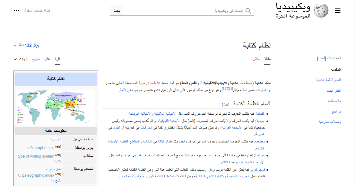
Following the layout conventions of a given language or locale will make your site’s visual hierarchy more familiar and predictable, even if someone’s never seen it before. Beyond being culturally cognizant, having a predictable visual hierarchy brings with it accessibility benefits. For one thing, familiar visual hierarchies reduce cognitive load for users with cognitive disabilities. For another, predictable placement of information and controls can benefit screen magnification users who can’t necessarily see the full layout at once by making it less tedious to find what they’re looking for. These benefits mean the inverse is also true, though: while unfamiliar layouts will be frustrating for anyone, they’ll be especially alienating and difficult for disabled users.

Fortunately, web technologies have gotten way more flexible at handling text direction thanks to CSS's logical properties and values. Logical properties and values let us define margins, padding, borders, text alignment, flex layouts, and more in ways that will automatically adapt to a language’s writing direction. For example, the margin-inline-start property is akin to margin-left in left-to-right languages, margin-right in right-to-left languages like Arabic and Hebrew, and margin-top or margin-bottom in vertical writing modes such as those sometimes used for Chinese, Japanese, Korean, and Mongolian text… all with one tidy CSS rule. Nifty!

Logical CSS isn’t a cure-all for every writing direction-based layout issue, however. There are still some spots where we’ll need an intentional content strategy. One scenario I’ve encountered is hero banners. For instance, if our hero banners involve overlaying some text on top of a splash image, take care that right-aligning the hero’s text doesn’t suddenly place it on top of the busy detail of the splash image, posing color contrast and general illegibility issues. Plan for right-to-left layouts from the get-go, whether by supplying right-to-left specific hero images; ensuring hero images are safe to mirror (i.e. lacking any text, symbols, or logos that would look amiss upon mirroring); or by redesigning the heroes to avoid overlaying altogether.


Handle Text Expansion with Adaptive Layouts

Responsive, fluid web design is critical to account for the wide spectrum of devices people may be using. From an accessibility perspective, following robust responsive web design techniques ensures that if, for instance, low-vision users need to zoom in or bump up the base font size in their browsers or operating systems to be able to read a webpage, they can do so without the page falling apart.

However, when multiple languages are involved, responsive techniques become even more critical because of the potential for text size expansion. Words and phrases that are short and tidy in the source language might balloon dramatically when the target language…

  • …uses longer words in general
  • …has wider characters
  • …assembles long compound words that provide fewer natural line breaks (looking at you, German)
  • …requires that abbreviations be written out in full instead

In one instructive example from the W3C Internationalization Activity, when translating their site into Italian, Flickr translated views, as in the number of times a given image had been seen, as visualizzazioni, going from just five characters in English to 15 in Italian, a 300% increase. And as the W3C Internationalization Activity goes on to note, this is par for the course: English text often doubles or triples in length when translated into Italian and other European languages.

Cramming this kind of text expansion into pixel-perfect layouts designed with anglocentric assumptions in mind is a recipe for disaster. In the Flickr example, we can imagine how, if a view counter had been tucked in the corner of some limited-width container like a card, the string “visualizzazioni” could cause some overflow issues, particularly if the design also tried to cram in other elements inline, too. Navbar items, too, will need to pack longer words and phrases into tight spaces. And bringing this back to accessibility, all of this is especially true if the user also needs to zoom in or bump up their browser’s base font size. Text expansion and the need to zoom/resize all but guarantee users will reach any dreaded overflow issues your layout might have sooner.

One common tactic for attempting to rein in overflow is text truncation. However, truncation poses its own accessibility issues and, to quote Karen McGrane, it’s infamously not a content strategy (⚠️ results may be NSFW). It’s usability’s way of throwing in the towel. We can do better, especially where navigation and pages’ critical functions are concerned.

Instead, tackle these issues at the root:

  • Follow responsive web design best practices instead of striving for pixel-perfect layouts
  • Avoid capping elements’ dimensions to maximum widths or heights
  • Give your UI elements plenty of room to grow should they need to accommodate longer text
  • Build layouts that anticipate text wrapping onto new lines
  • Ensure design comps reflect the messy asymmetry of the real world from the get-go, rather than only demonstrating cases where content follows symmetrical, neat, tidy, elegant happy paths

Account for Text Shrinking with Defensive CSS

Where text expansion in translation can cause problems by exacerbating possible overflow, text shrinking in translation causes problems by making elements too small to use. This is especially troublesome for links and buttons that lean on their text contents’ intrinsic lengths for their own sizing.

To borrow an example from Ahmad Shadeed, imagine we have a confirmation button that says Done in the English version of the site. This same button might read تم in the Arabic version. Yet, the difference in widths between these two buttons is stark:

Two purple buttons, side by side. The left button says “Done” in English. The right button says “تم” in Arabic. Both buttons have the same padding, but the Arabic button comes across as very narrow.

Even with a little bit of added padding and typographic adjustments, the Arabic version of the button would be pretty fiddly, especially on touch devices. This can make the site harder to use for anyone with motor/mobility disabilities such as Parkinson’s that make hitting precise targets difficult. This is especially problematic in cases of primary action buttons (like submit buttons and confirmation buttons), navigation links, and call-to-action links.

Fortunately, we can use the defensive CSS technique of applying a minimum width. We could set it to something like 44px, to hit the minimum target size recommended by WCAG's Level AAA Success Criterion 2.5.5: Target Size (Enhanced), or we can go even wider if we want to give the control the proper oomph and gravitas of a primary action button or a call to action.

.button {
	min-width: 90px;
}
The same two purple confirmation buttons, but this time, both have a minimum width set that gives them each a healthy, wide, buttonlike appearance.

You can also similarly set a minimum height, especially if you plan to stack interactive controls. Just be sure to only set the minimum height and width this way; don’t cap controls like this to fixed dimensions.


Use Readable Typography

The specifics of what legible typography entails for your design will depend heavily on which languages you support. Where possible, lean on the typographic conventions established for a given language or script. Here are some things to look for:

  • Typefaces: Pick a typeface that has been intentionally designed for the particular language. When in doubt, consider leaning on system fonts: familiarity contributes heavily to legibility, and the performance boost won’t go amiss either.
  • Font variations: Not all writing systems support capitalization, boldface, italics, or underlining like the Latin alphabet does. Inserting these western typographic conventions into writing systems that don’t traditionally support them can clutter the text, making it muddier and less legible.
  • Font size: Writing systems with more intricate/complex characters often benefit from a larger font size.
  • Tracking: Fixed-width/monospace writing systems like Chinese, Japanese, and Korean (CJK) characters can benefit from wider tracking (the spacing between characters), though you should first check whether your font has handled that tracking baked in already.
  • Line height: Average character height, diacritics, ruby text, and more can all contribute to a line of text feeling crowded. Writing systems with these features usually benefit from larger line heights.
  • Line length: Fixed-width/monospace writing systems may need fewer characters per line to stay readable.

For some concrete examples of some of these typographic differences and their requisite adjustments, I highly recommend reading through An Introduction to Writing Systems & Unicode: Typographic Differences by r12a.


Make Sure Every User-Facing String Gets Translated

Accessibility work often leans on strings of text that aren’t necessarily ever made visible. These include…

  • Attributes that expose arbitrary text values, such as alt, aria-label, or title
  • Visually-hidden (née “screenreader-only”) help text
  • Live region announcements
  • <title> and <desc> nodes within SVGs

Unseen as they are, these strings are more prone to getting missed in translation workflows. This means that swaths of the interface will still be rendered in a fallback language that’s unfamiliar to the reader. An aria-label="Close" on a dialog’s close button, for instance, won’t really do someone any good if they don’t speak English. Text meant to improve access instead introduces more barriers. (And if you’re relying on automatic translation as your internationalization strategy, be forewarned that there are many cases where attributes like aria-label won’t auto-translate)

To ensure a multilingual site is accessible across languages, it’s critical that hidden strings are included in whichever translation workflow your site uses, even if they’re hidden or buried inside attributes. Make a practice of never using a hardcoded string for user-facing content.

One gotcha I’ve especially noticed here is with dynamically generated text. While an English-only site might be content to build up strings using concatenation or template literals…

editButton.setAttribute('aria-label', 'Edit ' + title);
// or:
editButton.setAttribute('aria-label', `Edit ${title}`);

…these approaches don’t really carry over well to any sort of multilingual context, even if you translate the strings’ individual components…

editButton.setAttribute('aria-label', translate('edit') + ' ' + title);
// or:
editButton.setAttribute('aria-label', `${translate('edit')} ${title}`);

…because different languages have different word orders. German users, for instance, wouldn’t expect “Bearbeiten [title],” but rather, “[title] bearbeiten.” Instead, make sure that your translation methodology supports placeholders for interpolation, rather than trying to build up the individual bits and bobs of a longer string within the interface. This is just as much of a need for visible labels as it is for hidden text, but in my experience, this is easier to forget (and much harder to catch when it does happen!) for hidden strings.

Make sure every user-facing string gets translated is, for sure, far easier said than done. To that end, there are a few things you could do to reduce your reliance on hidden text that might get missed in localization:

  • Where possible, use visible text labels, minimizing the use of hidden text. This will better surface any translation gaps and reduce the chances of discrepancies between the visible and aural user experiences.
  • Lean on semantic elements and attributes, including ARIA attributes, to convey UI elements’ roles and states so that assistive technologies can fill in the user’s preferred localizations/translations.

Ensure Consistent Microcopy

Microcopy is all the little bits of text that appear throughout the site: the nav links, the sidebar headings, the form field labels, stuff like that. When microcopy is written and used consistently, the site layout becomes much more predictable, and users won’t have to guess as much about how the site functionality works, which in turn:

  • Reduces the cognitive load of using the site, which especially benefits cognitively disabled users
  • Increases confidence in a control’s functionality, even when someone can’t see any or all of the surrounding context
  • Helps voice control users build up a mental model of the commands they can use to target their desired elements, without which, they’d need to resort to tedious workarounds

And speaking of voice control, there’s one especially pernicious kind of accessibility bug that can crop up as a result of inconsistent microcopy. Consider a site where a translator opts to translate Delete as Löschen in German. Later, a translator translates the string Delete file as Datei entfernen, opting to use a different verb this time. Generally, professional translators will avoid discrepancies like this, but given a large enough project with enough translators and over a long enough time, inconsistencies can happen.

While both of these may well be viable translations of these strings, a problem arises when, as a result, we localize this button:

<button aria-label="Delete file">
	Delete
</button>

as…

<button aria-label="Datei entfernen">
	Löschen
</button>

(Thanks to Moritz Rebbert for suggesting this particular example!)

Suddenly, the German version of our site has a Success Criterion 2.5.3: Label in Name (Level A) violation that the English version doesn’t. This can confuse sighted screenreader users, as well as make it much harder for voice control users to target this button in their commands. However, neither string alone is the issue. Rather, this issue emerges from trying to use these two strings together. What’s more, this isn’t the kind of issue that can be caught by spot-checking the source language version of the site, and it is exactly the kind of issue that can emerge as a web project grows in complexity.

From the translator side, inconsistent microcopy can be mitigated by adhering to detailed styleguides, regularly checking translation consistency tooling, and periodically reviewing older translations.

Designers and developers can prevent these kinds of Label in Name collisions in the first place by reworking the underlying design and implementation to not be so dependent on aria-label or other hidden text, and instead surfacing context through visible text. While I don’t think we can avoid aria-label entirely, we can pare down the chances something like this can come up.


Vet Third-Party Libraries for Multilingual Accessibility

You can invest a lot of effort into the above few tips, and it can all be dramatically undercut by introducing third-party code that hasn’t been so thorough.

If you use component libraries or other third-party scripts on your site or web application, it’s important to vet those third-party libraries for accessibility. However, if those third-party libraries aren’t also properly considering internationalization and localization, this can throw another wrench in the works. After all, just like your own code, a component library’s aria-label attributes or live region announcements are limitedly helpful to users if they’re all hardcoded in one language. Similarly, a beautiful UI component will stick out like a sore thumb if it doesn’t readily adapt to other writing directions. What’s more, fixing these gaps via issues or code contributions will generally be trickier and slower than it would have been to fix your own code.

Unless a third-party library happens to support all the same languages and locales that you do, with translations that you’re happy with, look for libraries that:

  • Support you passing in your own (localized) strings for attributes, announcements, etc.
  • Either provide their own styles for writing direction support or are easy enough for you to style yourself

Adieu

Multilingual web accessibility is, in many ways, a stress test for both your accessibility standing and your internationalization/localization standing. Very few of these tips are truly specifically about the intersection of multilingual web accessibility. Rather, these are more like ways that the complexity of multilingual sites’ needs can exacerbate existing seams in inaccessible designs, and vice versa. An unresponsive layout is an unresponsive layout, for instance — switching to German’s long compound words just surfaces those issues faster. Fortunately, if accessibility and internationalization are both planned for from the get-go, it’s possible to tackle problems of multilingual web accessibility robustly.

I’m constantly in the process of learning new things, especially about accessibility and internationalization, and I’m sure this article is nonexhaustive. If there’s something I’ve missed, let me know on Mastodon!


Further Resources


Originally posted on my blog, , as Lost in Translation: Tips for Multilingual Web Accessibility

]]>
Build a Blogroll with Eleventy A step-by-step guide to adding a blogroll, complete with each blog’s latest posts, to your Eleventy site. Ben Myers https://benmyers.dev 2023-09-21T00:00:00Z https://benmyers.dev/blog/eleventy-blogroll/ Recently, inspired in part by a conversation Claudia Snell was having with folks in the Frontend Horse Discord server, I set up my blogroll, a list of some blogs I read regularly that I would recommend folks check out.

At its heart, all a blogroll needs to be is a static list of links to other blogs. No further complexity is required beyond that point. You could absolutely hardcode such a thing directly in HTML. However, I wanted to try my hand at a more complicated design, featuring each site’s favicon and a link to their latest post.

What follows is how I built the finished product. My site is built with Eleventy, so this approach will definitely be Eleventy-flavored, but I’m sure bits and pieces of this approach could be adapted to any build tool or framework.

Ensuring the Latest Posts Stay Somewhat Up to Date

Eventually, we’ll be fetching RSS feeds and displaying each blog’s latest posts, but well before that point, we’ll need an approach to ensure those posts stay roughly up to date.

We have a few possible approaches we could take to ensure we’re showing the latest, greatest, up-to-datest posts:

  • Do nothing special; let each rebuild update the posts. If you rebuild your site frequently, this will work well enough. If your site rebuilds less frequently, the “latest” posts will remain very stale for a long time.
  • Schedule regular rebuilds. The blogroll page is still static and pregenerated, but automatically updating it, say, every day or so will make sure the latest posts never fall too far behind.
  • Build the blogroll on each request. For an Eleventy site, this would entail using either Eleventy Serverless or Eleventy Edge to fetch each blog’s RSS feed and build the blogroll page anew whenever a user hits the page.
  • Fetch RSS feeds with client-side scripts. This involves pushing a bunch of scripts to users, delays the latest-post information rendering, and will likely introduce the need to handle loading and error states.

In my case, my site was already set up to rebuild daily, something I’d put together in my Some Antics days to auto-update the YouTube thumbnail on the homepage without serving up YouTube’s heavyweight scripts to every user. I use a GitHub Action to schedule my daily Netlify builds; your stack may have a different approach for scheduling regular rebuilds.

The regular-rebuilds technique won’t be truly, immediately up-to-date, but for my needs, it’s up-to-date enough — especially given that this is the most robust and performant experience for the end user, who as far as their browser is concerned, is just pulling a standard-issue, prebuilt HTML file living on a server.

Setting Up the Basic Blog Data

Next up, I opted to store a list of the blogs in Eleventy data. If I were going for a simple list of links to blogs with nothing added, I’d push for just hardcoding the markup directly, but since I planned to use this information to orchestrate fetching further information, I needed the blog list stored in data.

This data is only used on one page, the blogroll page, which means the blog list could sit pretty much anywhere in Eleventy’s data cascade. I opted to set it up as directory data so I could colocate the data with the upcoming template file, but there’s no reason I couldn’t have set it up as global data instead.

I created a src/blogroll/ directory in my project, and in there, I created a JSON file called blogroll.11tydata.json. The fact that the blogroll in the filename matches the directory name establishes this file within Eleventy as a directory data file.

Then I populated that JSON file:

src/blogroll/blogroll.11tydata.json
{
	"blogs": [
		{
			"name": "Adrian Roselli",
			"url": "https://adrianroselli.com/",
			"feed": "https://adrianroselli.com/feed"
		},
		{
			"name": "Ashlee M. Boyer",
			"url": "https://ashleemboyer.com/",
			"feed": "https://ashleemboyer.com/rss.xml"
		},
		{
			"name": "Baldur Bjarnason",
			"url": "https://www.baldurbjarnason.com/",
			"feed": "https://www.baldurbjarnason.com/index.xml"
		},
		// ...
	]
}

Now, any template within src/blogroll/ will be able to access this list using the blogs data variable.

The details I’ve provided about each blog here are minimal, only the stuff I’m fine hardcoding. For your blogroll, you might opt to hardcode more details into this list — maybe a short description of each blog?

Fetching the Latest Posts

Now that we have the basic scaffold of information for each blog in our blogroll, we want to fetch each blog’s latest post and surface it within our Eleventy data.

Anytime we want to take some data that already exists (like our raw blog list) and act on it to expose some new data (like latest posts), Eleventy’s computed data feature comes in handy.

Here, I needed two libraries: rss-parser, which does what it says on the tin, and Eleventy Fetch, which handles caching fetched results for us whenever we run the dev server locally.

npm install --save rss-parser @11ty/eleventy-fetch

Then in src/blogroll/, I created a JavaScript directory data file called blogroll.11tydata.js. That data file looked like this:

src/blogroll/11tydata.js
const {AssetCache} = require('@11ty/eleventy-fetch');
const RssParser = require('rss-parser');

const rssParser = new RssParser({timeout: 5000});

/** Sorter function for an array of feed items with dates */
function sortByDateDescending(feedItemA, feedItemB) {
	const itemADate = new Date(feedItemA.isoDate);
	const itemBDate = new Date(feedItemB.isoDate);
	return itemBDate - itemADate;
}

/** Fetch RSS feed at a given URL and return its latest post (or get it from cache, if possible) */
async function getLatestPost(feedUrl) {
	const asset = new AssetCache(feedUrl);

	// If cache exists, happy day! Use that.
	if (asset.isCacheValid('1d')) {
		const cachedValue = await asset.getCachedValue();
		return cachedValue;
	}

	const rssPost = await rssParser
		.parseURL(feedUrl)
		.catch((err) => {
			console.error(feedUrl, err);
			return null;
		})
		.then((feed) => {
			if (!feed || !feed.items || !feed.items.length) {
				return null;
			}

			const [latest] = [...feed.items].sort(sortByDateDescending);

			if (!latest.title || !latest.link) {
				return null;
			}

			return {title: latest.title, url: latest.link};
		});

	await asset.save(rssPost, 'json');
	return rssPost;
}

module.exports = {
	eleventyComputed: {
		/** Augments blog info with fetched information from the actual blogs */
		async blogData({blogs}) {
			const augmentedBlogInfo = await Promise.all(blogs.map(async (rawBlogInfo) => {
				return {
					...rawBlogInfo,
					latestPost: rawBlogInfo.feed ?
						await getLatestPost(rawBlogInfo.feed) :
						null
				};
			}));
			return augmentedBlogInfo;
		}
	}
};

Whew. There’s a lot here. The long and short of this is that in addition to our scaffoldlike blogs data array, we now also have a blogData data array which looks similar, but wherein each blog object might also have a latestPost property. Additionally, each fetch response is stored in a cache (via Eleventy Fetch’s AssetCache) that persists for one day, which will ensure that our local development server doesn’t fire off spurious requests to each of these feeds every time we make a change to our site, so that our dev server isn’t bogged down and we’re not flooding our favorite blogs with swarms of unnecessary requests.

We’ll add more to our augmented blog data objects shortly, but first, let’s put some contents on an HTML page, just to make sure everything’s working so far.

The Blogroll Page Template

Next up, I created a template file for the blogroll page. In practice, this template made use of some base layouts I already had, but I’ll omit that setup for the purpose of this blog.

src/blogroll/index.njk
<!DOCTYPE html>
<html lang="en">
<head>
	<meta charset="UTF-8">
	<meta name="viewport" content="width=device-width, initial-scale=1.0">
	<title>Blogroll</title>
</head>
<body>
	<main>
		<div class="blogroll-grid">
			{% for blog in blogData %}
			<article class="blogroll-card">
				<p class="blog-title">
					<a href="{{ blog.url }}">
						{{ blog.name }}
					</a>
				</p>
				{% if blog.latestPost and blog.latestPost.title %}
				<p class="latest-post">
					<b>Latest post:</b>
					<a href="{{ blog.latestPost.url }}">
						{{ blog.latestPost.title }}
					</a>
				</p>
				{% endif %}
			</article>
			{% endfor %}
		</div>
	</main>
</body>
</html>

This template iterates through our augmented blogData data array, and outputs an <article> for each entry. Each <article> contains a link to the blog and, if a latest post was found successfully, a link to that post.

If you run your project, you should now see this new template at /blogroll/. Each blog should be listed out alongside its latest post.

At this point, you can begin styling the page, but I had a few more enhancements I wanted to make.

Showing Each Blog’s Favicon

Favicons are a lovely expression of each site’s personality, and showing them would go a long way towards giving each blog entry its own flair.

I explored a few options for getting a site’s favicons, but at the end of the day, the simplest option by far came from URL-based favicon fetching API services, including one from Eleventy project itself: Zach’s IndieWeb Avatar service. Given any site URL, you can get its favicon as a valid <img> src with just a quick transformation:

const encodedBlogUrl = encodeURIComponent(blog.url);
const src = `https://v1.indieweb-avatar.11ty.dev/${encodedBlogUrl}/`;

Easy enough!

This transformation from blog URL to its IndieWeb Avatar service URL could be achieved perfectly fine with Eleventy filters in your templates, but since I already had the computed data infrastructure, I opted to keep adding to it instead:

src/blogroll/blogroll.11tydata.js
// … all your imports, getLatestPost, etc.

module.exports = {
	eleventyComputed: {
		/** Augments blog info with fetched information from the actual blogs */
		async blogData({blogs}) {
			const augmentedBlogInfo = await Promise.all(blogs.map(async (rawBlogInfo) => {
				const encodedUri = encodeURIComponent(rawBlogInfo.url);
				const favicon = `https://v1.indieweb-avatar.11ty.dev/${encodedUri}/`;

				return {
					...rawBlogInfo,
					favicon,
					latestPost: rawBlogInfo.feed ?
						await getLatestPost(rawBlogInfo.feed) :
						null
				};
			}));
			return augmentedBlogInfo;
		}
	}
};

Then in our templates:

src/blogroll/index.njk
<!DOCTYPE html>
<html lang="en">
<head>
	<meta charset="UTF-8">
	<meta name="viewport" content="width=device-width, initial-scale=1.0">
	<title>Blogroll</title>
</head>
<body>
	<main>
		<div class="blogroll-grid">
			{% for blog in blogData %}
			<article class="blogroll-card">
				<p class="blog-title">
					<img alt="" src="{{ blog.favicon }}" width="16px" height="16px" loading="lazy" decoding="async" />
					<a href="{{ blog.url }}">
						{{ blog.name }}
					</a>
				</p>
				{% if blog.latestPost and blog.latestPost.title %}
				<p class="latest-post">
					<b>Latest post:</b>
					<a href="{{ blog.latestPost.url }}">
						{{ blog.latestPost.title }}
					</a>
				</p>
				{% endif %}
			</article>
			{% endfor %}
		</div>
	</main>
</body>
</html>

Now, our blogroll shows some handy favicons, adding a pop of color and variety to each blog in the list!

It’s worth mentioning that if the IndieWeb Avatar service fails to get the blog’s avatar, it’ll use a fallback image of the Eleventy logo. This may or may not be your speed.

There are a number of other similar avatar services you could use instead, if you like, including those made by Google and DuckDuckGo. These all follow similar URL-based approaches. For more info, I recommend Jim Nielsen’s post on displaying favicons.

Displaying Pretty URLs

For my blogroll design, I wanted to show a cleaned up version of each blog’s URL. I did this with the normalize-url package, which I’d previously used on the Some Antics site to format guests’ personal sites.

We’ll first install normalize-url. In v7 of normalize-url, the package went ESM-only. Since, at time of writing, Eleventy doesn’t yet support ESM, we’ll need to install version 6 or lower. Other frameworks or build tools likely won’t have that stipulation.

npm install --save normalize-url@6

Like the avatar, we could probably set up a filter to handle this transformation for us, but since I already had the computed data approach set up to augment the data for each blog in the list, I just kept using that.

src/blogroll/blogroll.11tydata.js
const normalizeUrl = require('normalize-url');

// … all of your other imports, getLatestPost, etc.

module.exports = {
	eleventyComputed: {
		/** Augments blog info with fetched information from the actual blogs */
		async blogData({blogs}) {
			const augmentedBlogInfo = await Promise.all(blogs.map(async (rawBlogInfo) => {
				const encodedUri = encodeURIComponent(rawBlogInfo.url);
				const favicon = `https://v1.indieweb-avatar.11ty.dev/${encodedUri}/`;

				return {
					...rawBlogInfo,
					cleansedUrl: normalizeUrl(
						rawBlogInfo.url,
						{stripProtocol: true}
					),
					favicon,
					latestPost: rawBlogInfo.feed ?
						await getLatestPost(rawBlogInfo.feed) :
						null
				};
			}));
			return augmentedBlogInfo;
		}
	}
};

And then we add this new data to the page in our template:

src/blogroll/index.njk
<!DOCTYPE html>
<html lang="en">
<head>
	<meta charset="UTF-8">
	<meta name="viewport" content="width=device-width, initial-scale=1.0">
	<title>Blogroll</title>
</head>
<body>
	<main>
		<div class="blogroll-grid">
			{% for blog in blogData %}
			<article class="blogroll-card">
				<p class="blog-title">
					<img alt="" src="{{ blog.favicon }}" width="16px" height="16px" loading="lazy" decoding="async" />
					<a href="{{ blog.url }}">
						{{ blog.name }}
					</a>
				</p>
				<p class="blog-url">{{ blog.cleansedUrl }}</p>
				{% if blog.latestPost and blog.latestPost.title %}
				<p class="latest-post">
					<b>Latest post:</b>
					<a href="{{ blog.latestPost.url }}">
						{{ blog.latestPost.title }}
					</a>
				</p>
				{% endif %}
			</article>
			{% endfor %}
		</div>
	</main>
</body>
</html>

Voilà

With that, you have the setup for a blogroll that updates daily for any Eleventy site. If you haven’t already, now’s the time to add your styles.

Other enhancements could absolutely be added to the blogroll — showing the blogs’ latest posts’ dates or their total post counts comes to mind, as does adding brief descriptions of each blog — but I was pretty happy with this state so far.

What does your blogroll look like?

Have you added anything exciting to yours? Let me know on Mastodon!


Originally posted on my blog, , as Build a Blogroll with Eleventy

]]>
I’m a Spotless Giraffe. AI models were perplexed by a baby giraffe without spots. They’re perplexed by me, too. Ben Myers https://benmyers.dev 2023-09-10T00:00:00Z https://benmyers.dev/blog/spotless-giraffe/

This post contains no AI-generated text or images, but does discuss experiments I’ve done in the past with AI art generators. For more info, read my statement on generative AI.

On , Kipekee the reticulated giraffe was born at Brights Zoo in Tennessee. Kipekee is remarkable in that she has no spots. In fact, she seems to be only the fourth brown spotless giraffe in recorded history; the last known one was born in . White spotless giraffes — who have what’s called leucism — are slightly more common, but still exceedingly rare.

I first learned about Kipekee from Janelle Shane’s AI Weirdness blog, where she asked some image recognition models about pictures of Kipekee. Although the models she chose were fairly highly regarded for their image recognition chops, they struggled to identify and comment on Kipekee’s spotlessness coherently or reproducibly. Kipekee’s spotlessness had thrown them for a loop.

Janelle attributes the image recognition models’ strugglebus to three main factors:

  1. AI does best on images it’s seen before. We know AI is good at memorizing stuff; it might even be that some of the images in the examples and benchmarks are in the training datasets these algorithms used. Giraffe With No Spots may be especially difficult not only because the giraffe is unusual, but because it’s new to the internet.
  2. AI tends to sand away the unusual. It’s trained to answer with the most likely answer to your question, which is not necessarily the most correct answer.
  3. The papers and demonstration sites are showcasing their best work. Whereas I am zeroing in on their worst work, because it’s entertaining and because it’s a cautionary tale about putting too much faith in AI image recognition.
—– Janelle Shane, AI vs a giraffe with no spots”

That second factor — AI tends to sand away the unusual — struck something of a chord. I wasn’t alone in this. Echoing that sanding factor on Mastodon, J. Rosenbaum, who researches AI's perceptions of gender, added:

Boom. 🎤 Now imagine that you are one of the edges that is sanded away.

—– J. Rosenbaum (@[email protected])

As someone who’s visibly physically disabled, I don’t have to imagine.

My arms are shorter than most, and my left is noticeably shorter than my right. My hands bend inwards at a 90° angle at the wrists, and I have no thumbs. I’ve got craniofacial differences, and a hearing aid implant to boot. Try making that with your character creation sliders, eh? I’m not exactly a stranger to being somewhat less than represented in digital representations of people and bodies.

Back in , though, I had a thought: how easy would it be to get one of the more commonplace image generation models to generate me — or, at least, the parts of me that I’d never gotten a computer to faithfully reproduce? And so I set out to try and explain my arms and hands to DALL-E and Midjourney. Could other models have done better? I’m sure they could, especially months later, but I was aiming for some of the tools that were most commonplace and discussed, the tools that were in the hands of the masses the most at the time.

The results were, as you’ve probably guessed, disappointing. DALL-E surfaced standard-issue arms and hands. Midjourney showed veiny, muscular arms with hands that seemed painfully clasped together, but still, the anatomy was standard-issue. Thumbs, too, were inescapable. I tried again several times, rewording the prompts and making them more specific, all to no avail. If I was gonna make my arms happen, it certainly wasn’t going to come easily.

It’s easy to point to a technical reason for this experience. Bodies like mine are incredibly uncommon, and the probability that anyone who looks like me found their way into the AIs’ training data is very unlikely, let alone in a well-described, well-classified way. I am the spotless giraffe.

In theory, expanding the inclusion of less normative bodies in the training data would push the needle towards making it easier to create facsimiles of me.

…Except.

Tech is not neutral. It can’t be. It is always the sum total of human decisions, priorities, and tradeoffs, deployed to meet certain ends and desires, and particularly capitalistic interests. AI is far from being an exception to the rule. And in this case, any desire for image generation models to be able to represent me is going to butt heads with another incentive: the desire to avoid shocking users with body horror.

When DALL-E, Midjourney, and other image generation tools entered the scene, they were laughably bad at rendering human limbs. AI-rendered human bodies in general veered heavily into the uncanny valley, and generators produced straight-up body horror pretty often. And as it turns out, having a reputation for inaccurate anatomy and surprise shock value is bad for business!

Successive model retrainings have made rendering humans much more accurate, and tighter restrictions on prompts have made it much harder to generate body horror, even intentionally. As a consequence, non-normative bodies are also incredibly difficult to generate, even when the engine is fed hyperspecific prompts. When I’ve tried, I’ve gotten the sense the generators are pushing back against me. Still thinking about that a few months later, I posted:

One of these days, we’ll reckon with the fact that AI art generators’ anti-body-horror filters also make it downright impossible to generate a person that looks like me.

—– Ben Myers (@[email protected])

It’s not just that the training sets simply don’t have examples of people who look like me. It’s that the system is now explicitly engineered to resist imagining me.

…Hey, is now a good a time to mention that in an effort to create a welcoming and inclusive community for all users, the Midjourney Community Guidelines consider deformed bodies a form of gore, and thus forbidden?

It is something of an amusing curiosity that some AI models were perplexed by a giraffe without spots. But it’s these same tools and paradigms that enshrine normativity of all kinds, sanding away the unusual. As tech continues to charge headfirst into AI hype, this is going to have far-reaching, yet largely invisible to the mainstream, consequences to anyone on the wrong side of that normativity. Better hope you have spots.


Originally posted on my blog, , as I'm a Spotless Giraffe.

]]>
How I Write Alt Text for Code Snippets on Social Media Because blind and low-vision programmers deserve a little better than “code snippet.” Ben Myers https://benmyers.dev 2023-08-28T00:00:00Z https://benmyers.dev/blog/code-snippet-alt-text/

Oh, hey! It’s a “how to write alt text” post. This is something of a rite of passage for accessibility bloggers. That said, I don’t rely on alt text in my day-to-day browsing. As such, this post is drawn less from my own lived experience and more from aggregating advice given by blind and low-vision people sharing their own lived experiences and preferences. To learn more, I’d especially recommend Veronica Lewis’s guides to writing useful alt text for further guidance.

Posting screenshots of code snippets has become something of a staple for programming educators and advocates on social media. Generally, these snippets are meant to serve as an eye-catching way to illustrate some technique being shared in the post. They can be literal screenshots from an editor or, quite commonly, they’re generated with tools such as Carbon.

However, oftentimes, these snippets are shared but their alt text leaves a lot to be desired. Sometimes, it’s missing altogether. Other times, it’s vague and unusable, like “Code snippet.” Either way, blind and low-vision programmers aren’t given the opportunity to meaningfully learn from the snippet.

What’s the best alt text to provide? Should the alt text just be a copy of the full code? As we’ll see, my answer is the classic accessibility mantra: It Depends™.

How Alt Text Is Experienced

The goal of alt text is in its name: to provide a viable alternative, in text form, in place of an image. Someone who reads an image’s alt text should generally have the same takeaways as someone who saw the image directly. This is especially critical when the goal of an image is to educate. This means that for screenshots of text, reproducing the text verbatim is often the best alt text.

However, the more text there is to reproduce, the more tedious that wall o’ alt text becomes. Not all screenreaders afford their users the ability to pause an image’s alt text readout or to backtrack a few words. Those that do may also add extra clutter the longer the alt text gets. This makes images with very long alt text a commitment, and screenreader users can end up getting lost in the sauce halfway through, faced with the choice to either keep going, start the alt text all over again, or just nope out and skip the rest. This is why, even though screenreaders have no real character limit for alt text these days, it’s still important to keep your alt text succinct. Accessibility advocates sometimes suggest a max length of around 120 characters or so as a general rule of thumb, but context will impact how many characters you actually need.

This means your approach to writing alt text for those screenshots of code snippets will probably need to change depending on the length and focus of the snippet.

update

In a previous version of this post, I said that screenreaders in general don’t allow users to pause or traverse alt text. It’s since been brought to my attention that I was mistaken — JAWS and NVDA definitely do allow traversing alt text in all the same ways as regular text, but VoiceOver does not seem to. Thanks to Ramón on Twitter as well as Ryan and Roberto at work for pointing this out!

Short, Focused Snippets

If your snippet is only a few short lines long (I’d say maybe five lines or fewer, but as always, It Depends™), and focused on a very particular syntax or technique, then I would reproduce the code exactly for the alt text; no more, no less.

For example, say our post demonstrates how one could use place-items: center to center an element’s children:

The snippet:

.centered-children {
	display: grid;
	place-items: center;
}

The alt text:

.centered-children { display: grid; place-items: center; }

Beautiful. Nice and tidy. As a sidenote, centering in CSS is awesome these days.

Medium-Length Snippets

Medium-length snippets often establish the relevant syntax or technique in some wider context. This context can be useful to see how the technique would be used in the wild, but it also means that our alt text is veering towards being long enough to be considered a tedious commitment.

In these cases, I like to provide a brief preamble that describes what the snippet is and does, before launching into the code verbatim. Usually, this tends to follow this template or something similar:

[Language or framework name] snippet which demonstrates [relevant syntax or technique] to [provided context]

Then I reproduce the code in full.

This preamble gives screenreader users a handy way to make sense of the code that follows. Crucially, it gives them a handy off-ramp to skip the rest of the alt text if they just can’t be bothered.

For example, in a tweet about the <caption> element, I demonstrated <caption> being used inside of a (somewhat truncated) table:

The snippet:

<table>
	<caption>Leaderboard</caption>
	<thead>
		<tr>
			<th scope="col">Rank</th>
			<th scope="col">Contestant</th>
			<th scope="col">Score</th>
		</tr>
	</thead>
	<tbody>

	</tbody>
</table>

It seemed perfectly sensible to me that a screenreader user might want to nope out after finding out that it depicted markup for a <table> with a <caption>, so I frontloaded the alt text with that context.

The alt text:

HTML snippet for a table with a caption that reads “Leaderboard.”

<table>
 <caption>Leaderboard</caption>
 <thead>
  <tr>
   <th scope=“col”>Rank</th>
   <th scope=“col”>Contestant</th>
   <th scope=“col”>Score</th>
  </tr>
 </thead>
 <tbody>
   …
 </tbody>
</table>

Long-Form Snippets

Long-form snippets contain a lot of text — often well above that general 120-character rule of thumb. In my experience, they’re less about demonstrating a specific syntax or technique and more about conveying some bigger-picture idea like a framework component or a full stylesheet. Reproducing the code snippet in full would make the alt text a very tedious slog to get through, with a high chance of the reader getting lost or giving up halfway through.

In these cases, I will generally go with a similar description as I would have for the medium-length snippets, without including the full code in the alt text.

For example, in one tweet, I shared a screenshot I’d found of some cursed Java code where the curly braces and semicolons had been indented to the far right side of the editor to make the code resemble Python’s bracelessness and semicolonlessness in an amusingly horrifying way.

public class Permuter																			{
	private static void permute(int n, char[] a)						{
		if (n == 0)																						{
			System.out.println(String.valueOf(a))								;}
		else																									{
			for (int i = 0; i <= n; i++)												{
				permute(n-1, a)																		;
				swap(a, n % 2 == 0 ? i : 0, n)										;}}}
	private static void swap(char[] a, int i, int j)				{
		char saved = a[i]																			;
		a[i] = a[j]																						;
		a[j] = saved																					;}}

In this case, what the code actually did or said didn’t matter all that much. It could have been any Java code, really. It just happened to be a Permuter class. Replicating the code in full wouldn’t have done the humor of the screenshot any justice. Instead, I kept the alt text very surface-level.

The alt text:

A Permuter class written in Java, but the semicolons and opening and closing braces for each line have been aligned to the far right.

This approach works fine if the code snippet is a little jokey or the exact contents don’t really matter. But what do we do if the contents do matter, but they’re just a little long?

At this point, lots of readers will be struggling with the size of the snippet. Overzealous image compression will make the code grainy and hard to read. Eager learners who want to try out the code for themselves will have to transcribe a veritable tome of source code by hand. And, of course, screenreader users will still care what the image has to say.

At this point, the most useful thing the poster can do is include a link to the screenshotted code as raw text — often as a GitHub gist — in the body of the post itself. This approach…

  • Allows anyone to copy and paste the code into their own editor to give it a spin
  • Enables screenreader and text-to-speech users to navigate through the code at their own pace
  • Sidesteps the loss of readability that can come from image compression
  • Lets users zoom in to read the code at a more pleasant font size
  • Enables folks to use custom user styles and operating system settings such as forced colors mode to have the viewing/reading experience that works best for them

A picture might be worth a thousand words, but there’s a reason why actual raw text is the universal medium.

In cases where I link out to a gist or other text transcription of the code, I like to call it out in the alt text of the image itself, usually by appending something like Full code at the provided link after the aforementioned description of the code’s functionality. For example:

A React ThemeToggle component which uses the useTheme hook to switch between light and dark themes. Full code at the provided link.

If a screenreader user wants to access the full snippet, they have the means to get to it. On the other hand, if they don’t care, the alt text is now minimally intrusive. We’re striking a healthy balance between providng relevant and equivalent information and avoiding needless overwhelm. Nifty.

⚠️ Warning: URLs don't belong in alt text.

Sometimes, well-meaning posters (and some posters who’d rather the URL not count against their post’s character limit) will put the gist URL in the alt text itself. Don’t do this! For one thing, the URL won’t be actionable when it’s read out, so screenreader users won’t be able to navigate to it. It’ll pretty much just be cumbersome gobbledygook. For another, anyone else who wants to benefit from the raw text version of the code won’t be able to get to the link, save for some workarounds involving the social media platform’s bespoke alt text pop-ups.

Conclusion

This isn’t just about code snippets. Sharing screenshots of hefty bodies of text is absurdly common on social media — be it influencers sharing screenshotted apologies, politicians publishing screenshots of their official statements, or people clipping excerpts of news stories. Oftentimes, these screenshots go undescribed, and when alt text is provided, it’s nearly always so vague as to be useless.

Writing alt text that is meaningful and useful remains an artful balance. My hope is that by sharing some of the templates I use, as well as the heuristics and thought processes I run through, someone might get the inspiration they need to describe content they post with a little higher fidelity than “Code snippet.”

Chances are really good I’ve gotten something wrong or didn’t take something into account. If that’s the case, please reach out on Mastodon. I’d love to hear from you.


Originally posted on my blog, , as How I Write Alt Text for Code Snippets on Social Media

]]>
The Curious Case of “iff” and Overriding Screenreader Pronunciations Markup hacks to override screenreader pronunciations can get a little iffy. Here’s some techniques to try instead. Ben Myers https://benmyers.dev 2023-07-31T00:00:00Z https://benmyers.dev/blog/overriding-screenreader-pronunciations/ I recently responded to a call for accessibility guidance on Mastodon. The author, a logician, frequently includes the abbreviation iff — short for “if and only if” — in his writing. He’d recently tested his content with a screenreader and found that iff sounded exactly like “if,” and he wanted some help making sure iff sounded distinct.

In logic, if versus iff is a very meaningful distinction. To borrow an example from Wikipedia, if Madison will eat a fruit if it’s an apple, then she’ll definitely eat any apples she comes across, but bananas or oranges are still fair game. On the other hand, if Madison will eat a fruit iff (if and only if) it’s an apple, then she’ll still eat any apple she comes across, but bananas and oranges are off the menu. Mistaking an if for an iff here, or vice versa, can mean entirely misinterpreting what a formal logic statement is saying.

While developers might reach for approaches such as ARIA attributes or the ol’ “visible-but-aria-hidden node plus the visually-hidden, screenreader-friendlier alternative node” one–two punch to try to force a particular pronunciation, the conventional accessibility wisdom here is instead to not override screenreader pronunciations at all, for a number of reasons. These override attempts often make braille display output much harder to read, and they can make it much harder to use other assistive technologies such as voice control as well. Crucially, overrides usually come from a place of assuming (and generally vastly underestimating) screenreader users’ familiarity with their screenreader’s pronunciation quirks and their comfort with their screenreader’s verbosity settings and navigation modes.

Is iff a special case? Does the possible confusion with if necessitate markup hacks to try and force a different pronunciation? I don’t know, and I’m genuinely not here to say. I think only user testing can give that judgment call. Instead, I’d like to propose a few steps one could take before using markup hacks to override screenreader pronunciations. If you’re dealing with your own case where you think a pronunciation override might be best, consider whether one of these options could work for you instead.

Let It Be

For logicians who use screenreaders, your iff is probably not the first iff they’ve come across, and it certainly won’t be the last. The same goes for other mathematicians, programmers, and other professions that rely on special symbols to communicate meaning.

In many cases, screenreader users with expertise in these fields have approaches for making sense of these symbols already. This might be inferring meaning from context, retreading the confusing text letter-by-letter, ratcheting up their screenreader’s verbosity settings when they know they’re in a symbol-heavy context, or leaning on custom pronunciation rules they’ve added to their screenreader for such a situation.

It’s also worth evaluating how serious the pronunciation quirk really is. When I worked at USAA, it was an occasional topic of conversation that the JAWS screenreader would pronounce USAA as “oosa.” As much as USAA would have liked to be pronounced correctly for brand reasons (and maybe that can be a reality someday with CSS Speech), internal accessibility subject matter experts, including some who are blind, generally advised against markup hacks, in part because anyone who was hearing “oosa” would figure out what that meant pretty quickly anyways. It was no more harmful than a GPS mispronouncing a street name — you chuckle for a bit, and then you move on with your day.

All this to say, your readers who use screenreaders may very likely already have techniques for dealing with unusual symbols, abbreviations, or pronunciation quirks, or those quirks might not be as critical as you might think at first, and so there might not be anything you have to do at all.

Still Let It Be, But Provide Some Guidance

The above might work just fine for someone who already has enough familiarity with a field to know how best to make sense of its text, but what about situations where someone might be coming in fresh such as a college course?

One option might be recommending your readers set up custom pronunciation rules in their own screenreaders. Here’s a few articles and tutorials you could point them to:

It might be worth setting up a page where you provide guidance on adding custom pronunciation rules to one’s screenreader, along with a list of recommended rules for common confusing phrases you intend to use. From there, you’d just need to make sure that page is somehow discoverable, perhaps linked to from an accessibility statement. This has the advantage of fully empowering the reader to decide if and how to use the rules. Maybe they won’t add any rules at all — or maybe, they’ll decide that iff should be pronounced as “if F,” or “I F F,” or “if and only if.” Instead of you going through the work to hack the markup and slot users into whichever pronunciation you feel is right, you instead give readers the tools they can use to build whichever reading experience is best for them.

For what it’s worth, USAA has one such list of suggested custom pronunciation rules, which includes USAA, as well as abbreviations that are common in banking and insurance.

Rephrase and Unabbreviate

In some cases, you might be able to reword the text to avoid a contentious, confusing phrase altogether. In the case of iff, you might not be able to avoid it entirely in formal logic statements, but what about the surrounding prose? In many cases, it could be clearer to write out “if and only if” in full. In addition to being more explicit and not relying on pronunciation rules, verbosity settings, or markup hacks to get the point across, it’s also visually more distinct. If someone is scanning a page or reading quickly, iff is pretty easy to mistake for if, and that’s before adding low vision or dyslexia into the mix. In this case, the instinct to reach for a screenreader-specific hack could be a sign that this content is confusing or hard to read for lots of people in general.

Even if you can’t avoid all instances of the confusing text, you can still get some lift from rephrasing that minimizes the need for markup hacks elsewhere. Occasionally including the long form of an abbreviation alongside its short form, for instance, a la “intravenous (IV)” or the other way around, “iff (if and only if),” can be a subtle yet handy reminder to readers that possibly confusing abbreviations are in play, so they should be extra careful when reading the page. This is also a handy tactic for meeting the Web Content Accessibility Guidelines’ Success Criterion 3.1.4 Abbreviations (Level AAA).

Conclusion

Markup hacks meant to force a particular pronunciation in screenreaders often arise from incomplete understandings of how screenreader users navigate the web and unvalidated assumptions about how they would prefer to receive information, and they can shape a user experience at the expense of braille display users, voice control users, and more. Before reaching for a pronunciation hack, consider if it’s really necessary or worth the complexity you’re adding to your site, or if there are ways to rework the content or design to add clarity and avoid needing the hack in the first place.

Additionally, validate assumptions! If you can, get feedback from screenreader users. It may well be that they find leaving those phrases as they are really is confusing and untenable! I personally don’t believe we can avoid screenreader-specific hacks 100% of the time. If (and only if 😜) your user testing shows such hacks are necessary for comprehension, then by all means go ahead!


Originally posted on my blog, , as The Curious Case of “iff” and Overriding Screenreader Pronunciations

]]>
The Web Needs a Native .visually-hidden For years, developers have passed around a set of styles like a magic incantation. It’s time we made it a web standard. Ben Myers https://benmyers.dev 2023-03-01T00:00:00Z https://benmyers.dev/blog/native-visually-hidden/ One of the strangest artifacts of web accessibility to me is the .visually-hidden utility class. You might also know it as .sr-only (or possibly as .screen-reader-text, .element-invisible, or any number of other names throughout the ages).note 1

Conventional ways to hide elements include the styles display: none or visibility: hidden, or using HTML's hidden attribute. When you use any of these approaches, the browser assumes no one is meant to access those elements, and it won’t expose that content to assistive technologies. This makes for a bit of a conundrum: what if you want to hide something visually, but still expose it to assistive technologies such as screenreaders? For instance…

Enter, the .visually-hidden utility class, which usually (foreshadowing!) looks something like:

.visually-hidden:not(:focus):not(:active) {
	border: 0;
	clip: rect(0 0 0 0); 
	clip-path: inset(50%);
	height: 1px;
	margin: -1px;
	overflow: hidden;
	padding: 0;
	position: absolute;
	white-space: nowrap; 
	width: 1px;
}

I’ve borrowed this particular set of rules from Kitty Giraudel’s .sr-only snippet. These rules make the applied element take up zero space, without triggering any of the heuristics browsers use to exclude elements from assistive technology output. To learn more about how these styles work, I recommend checking out James Edwards’s breakdown of .visually-hidden.

This snippet of styles works really well, and has been iterated upon and vetted by accessibility practitioners over the years. However, it would be a big win for the web to have a native HTML or CSS technique, no copypasta required, to visually hide elements while still exposing them to assistive technologies.

Problems with Copypastas

It’s a Bundle of Hacks

Or, at least, it feels that way.

After all, the very reason for these styles is to make an element as hidden as possible without also triggering browsers’ heuristics for hiding elements from assistive technologies. The various rules could each constitute a point of failure if browsers adjust their heuristics, whether through conscious decision or as a bug. If a browser, for instance, stopped exposing content obscured by overflow: hidden to assistive technologies, this ruleset would be toast. Ideally, browsers wouldn’t just break stuff like that — I don’t think there’s a big chance this would happen — but it would be safer not to rely on browser regression so much.

Which Snippet Should You Use?

As my friend Evan noted, there’s not just one set of visually-hidden rules out there:

@ben there’s also more than one magical copy-pasta floating around out there, and I’m never entirely sure which one I should use.

—–Evan (@[email protected])

There have been lots of takes on visually hidden styles over the years. Some are homegrown, unvetted, and brittle, such as one I found recently which leaned in large part on color: transparent, which would be ignored in forced colors mode, causing invisible text to become visible again. Other approaches were once commonplace but are now discouraged — namely, an approach which put the contents very far off screen with absolute positioning or a large negative text-indent. This is discouraged nowadays because it caused issues for right-to-left content,note 3 people using screen magnifiers, sighted screenreader users who benefit from seeing their screenreader’s cursor, and mobile screenreader users who rely on touch.

While today, accessibility practitioners have landed on the clip-paths-and-hidden-overflows approach provided above, there are still iterations and variations on the theme, all attempting to deal with new quirks or contexts faced in the real world. For instance, Kitty Giraudel’s visually-hidden styles are pretty similar to those shared by Scott O’Hara, except that Kitty also removes the element’s border, padding, and margins. These additions make the visually-hidden styles more robust in edge-casier scenarios such as parents with overflow: auto.

Given that we’re still occassionally finding quirks that need to be accounted for, how do we know that the visually-hidden styles that have been sitting in our codebase for a few years (including those provided by third-party libraries and CSS frameworks) are the latest, greatest, up-to-datest iterations? How should accessibility practitioners communicate incremental updates to the webdev community at large?

What I’d Love to See

Given there’s a market for visually hiding content while still exposing it to assistive technologies, the web would benefit greatly from providing a native, spec’d out CSS/HTML technique that doesn’t require copying and pasting a magic snippet. And for my money, the approach I’d most love to see is…

/* Hypothetical */
display: visually-hidden;

…defined as identical to display: none, except that this style doesn’t disqualify the element from being exposed to assistive technologies.note 4

In the wild, this would probably lead to style declarations like:

.skip-link:not(:focus):not(:active) {
	display: visually-hidden;
}

And I think using it with Sass or CSS nesting would feel very clean:

.skip-link {
	/* Put your fancy styles for when the link is visible here */

	&:not(:focus):not(:active) {
		display: visually-hidden;
	}
}

Depending on how closely this hypothetical display: visually-hidden matches the behavior of display: none, this would have another leg up on the .visually-hidden styles in that text hidden this way wouldn’t show up in Ctrl+F in-page searches or get added to the clipboard, either of which could be unexpected and unintuitive for sighted users.

What Are The Options?

And why do I think display: visually-hidden is the way to go?

When I’ve asked about proposals for native visually-hidden on Twitter before, I’ve gotten a myriad of different potential implementations folks would like to see.

Put It In HTML!

Some responses I’ve gotten propose adding some attribute or new attribute value to HTML.

In some cases, people suggested adding a new value to the hidden attribute (maybe something like hidden="visually"?), since hidden is no longer a simple boolean. I think this would be a dangerous route to go down (in my mind, a complete nonstarter), because the failure mode for a browser that doesn’t recognize the new value yet would be to exclude the content from assistive technology output altogether.

Additionally, in the early days of the hidden attribute, many stylesheets added this rule to be able to start using hidden earlier.

[hidden] {
	display: none;
}

This rule is still present on many sites, and in CSS resets and normalizers such as normalize.css. Sites with a rule like this would still prevent visually-hidden content from being exposed to assistive technologies.

This brings us to a larger point about putting this in HTML: even if we were to create some sort of brand new visuallyhidden attribute, browsers’ default styles for HTML elements and attributes are incredibly easy to override. All it takes is a well-meaning developer to write…

[visuallyhidden] {
	display: none;
}

…and the attribute is toast for a site in a way that most developers would totally miss.

Additional concerns I have around putting this in HTML are that:

  • It doesn’t really facilitate responding to the viewport or container size without JavaScript (I could see wanting to use media queries or container queries to show/hide the text inside of an icon button at various viewport widths or container sizes, for instance)
  • It doesn’t really facilitate responding to states such as hover or focus without JavaScript either (consider the visually-hidden skip link which appears when it receives keyboard focus)
  • The notion of something being “visually” hidden is a very presentational, browser-centric idea, and I’m not sure how well these semantics would translate to other user agents

In my mind, if we’re going to have a native approach to visually hiding some element, it’s gotta be in CSS.

Make a New CSS Property!

I could definitely live with this!

This would require a bit of bikeshedding on the name, because naming is hard, but for the purposes of this article, let’s say it looks something like:

/* Hypothetical */
element-visibility: visually-hidden;

This gives us something that we can use along with all of our media queries, container queries, pseudo-classes, and more!

/* Hypothetical */

.skip-link:not(:focus):not(:active) {
	element-visibility: visually-hidden;
}

@media only screen and (max-width: 600px) {
	button.icon-button > span {
		element-visibility: visually-hidden;
	}
}

This is absolutely a step in the right direction for me!

A weakness of a new property like this, however, is that it’s not entirely clear to me how this would resolve:

element-visibility: visually-hidden;
display: none;

Would the element still be hidden from assistive technologies because of the display: none?

Or what about this?

element-visibility: visually-hidden;
display: block;

Would the element be visually hidden here, or would the display: block unhide it? Could we articulate why that behavior is the way it is?

I’m sure the specs would settle on an order of precedence here, but I’m not sure that precedence could ever be completely intuitive to a developer. In my opinion, that just increases the risk that some content might not get exposed to assistive technologies that’s intended to be.

I think introducing a new property also comes with an education cost. CSS already has display, visibility, content-visibility, and other ways to hide an element, which is already a confusing jumble of similar names and functionality. If we introduce a new property, not only do we have to figure out how it interacts with the other CSS ways to hide something… we also add to the confusing jumble, which I feel would just make this wing of CSS just that much less approachable to newcomers.

If we want to avoid adding a new, similarly named CSS property to the pile and reduce how many other properties this could conflict with,note 5 then it seems to me that the way to go is to add a new value to a property that already exists. Since in my mind, the ideal functionality is like display: none except without hiding content from assistive technologies, a new display property makes the most sense to me. Hence, display: visually-hidden!

The Road Ahead

An addition like this would go through the CSS Working Group. Back in 2016, Sara Soueidan filed an issue recommending exactly this, but the conversation seems to have stagnated. If a display: visually-hidden seems appealing to you, give it a thumbs up and consider contributing to the conversation.

If display: visually-hidden ever does go through, I think it’s worth being strategic about how we start to incorporate it into our sites (given that “evergreen” doesn’t mean immediately available). For my money, the simplest and most robust approach would be to add the rule to our already-working .visually-hidden/.sr-only classes:

.visually-hidden:not(:focus):not(:active) {
	/* Hypothetical */
	display: visually-hidden;

	border: 0;
	clip: rect(0 0 0 0); 
	clip-path: inset(50%);
	height: 1px;
	margin: -1px;
	overflow: hidden;
	padding: 0;
	position: absolute;
	white-space: nowrap; 
	width: 1px;
}

…at least until our browser stack has reliably supported this value for some time.

Conclusion

While the .visually-hidden/.sr-only utility styles have proven incredibly useful, the web would absolutely benefit in the long run from enshrining a native approach into the web standards. Such a rule would be easier to teach and easier to incorporate with CSS‘s responsive and stateful features. It’d also discourage unvetted, homegrown approaches from popping up, and it’d ensure that developers wouldn’t need to update their projects’ styles every few years when an improvement is discovered.

update: Since publishing this article, a few people have published their responses! I’d especially recommend giving Scott O’Hara’s response a read. It goes into some of the problems that would emerge from enshrining the .visually-hidden technique into the standards, and pitches a few improvements the web could make that would mitigate the need for visually hiding in the first place.

More CSS Wishlists

This article is inspired in part by Dave Rupert’s CSS wishlist for 2023. Several other people have put out their own CSS wishlists, and you should give them a read!


Footnotes

  1. .sr-only,” short for “screenreader only,” is a widely used name for these styles, and would be especially familiar to Tailwind users and to Bootstrap users before them. WordPress, meanwhile, uses the name “.screen-reader-text.” The name “.element-invisible” was once used in Drupal, but was deprecated and replaced with “.visually-hidden” to better align with the HTML5 Boilerplate.

    Although it’s common to explicitly reference screenreaders in the classname, I personally recommend using the name “.visually-hidden,” since content hidden this way would also be exposed to other assistive technologies, as well as be surfaced in browser Reader Modes or RSS readers, and so “screenreader-only” is a bit of a misnomer. | Back to [1]

  2. The one-two punch of an aria-hidden node for the visual treatment along with a .visually-hidden node with a clearer experience for assistive technologies is pretty common. I’ve seen this approach used for icon buttons, expanding abbreviations and timestamps, providing an unsplit alternative for split text, or substituting punctuation that gets inconsistently announced by screenreaders out for its spelled-out name in signup form help text. Use with care — the assistive technology experience shouldn’t diverge too much from the visual experience. | Back to [2]

  3. This concern largely comes from a time before logical properties. Were it not for the other concerns with offscreen positioning, a modern solution could have been to absolutely position the element with inset-inline-start. | Back to [3]

  4. I’ve worded it this way, and not as “the element is exposed to assistive technologies,” because other factors would still exclude the element from the accessibility tree, such as the hidden and aria-hidden attributes. It’s not that this style would guarantee the element is in the accessibility tree; just that visually hiding the element would not be what prevents it from being exposed. | Back to [4]

  5. You’d definitely still get conflicts if you were to, say, combine display: visually-hidden and visibility: hidden. This would reduce the combinatorics here, but not eliminate them. | Back to [5]


Originally posted on my blog, , as The Web Needs a Native .visually-hidden

]]>
Create Shareable Automatic Captions for Live Online Events with Web Captioner Stuck using a platform for live online events that doesn’t support captions? Here’s how to generate captions you can share in a few quick steps. Ben Myers https://benmyers.dev 2023-02-23T00:00:00Z https://benmyers.dev/blog/shareable-captions/

⚠️ Warning: Deprecation Notice

As of , Web Captioner has been sunset. I’ve left this article up, but unless someone hosts a fork of the original source code, this article won’t work anymore. If you find viable alternatives, please let me know on Mastodon!

Introduction

Yesterday, I participated in a Twitter Space with JavaScript Jam to chat about accessibility and web standards. Ordinarily when I do this kind of speaking, I try to make sure there are, at minimum, automatic captions for the live event (yes, despite automatic captions’ serious limitations) and polished captions for any recordings afterwards. What I didn’t realize, until Nic Steenhout pointed it out, was that Twitter Spaces no longer provides captions. They used to, but Twitter’s new management has since disabled that, rolling back significant progress.

Ideally, live chats like this will happen on platforms that provide captions out of the box which are built directly into the interface. That will ensure the captions are discoverable, and that the user won’t have to leave the application window to get their captions. If you’re looking to ensure participants can get captions, this is where you should start: by seeking out platforms that explicitly support captions.

If you absolutely can’t get in-app captions to work or move to another platform, then what follows is the last-ditch fallback I ended up going with: using Web Captioner to generate a shareable link to automatic captions that you can pass along to participants in your Twitter Space, Discord voice chat, or other uncaptioned live audio.

What is Web Captioner?

Web Captioner is a website that uses Google Chrome’s built-in speech recognition to provide a simple speech-to-text display. Currently, that speech recognition functionality is only in Google Chrome, so Chrome is required for whoever is recording the audio.

Web Captioner seems largely designed for local use cases, such as a classroom setting, where you could show the transcription on a big screen. Web Captioner also has options to integrate with software like Zoom, OBS Studio, or vMix to provide true closed captions. Crucially for this jerry-rigged solution, Web Captioner also provides an experimental feature for creating shareable links to your captions.

Step 1: Set Up Audio Loopback

The specifics of this step depend a lot on your operating system.

Web Captioner depends on Chrome’s ability to capture audio. As a result, while Web Captioner can pick up your microphone just fine, it won’t be able to transcribe the audio from anyone else on the call out of the box. If you want to transcribe the full call, you’ll need to set up Google Chrome to use the system’s entire audio output as an input.

To do this, you’ll need to install and set up some audio loopback software, since operating systems can get pretty weird about using audio outputs from some applications as inputs in others. Web Captioner themselves have some steps you can walk through for setting up some loopback software:

Audio loopback can get really messy, particularly if you also plan to use your own microphone, so where possible, I’d recommend using a two-device setup — one for your microphone, and one for listening — if you can get away with it.

If you already have audio loopback software set up (For instance, I use shinywhitebox’s SWB Audio App for streams, and I know of other people who use BlackHole) to provide device audio output as an audio input source, then you should be able to use that setup just fine.

Step 2: Get Chrome to Use Your Audio Output

Once you’ve set up your loopback software to provide device audio output as a new audio input source, we need to get Google Chrome to use that device audio in place of your microphone.

To set this, go to Chrome’s microphone settings at chrome://settings/content/microphone, and find the microphone dropdown. Choose the audio source you created during Step 1. On my Mac, it had “(Virtual)” at the end to make it easier to find. I’m not sure whether Windows would do the same thing.

If your device audio isn’t available from the dropdown, you might need to restart Chrome.

Step 3: Test the Transcription in Web Captioner

Time for the big moment of truth! Let’s make sure Web Captioner can accurately pick up your device audio now.

Go to Web Captioner, and click either of the bright blue Start Captioning buttons in the header:

Web Captioner homepage, featuring an astonishingly bright yellow hero section with two blue 'Start Captioning' call-to-action buttons.

This will take you to the mostly blank, black screen of the transcription interface:

The Web Captioner transcription interface. The page is mostly a blank, black space. At the bottom of the page, a footer contains the Web Captioner logo, a yellow 'Start Captioning' button, and a profile menu toggle kebab

Click the yellow Start Captioning button in the footer. In another tab, window, or application, play some audio with some dialogue. I used a YouTube video for this. Hop back to Web Captioner and confirm that Web Captioner is transcribing the audio. If you’re using Web Captioner on the same device you’re chatting from, try speaking into the mic to confirm whether your mic audio is also getting transcribed.

Assuming this worked, it’s all smooth sailing from here! ⛵

Next up, we’ll have Web Captioner generate a link to our live captions that we can share with participants.

You’ll need to be signed in to save settings and to generate the link. First, click the Settings menu icon in the very bottom right corner of the captioner’s interface, and then click Sign in. Follow the steps to authenticate into Web Captioner with an account.

Next, we’re going to enable the experimental Share feature. This experiment is currently hidden away, so to get to it, you’ll need to visit https://webcaptioner.com/captioner/settings/experiments?add=share directly. When you do, you’ll be greeted with a popup like this:

Web Captioner settings page with a modal dialog on top, which asks: Do you want to add this experiment? This feature is still in the oven and may not work right. Three checked checkboxes are used to confirm the user understands the experiment may not work perfectly and things might break, the experiment could go away at any time, and that the user agrees to give feedback. The bottom of the dialog has a Cancel button and an Add Experiment button.

Check each checkbox provided, and then click the Add Experiment button to proceed.

Return to the captioner interface. Next to the Start Captioning button, there should be a new button with an icon that looks like a radio tower. Click it to open up a new popup:

Web Captioner's captioning interface. In the bottom right, a modal dialog titled 'Share Captions' offers settings for share links, including whether the interface will display a link back to the stream or site, or whether it will provide a custom welcome message. Additional settings allow for generating a random link (expires in 48 hours) or a custom vanity link (never expires).

Use these settings to configure your share link as needed. I wasn’t able to get the custom vanity link to work, but that could have just been a temporary issue. When you’re ready, click Get Link.

Before the live event starts, promote the captions link, making it as easy as possible to find. After all, these captions are only as useful as they are discoverable. You should also draw attention to the link during the event itself. I set up a memorable, intuitive redirect (benmyers.dev/captions) so I could mention the captions link on air without having to spell out the randomly-generated string of letters. For the purposes of the Twitter Space, we also pinned a tweet to the top of the Space with a link to the captions.

When the event starts, be sure to click Start Captioning to kick off the transcription.

Step 6: Post-Event Wrap-Up

After the event is done, you’ll want to return to Web Captioner and stop the captions. You should probably do this before you or any other hosts say something you don’t want broadcast to the world 😅

While in the Web Captioner interface, you can export a transcript! This is especially helpful if you plan to upload a recording of the event. To export your transcript, pop open the Settings menu in the bottom right corner of the captioner interface again, and click the button with the floppy disk Save icon:

Web Captioner's captioning interface, with the Settings menu open. A button with a floppy disk-like Save icon has a tooltip which reads: Save transcript.

From there, you’ll be able to export your transcript as both a text file and a Word document:

A modal dialog reads 'Save to File,' and offers buttons to export as a text file or a Word document.

Using this transcript elsewhere?

If you’re planning to use this transcript alongside an upload of the event, please be sure to clean it up and correct it first. The exported transcript will have plenty of mistranscribed words, as well as weird mixes of prematurely cut off sentences alongside run-on sentences. You’ll also need to clearly indicate who’s speaking, and probably add in any non-dialogue audio cues as well.

Finally, you might want to put your Chrome instance back in its default microphone state, as well as disable any audio loopback software you have runnning, so that your audio experience for day-to-day app usage is back to normal.

Conclusion

If you can use a platform that supports captioning out of the box, please do so. It’ll be far more reliable than running finicky audio loopback software, depending on continued support for a hidden experimental feature inside Web Captioner, and requiring listeners to have a separate window up to follow the conversation. However, if you’ve exhausted other options, a shareable link like this could work in a pinch.

You may also be interested in /u/mossonrok’s Reddit post, where they go into using a similar approach on macOS, with a focus on Discord voice chats.


Originally posted on my blog, , as Create Shareable Automatic Captions for Live Online Events with Web Captioner

]]>
A First Look at the Websites and Software Applications Accessibility Act Bill Congress just introduced a new bill to ensure digital accessibility for websites and applications. I took a look. Ben Myers https://benmyers.dev 2022-10-01T00:00:00Z https://benmyers.dev/blog/a11yact-bill/

Introduction

This week, Sen. Tammy Duckworth and Rep. John Sarbanes introduced a digital accessibility bill called the Websites and Software Applications Accessibility Act (or the #A11yAct, if you’re on Twitter) to Congress. If passed, it would build on the Americans with Disabilities Act, and lead to clearer regulations for digital accessibility requirements in the US.

I’m not a lawyer or legal expert, but a web developer with a focus on accessibility — so take this with a grain of salt — but here were some of my takeaways having read the bill.

Bottom Line Up Front

Legal stuff can be dry, so here’s what I think are the biggest takeaways from this bill if it gets enacted into law:

  • Businesses’ sites and applications need to be accessible, period. Nexus (connection to a physical, brick-and-mortar place of accommodation) won’t be a factor.
  • Web and application accessibility regulations would get updated every three years. This will help ensure accessibility law keeps up with technology.
  • It’s still probably not a cure-all, but it’s a great start. This bill, if enacted, aims to build on and clarify laws we already have that businesses don’t always follow. That said, it gives disabled users a better position for legal recourse against inaccesssible products.

Why Build on the ADA?

First of all, is a new law necessary? If so, why?

The Department of Justice has long held that the Americans with Disabilities Act applies to websites and other digital services. They issued an opinion on the matter in 1997, and have since reaffirmed their position several times, most recently in March 2022. And yet… going to court with a web accessibility case can be a mixed bag, as some courts hold that websites are required to be accessible, and some courts don’t. So what gives?

The Americans with Disabilities Act has had three major growing pains when it comes to digital accessibility:

  1. A lack of rulemaking. Despite its affirmations that the ADA applies to websites, the Department of Justice still hasn’t published regulations for what standards websites will be held to and how those regulations will be enforced. There have been false starts, but right now, the best we’ve got is an advanced notice of proposed rulemaking for web accessibility regulations as they pertain to state and local government sites, with no clear indication of whether the Department of Justice has any plans to eventually do the same for public accommodations.
  2. Tethering to physical locations. Much of the “does the ADA apply to websites?” debate in courts has centered around the question of whether websites count as public accommodations. Courts have differed on that front, but the more connected a website is to a physical, brick-and-mortar accommodation, the more likely the court is to rule the site must also be accessible. This is an idea called nexus, and it covers a lot of businesses, but it doesn’t really help when it comes to digital businesses.
  3. Keeping up with the times. The Americans with Disabilities Act was intended to keep up with technology. When deliberating on the ADA, the House Committee on Education and Labor said it “should keep pace with the rapidly changing technology of the times.” That said, even though the ADA has been amended several times, it hasn’t really kept up. The applicability of the ADA to websites hasn’t been clarified in the law itself, let alone its applicability to mobile applications or smart devices.

The proposed Websites and Software Applications Accessibility Act is predominantly focused on those growing pains, ensuring that digital accessibility regulations are finally promulgated and that they’re reviewed on a regular, timely basis. Clear, updated guidance will also hopefully reduce the need for lawsuits in the first place.

With that in mind, let’s take a look at…

The Bill Itself

I think it makes sense to break the bill down into three parts:

  1. How it affirms digital accessibility requirements
  2. How it sets itself up to keep up with technology
  3. The support structures it sets up

Affirming Digital Accessibility Requirements

This bill provides the best definition I’ve ever seen for web and application accessibility:

“The term ‘accessible’ or ‘accessibility’, used with respect to a website or application, means a perceivable, operable, understandable, and robust website or application that enables individuals with disabilities to access the same information as, to engage in the same interactions as, to communicate and to be understood as effectively as, and to enjoy the same services as are offered to, other individuals with the same privacy, same independence, and same ease of use as, individuals without disabilities.”

There’s several things I love about this definition. For one, it’s pretty complete — I can definitely see myself using this definition in future accessibility presentations. For another, the reference to “perceivable, operable, understandable, and robust” means that the bill authors are borrowing language from the Web Content Accessibility Guidelines, the industry standard for web accessibility requirements. Thirdly, it’s reassuring that the definition of accessibility provided here calls out that sites and apps shouldn’t require disabled users to compromise on privacy or independence for access.

The new rules themselves… read pretty much how I’d expect!

  • Employment entities (employers and labor organizations) can’t discriminate against applicants or employees via inaccessible sites or applications. This builds on Title I of the Americans with Disabilities Act.
  • Public entities (that’s your state and local governments) can’t discriminate against disabled individuals or bar them from access to information, services, or programs via inaccessible sites or applications. This builds on Title II of the Americans with Disabilities Act.
  • Public accommodations (those are your businesses/private entities) can’t bar disabled individuals from the full and equal enjoyment of goods and services via inaccessible sites or applications. This builds on Title III of the Americans with Disabilities Act.
  • Testing entities (organizations that provide certifications or credentials) are grouped with public accommodations in this bill, and also can’t bar disabled individuals from goods and services via inaccessible sites or applications. I’m not sure why they get specific mention, but fair shout, I guess!
  • Commercial providers (vendors who provide websites or applications for any of the above entities) can’t provide their clients with inaccessible websites or applications.

In a move to tackle the debate over whether public accommodations’ websites need a nexus to a physical, brick-and-mortar location, the bill clarifies that these requirements apply “regardless of whether the public accommodation or testing entity owns, operates, or utilizes a physical location for covered use.” In other words, if you’re a private entity and your website or application is part of how you offer goods and services, it must be accessible, regardless of whether you have a brick-and-mortar location. This is a huge move, since it’d tackle the biggest debate and source of confusion in current web accessibility litigation.

As with the Americans with Disabilities Act, these requirements have stipulations for if the effort to make the website or application accessible would pose an undue burden or would fundamentally alter the nature of the goods or services.

Regulations That Keep Up With the Times

After a law is enacted, federal agencies put out regulations that describe how those laws will be implemented and enforced. One of the bigger conundrums around web accessibility litigation has been that the Department of Justice hasn’t put out any regulations for enforcing web accessibility according to the Americans with Disabilities Act, despite affirming several times since 1997 that the ADA applies to websites. This bill aims to address this lack of regulations around web accessibility, and also ensure that any digital accessibility regulations that come from this stay up to date with the pace of technology.

Once enacted into law, this act would set the following deadlines:

  • Within a year of being enacted: The Attorney General must issue (on behalf of the Department of Justice) a notice of proposed rulemaking for accessibility regulations for public entities, public accommodations, and commercial providers. The Equal Employment Opportunity Commission (EEOC) must issue a notice of proposed rulemaking for accessibility regulations for employment entities.
  • Within two years of being enacted: The Attorney General and the Equal Employment Opportunity Commission must issue their actual regulations.

From there, it’s a matter of keeping the regulations updated as technology advances. The bill sets up a process for periodically reviewing the state of accessibility litigation and a cadence for actually updating the regulations:

  • Periodic reviews: For the first three years of the act and then every other year after that, the Attorney General and the Equal Employment Opportunity Commission will prepare a report on the state of enforcement and civil actions under the act, and will present said report to several Congressional committees.
  • Updating regulations: Every three years after their initial regulations, the Attorney General and the Equal Employment Opportunity Commission will publish updated regulations.

This cadence for updating regulations is huge. It would allow federal agencies to include, for instance, the current version of the Web Content Accessibility Guidelines in their regulations, and then update to new WCAG versions in a relatively timely manner. From what I understand, three years is pretty fast as far as the law is concerned.

Other Support Structures

The bill, if enacted, would set up two organizations to serve as support structures.

The first would be a standing advisory committee on web and application accessibility. Excitingly, this committee would be required to be majority disabled individuals — living up to Nothing About Us Without Us. It must also contain other accessibility experts, and it may contain representatives from state/local governments, businesses, commercial providers, and other organizations the Attorney General and EEOC deem relevant. This committee would advise the Attorney General and EEOC on the implications of innovations in technology and accessibility.

The act would also require the Attorney General to fund a “technical assistance center,” which would collaborate with disability advocacy groups and with organizations such as the World Wide Web Consortium (W3C) to provide resources for organizations looking to make their sites and applications more accessible, as well as resources for disabled individuals looking to navigate sites and applications.

Additionally, it charges the National Council on Disability to do a study, due within five years of the act being enacted, on the effects of new, innovative technologies on disabled individuals, especially disabled individuals who are also impacted by other axes of marginalization.

Overall Thoughts

I’m really, really excited for this bill, and I hope it gets enacted. It clears up a lot of turmoil in web accessibility litigation — namely the question of nexus — and it looks like a fairly promising way to ensure accessibility law doesn’t leave disabled individuals behind as technology advances. These are things that courts have tried to accomplish with the Americans with Disabilities Act, but this bill would make these expectations more explicit. This comes at a time where web accessibility court cases are still on the rise, and while we’re three years into a pandemic that has forced large parts of our lives online.

That said… an act like this wouldn’t be a cure-all, and that’s important to keep in mind. Taking a company to court is expensive and time-consuming, and it’s not a viable option for most people — especially when you consider the scale of digital experiences we encounter on a regular basis. The Department of Justice and many courts alongside it have held for a long time that the laws we already have apply to the web and digital experiences, and companies nonetheless resist that. It just might be that the best we can hope for out of this is that clear and effective regulations reduce the number of lawsuits necessary.

Even so, I think this act would be a positive step forward for the web, and at very least, it’s something for anyone invested in digital accessibility to keep an eye on.


Originally posted on my blog, , as A First Look at the Websites and Software Applications Accessibility Act Bill

]]>
Style with Stateful, Semantic Selectors See how building with accessible semantics from the get-go can give you expressive, meaningful style hooks for free. Ben Myers https://benmyers.dev 2022-07-05T00:00:00Z https://benmyers.dev/blog/semantic-selectors/

Introduction

In web development, we frequently need to style elements to visually indicate some state they’re in. We give form fields red outlines to indicate invalid values. We show disabled or inactive elements in gray. We use any number of colors, icons, borders, and more to indicate what kind of state an element is in. Behind the hood, those visual styles are often handled by toggling CSS classes.

And yet: screenreaders, for instance, don’t expose colors or borders or underlines or most of our other visual styles.note 1 They have no idea what our .is-invalid or .selected classes mean. This can pose an accessibility gap, since we have a discrepancy between visually-conveyed information and information conveyed via assistive technologies. If a state is important enough to indicate visually, it’s probably important enough to expose to assistive technologies.

Let’s take current page indicators for nav links, for instance. It’s a common practice to style the current page’s link in a navbar, maybe coloring it differently or giving it a different border. This usually accomplishes two things:note 2

  • It orients the user as to where they are in the site’s architecture (which is especially useful if they’ve come directly to that page from some external source like Google)
  • It indicates that they probably don’t need to click that particular link lest they reload the page.

Often, you might end up with markup like this:

<nav>
	<a href="/about" class="current-page">About</a>
	<a href="/talks">Talks</a>
	<a href="/projects">Projects</a>
	<a href="/contact">Contact Me</a>
</nav>

There’s a problem here: that current page status would be super useful to screenreader users — after all, if a screenreader user reloads the current page, they might be flooded with announcements as the screenreader begins reading the page anew — and yet, screenreaders have no clue that this extra context exists.

We could address this with an ARIA state attribute — specifically, setting aria-current="page" on the link.note 3 When aria-current="page" is provided on a link, the screenreader will announce something like link, About, current page. The exact announcement may differ depending on which screenreader is used. Now, our markup looks like this:

<nav>
	<a href="/about" aria-current="page" class="current-page">About</a>
	<a href="/talks">Talks</a>
	<a href="/projects">Projects</a>
	<a href="/contact">Contact Me</a>
</nav>

We’ve introduced a new problem, though. Now we have to keep track of two things: the class and the ARIA attribute. In theory, everything should be fine, so long as we always remember to keep these two in sync. But what if they diverge, and we end up with a link that has the .current-page class but not aria-current="page"? It happens — sighted developers are much more likely to remember the visual indication and less so the semantic indication. Or, admittedly less likely, we remember to add aria-current="page" but we accidentally omit our .current-page class? We forget things. Bugs happen.

We can reduce the duplication and the risk of bugs, making impossible states impossible, by instead using the ARIA attribute as our selector:

a[aria-current="page"] {
	border-bottom: 7px solid yellow;	
}

Now, to get the desired visual indication, we have to provide the necessary semantics for assistive technology. We can’t get one without the other. I call this styling with stateful, semantic selectors. In my experience, it makes my code much more robust and ensures I don’t accidentally omit necessary accessible semantics.

There are many ways you can style with stateful, semantic selectors, but I’d like to show you a few more examples I love:

Expand/Collapse Triggers

In this pattern, you have a button which, when clicked, will show or hide some content. Frequently, this button will have some visual indication of whether that content is currently being shown or not — often, it’ll have a caret that’s in one orientation when the content is expanded, and it’s rotated when the content is collapsed.

As before, we could toggle that caret state with a CSS class — let’s call it .is-expanded.

<button class="is-expanded">
	Additional Details
</button>
button::before {
	/* Text for demo's sake */
	/* This should be an SVG */
	content: '❯';
	display: inline-block;
	transition: transform 0.2s;
}

button.is-expanded::before {
	transform: rotate(90deg);
}

⚠️ Warning: Avoid using text contents in pseudo-elements like this.

I’ve used Unicode characters as pseudo-element text contents in these examples as quick, easy-to-understand demos. However, given that, among other reasons, screenreaders can announce pseudo-element text contents, you should probably use an SVG for your pseudo-elements or some similar technique instead.

If you were to try to use the above button with a screenreader, you’d have an issue. When you press the button, the caret will rotate, but your screenreader will remain silent. It has no context that the button has hidden or revealed some content, so it says nothing. As a screenreader user, you’re left without any feedback, and you may start to wonder whether you even clicked the button at all.

Fortunately, there’s an ARIA state attribute for this exact purpose, called aria-expanded! When a screenreader navigates to a button with aria-expanded="false", it’ll announce the button along with something like collapsed, such as button, Additional Details, collapsed. This tells screenreader users that the button controls toggling some content, and that content is currently hidden. When the attribute is toggled to aria-expanded="true", the screenreader announcement will update to include expanded (or something to that effect), and say something like button, Additional Details, expanded.

Our code might update to something like:

<button class="is-expanded" aria-expanded="true">
	Additional Details
</button>
button::before {
	/* Text for demo's sake */
	/* This should be an SVG */
	content: '❯';
	display: inline-block;
	transition: transform 0.2s;
}

button.is-expanded::before {
	transform: rotate(90deg);
}

Upon every click of the button, a script toggles the .is-expanded class and flips aria-expanded between "true" and "false". However… we’re once again doing two things where we could be doing just one thing, and we’re risking impossible states if aria-expanded and the .is-expanded class fall out of sync with each other.

Instead, let’s use aria-expanded as the source of truth for our styles:

<button aria-expanded="false">
	Additional Details
</button>
button::before {
	/* Text for demo's sake */
	/* This should be an SVG */
	content: '❯';
	display: inline-block;
	transition: transform 0.2s;
}

button[aria-expanded="true"]::before {
	transform: rotate(90deg);
}

Sorted Table Columns

Say you’ve got a sortable table, and you’d like to indicate which column the table is sorted by, and in which direction. No sweat — this time, we can use the aria-sort attribute.

The aria-sort attribute should be applied to at most one column header at a time. For most sortable tables (sor-tables?), you’ll want to apply aria-sort="ascending" to the sorted column’s table header when the column is sorted in ascending order, apply aria-sort="descending" to the sorted column’s table header when the column is sorted in descending order, and remove aria-sort from the table header altogether when the sort is cleared. When a screenreader user navigates to a table where a column header has aria-sort="ascending" or aria-sort="descending", their screenreader will tell them the name of the sorted column and its direction.

Assuming you have buttons inside each of the table headers to let the user sort, your markup might look something like this:

<table>
	<thead>
		<tr>
			<th scope="col" aria-sort="ascending">
				<button aria-describedby="sort-description">
					Title
				</button>
			</th>
			<th scope="col">
				<button aria-describedby="sort-description">
					Author
				</button>
			</th>
			<th scope="col">
				<button aria-describedby="sort-description">
					ISBN-13
				</button>
			</th>
		</tr>
	</thead>
	<tbody>

	</tbody>
</table>

<p id="sort-description" hidden>Sort by column</p>

If we wanted to add some arrows inside the sorted column’s header’s button to indicate the current sort direction, the [aria-sort] attribute selector will see us through:

th[aria-sort="ascending"] button::after {
	/* Text for demo's sake */
	/* This should be an SVG */
	content: '↑';
}

th[aria-sort="descending"] button::after {
	/* Text for demo's sake */
	/* This should be an SVG */
	content: '↓';
}

(Simplified for the sake of demonstration. Check out Adrian Roselli’s sortable tables article for a much more thorough and robust approach)

And More!

These examples aren’t the only times stateful, semantic selectors could prove helpful. Here are just a few more I didn’t get into:

In short, building with accessible semantics from the get-go can give you expressive, meaningful style hooks for free. Leaning on those style hooks in your CSS selectors lets you reduce the number of moving parts in your site or application, and it can prevent accessibility bugs from creeping in down the road.

As with any web development recommendation, use your best judgment. If you find yourself contorting an element’s semantics or markup to get the appearance you want, it’s a sign to take a step back and revisit. Maybe classes are your friend, or maybe you need to revisit your design and determine whether it still makes sense.

I’m definitely not the first to write about this approach. Here are a few other articles on the subject I’d recommend reading:


Footnotes

  1. Visual styles alone typically don’t impact screenreaders or some other assistive technologies. However, there are some exceptions where CSS can impact assistive technologies’ ability to interpret the page. Check out my article CSS Can Influence Screenreaders to learn more. | Back to [1]

  2. Check out Navigation: You Are Here by the Nielsen Norman Group for more context on navigation design. | Back to [2]

  3. "page" is one of a fixed set of allowed values that aria-current can take. Please don’t make up your own values for this attribute — assistive technologies won’t understand them. | Back to [3]


Originally posted on my blog, , as Style with Stateful, Semantic Selectors

]]>
How I Doubled My Lighthouse Performance Score in One Night I spent some time seeing if I could get my Lighthouse performance score up. Here’s how I fared. Ben Myers https://benmyers.dev 2022-06-26T00:00:00Z https://benmyers.dev/blog/doubled-lighthouse-score/ Special thanks to Matthias Ott, whose post about enjoying meta-updates about personal sites was the encouragement I needed to go ahead and blog about some work I’d done.

Introduction

Last night, I was on a kick. I wasn’t happy with this site’s web performance. Lighthouse scans were scoring my homepage 48 out of a possible 100 points on performance. The Website Carbon Calculator was reporting that each load of my homepage emitted 7.8 grams of carbon dioxide, making it dirtier than 97% of the pages they had tested before. These scores seemed really, really surprising to me, especially given that this site doesn’t use any clientside frameworks, and is instead wholly pregenerated static assets built with Eleventy — it shouldn’t be that heavy or slow. There had to be some things I could do to improve the site’s performance.

Optimizing Fonts

The first piece of performance I chose to tackle was web font performance, since I hadn’t had any experience with it yet. Specifically, I figured I could improve the performance around my brand font Nexa, which I’m self-hosting.

To start, I looked for each variant of Nexa that was present on my site, as well as how much they weighed. Here’s what I found:

Fonts Downloaded Before Optimization
Font Downloaded Size
Nexa 300 Regular 58.9 kB
Nexa 300 Italic 61.6 kB
Nexa 400 Regular 59.4 kB
Nexa 700 Regular 62.0 kB
Nexa 800 Regular 61.8 kB
Nexa 800 Italic 63.8 kB
Nexa 900 Regular 59.9 kB
Total: 7 versions 427.4 kB

Each variant cost about 60 kilobytes. The browser was only downloading the variants present on a given page, but that usually meant only one or maybe two variants would be culled on a page load.

I found that one variant, Nexa 400 Regular, was only used for one thing: the date-posted stamps on each article. I opted to replace that with the Nexa 300 Regular, which was a quick 60 kilobytes saved.

To really cut down on font bundle sizes, I turned to subsetting, or removing unused glyphs from the font files themselves to serve only the glyphs you need. This is especially helpful to cut out alphabets of languages you aren’t writing in, as well as a bunch of other Unicode characters for things like arrows or mathematical symbols. Markos Konstantopoulos’s article on creating font subsets was hugely helpful here, and it guided me through using Zach Leatherman’s glyphhanger project to identify the character ranges I needed to include in my subsets, and through using pyftsubset to create subsets of my font files.

I chose a bare minimum subset (pretty much just the ASCII range) for the light Nexa 300 Regular and Italic subsets, since those variants are used in very particular pieces of the page. I chose more lenient subsets for the 700 and above variants, since those are used in headings, link text, and more. I could eke much more performance savings with more aggressive ranges there. As it stands, here are the current sizes with the subsets I’ve gone with:

Fonts Downloaded After Optimization
Font Downloaded Size
Nexa 300 Regular 11.7 kB
Nexa 300 Italic 12.7 kB
Nexa 700 Regular 40.5 kB
Nexa 800 Regular 40.6 kB
Nexa 800 Italic 41.9 kB
Nexa 900 Regular 39.4 kB
Total: 6 versions 186.8 kB

All in all, this means the total size of Nexa downloads is now about 44% the size of the original, which I’m pretty happy with.

However, playing with font bundles alone didn’t seem to move the needle all that much for Lighthouse. It was a good learning experience, but more drastic improvements needed to be made.

Refactoring the YouTube Embed

When run against my homepage, the Lighthouse scans were pointing towards one major culprit: the YouTube playlist embed for my Some Antics streams. Lighthouse warned me that this embed alone seemed to be bringing my Time to Interactive up quite a bit, as well as messing with my contentful paint metrics.

I decided to check out Paul Irish’s lite-youtube-embed project. This project introduces a <lite-youtube> web component which renders an embed that looks an awful lot like the YouTube player, but “approximately 224× faster” by cutting out a lot of unnecessary and invasive scripts.

There was one hiccup: I had been using YouTube’s playlist embed, so that I was always highlighting the latest Some Antics stream. However, lite-youtube-embed doesn’t currently support playlists. I had to do some finagling with Eleventy global data (code below if you’re interested!) to get the latest stream’s video, and set up a GitHub Action to rebuild my site daily to regularly update the latest stream. This meant I was making a bit of a tradeoff between performance and immediately showing the latest stream. Since I only update the latest stream at most once per week, though, this was worth it to me.

Eleventy code for displaying the latest stream in a playlist

_data/latestSomeAntics.js:

const ytfps = require('ytfps');

module.exports = async function() {
	// Supply your playlist ID to ytfps
	const {videos} = await ytfps('PLZluKlEc91YzYor_ItAax4d2iXTXbFAFF');
	const [latest] = videos;
	return latest;
}

In your templates:

<lite-youtube videoid="{{ latestSomeAntics.id }}" playlabel="Play {{ latestSomeAntics.title }}"></lite-youtube>

This move away from YouTube’s proprietary embeds ended up being a huge lift for my performance, bringing my homepage’s Lighthouse performance score from a poor 48 up to a respectable 81 out of 100. I’d heard just how devastating third-party scripts and trackers can be for a site’s performance, and this change really hammered that home for me.

But there was more to do before I really felt comfortable with the score…

Optimizing Images with Cloudinary Transforms

As it stands, my homepage has a lot of images, and none of them were particularly tiny. In one particularly embarassing case, I was serving a raw image hotlinked from Pexels that on its own cost an astounding 10.7 megabytes (oops… 😅). With time, maybe I’ll find a way to highlight my blogposts that doesn’t involve me needing to list out everything I’ve ever written on one page, cover images and all. In the meantimes, however, I wanted to tackle getting those cover images to an acceptable size.

I have been using the Cloudinary image CDN to host some of my images. As an image CDN, it’s able to serve up images in whichever format is optimal for the user’s device and browser, meaning it can serve up more performant image types in browsers that support them. Additionally, its URL transformations API enables you to apply transformations and adjust how the image renders by changing the image’s URL itself.

I opted for two URL-based transformations for the card cover images:

  1. Specify f_auto to allow Cloudinary to choose the optimal image format for the user’s browser.
  2. Specify q_20 to set the image’s quality level at 20 out of a possible 100. This does degrade the image quality, but from what I could tell, when applied to my own cover images as they appear in the cards, the effect wasn’t noticeable unless you were looking for it.

I wrote an Eleventy filter to insert those URL parameters for any cover image sources that pointed to Cloudinary (code below!), and migrated any cover images that weren’t already in Cloudinary into my Cloudinary media library.

Eleventy filter for adding Cloudinary transformations

.eleventy.js:

module.exports = function (eleventyConfig) {
	eleventyConfig.addFilter('applyCloudinaryTransformations', (url) => {
		if (url && url.includes('res.cloudinary.com')) {
			return url.replace(
				'/image/upload/',
				'/image/upload/f_auto/q_20/'
			);
		} else {
			return url;
		}
	});
};

Just like refactoring the YouTube playlist embed, this change proved fruitful. My Lighthouse score on the homepage went from 81 to 97 (and even 100 in some tests!).

Looking at the images now in my Network tab, I’m being served WebP images on Chrome, and these are the differences in sizes between a handful of images from before and after. With the delightful exception of the Pexels outlier, most images came to about 16% of the size they originally were, with acceptable image degradation.

Comparison of Image Sizes
Cover Image Original Size New Size Percent of Original
PodRocket 226 kB 39.1 kB 17.3%
Algolia Twitch bot post 296 kB 15.7 kB 5.3%
ARIA labels and descriptions post 108 kB 17.5 kB 16.2%
Takeaways from #ComicsA11y post 69.9 kB 11.1 kB 15.9%
Aforementioned Pexels image 10.7 MB 😅 163 kB 1.5% (!!!)

Where Are We Now?

After applying these optimizations, the site is in a much healthier place. Depending on the environment and the particular page, I’m scoring 97 to 100 on my Lighthouse performance scores, and Lighthouse is starting to frame its recommendations as helpful suggestions rather than critical issues.

My carbon footprint is doing much better, too! Where previously, loading the homepage produced about 7.8 grams of carbon dioxide, faring worse than 97% of sites measured by the Website Carbon Calculator, the new results look much more promising! Now, homepage loads only produce about 0.18 grams, and the Website Carbon Calculator says it’s doing better than 83% of the sites it’s tested. Check out the latest Website Carbon Calculator results for yourself!


Originally posted on my blog, , as How I Doubled My Lighthouse Performance Score in One Night

]]>
How to Fix Your Low-Contrast Text Solve 30% of the web’s accessibility defects with just the help of a calculator! Ben Myers https://benmyers.dev 2022-04-10T00:00:00Z https://benmyers.dev/blog/fix-low-contrast-text/

What if the web got better over six weeks?

The WebAIM Million report for 2022 identifies the six most common accessibility defects WebAIM found on the million most popular homepages:

  1. Low-contrast text (you are here!)
  2. Missing alternative text for images
  3. Empty links
  4. Missing form input labels
  5. Empty buttons
  6. Missing document language

In his blogpost What if… one day everything got better?, Dave Rupert proposes tackling spending some time tackling each of these issues, one per week, over the next six weeks until Global Accessibility Awareness Day. Once those six weeks are done, you’ll have cleared away some of the web’s most prominent barriers to access on your own sites.


I promised Dave he had my sword, and so this is Part 1 of six resources geared towards helping you make sense of the most common accessibility defects and what you can do about them.

The Web Content Accessibility Guidelines’ first principle of accessible content is that content must be perceivable. After all, you can’t access information or functionality if you can’t make out that it’s there! The most surefire way, it seems, to ensure users can’t make out your content is to set it in a color that doesn’t stand out from its background — in other words, to have a low color contrast.

People can struggle with low contrast for a variety of reasons — maybe there’s a glare from the sun reflecting off of their screen — but low-contrast text has an outsized impact on visually disabled users such as those with low vision or who are colorblind. On top of that, low-contrast text is everywhere. The WebAIM Million report for 2022 found that nearly 84% of the 1 million most popular homepages had at least one low-contrast violation, with an average of 31.6 distinct instances of low-contrast text per homepage. A 2021 report from Deque Systems (PDF) found that low-contrast text made up 30% of automatically detectable accessibility defects, making it the most common accessibility defect by far.

Remediating low-contrast text could go a long way towards making the web more usable. Let’s dive into how we can measure contrast, remediate low contrast easily, and build sufficient contrast into our sites going forward.

Get Ratioed

The easiest way to get started is with a color contrast checker. Tools such as the WebAIM Contrast Checker will take a pair of colors you give it and spit out a contrast ratio. Meanwhile, if you’ve already deployed your site and colors live for the world, you can use full-page accessibility scanning tools such as the axe DevTools extension, and they’ll perform color contrast operations for every bit of text and background on your page and identify specific elements on your page with insufficient contrast. Either way, you’ll get a color contrast ratio as a result.

These ratios take the format <some number>:1, ranging from 1:1 (no contrast — you’ve compared a color to itself) to 21:1 (maximum contrast, only obtainable by comparing black and white). The higher the first number is, the more contrast there is between the two colors.

This ratio isn’t really a score of how different the two colors are, per se, but rather a score of how discernible one color would be on top of the other. For instance, as someone who is not colorblind, the CSS colors tomato (#ff6347) and cornflowerblue (#6495ed) strike me as very different colors:

However, tomato and cornflowerblue have a very poor color contrast ratio together: only about 1.009:1. That’s barely better than comparing any color to itself! If we stack those colors on top of each other (apologies in advance!), we can see that this pair of colors is difficult, if not outright painful, to read together:

The current color contrast algorithms we use to get these ratios aren’t trying to give us the pure, mathematical difference between two colors, but rather describe a more subjective difference between the two colors based on human perception. Namely, the algorithms compare the two colors’ relative luminance — which essentially boils down to whether one color is lighter or brighter than the other. Here, tomato and cornflowerblue are pretty much equally bright, which is why they’re difficult to read together.

Making Use of the Ratios

Now that we’ve got a sense of how we’re measuring the contrast between two colors, how do we know when the contrast is sufficient?

In Success Criterion 1.4.3 of the Web Content Accessibility Guidelines, the World Wide Web Consortium sets forth two key benchmarks you’ll need to remember:note 1

  • Most text needs a ratio of at least 4.5:1 against its background.

  • The rules for larger text are a little more lax — large text only needs to meet a ratio of 3:1 against its background.

How to Improve Your Score

So you’ve measured your text and determined that it doesn’t meet color contrast requirements. What can you do about this without overhauling your design?

Typically, I approach color contrast remediation one of two different ways on a case by case basis:

  1. Picking lighter and darker colors
  2. Embiggening the text

Come to the Light/Dark Sides

Your main approach to remediating color contrast issues will be changing the underlying colors themselves.

Typically, however, you’ll find yourself limited in what you can do if you approach this by changing the colors’ hues. For one thing, brands usually have fairly strict color palettes, and changing hues will often create colors that can’t be found in the brand’s design systems. For another, as the tomato-and-cornflowerblue example from earlier showed, the colors’ hues often have a very minimal impact on the ratio between those two colors, especially if those colors have very similar brightnesses.

Instead, I tend to find that making one color lighter and/or the other color darker has a more profound impact on the contrast, all while feeling more consistent with the rest of the site’s design sensibilities.

Embiggening Is Perfectly Cromulent

Larger, thicker text tends to be far easier to read, even against low-contrast backgrounds, than smaller, thinner text. For instance, in the following example, both lines of text are the same color, but if you can discern the text at all, it’ll be easier to make out the top line of text, which is bigger and bolder:

This difference is why WCAG is a little more lenient for large text, which it defines as text that is at least 18pt or, alternatively, bold and at least 14pt. Remember that pt is a font size unit that’s defined by the user’s browser (much like rem) — in most browsers’ default settings, this means that the threshold is approximately 24px or both bold and about 19px. Text that meets this sizing criterion only needs to have a ratio of 3:1 against its background, according to WCAG.

In some cases, you can use this more lenient threshold to your advantage, as instead of needing to pick different colors, you might be able to bump up your font size or weight. If you’re purely using this approach to meet your minimum thresholds, this fix tends to be highly contextual and will likely only apply to things like headings. However, accessibility isn’t just about meeting thresholds. WCAG is the minimum bar to clear, but once you’ve cleared those minimum thresholds, you can use tactics like upping the font size, increasing the font weight, or picking a thicker typeface to provide a more readable experience, even though they won’t improve your contrast ratio score.

Build Systemic Approaches for Ensuring Color Contrast

These approaches work fine for adding one-off colors to a page or for remediating low-contrast text surfaced by an audit, but it’s not very sustainable for large sites or organizations.

Many organizations are turning towards design systems to communicate their UI and UX practices, including their color palettes, as well as their institutional knowledge about when and how each color in said palettes should be used. These design systems are an excellent place to encode knowledge about acceptable color pairings. For instance, a design system might determine acceptable background colors and text colors for buttons, and these colors might have been chosen based on acceptable contrast ratios. Designers and developers can leverage these decisions without even really needing the full background context of how those colors were chosen — there’s a wide and easy pit of success.

I’ve also heard of design systems that get even more explicit in how they communicate accessible color pairings. One trick I learned from Mike Aparicio comes in how he names shades of a design system’s colorway. In his design systems, every shade of a color is given a number from 100 to 900, where 100 is the lightest shade, 600 is the “base” shade, 900 is the darkest shade, and the other colors are filled out in between as needed. His color scales are calculated such that the “200” and lighter colors are always light enough to contrast against the “600” base shade. This rule is easy enough for designers and developers to remember, ensuring they’re far more likely to pick acceptable pairings. You can hear him talk about this approach on Frontend Horse and on my own show Some Antics.

A Few More Things to Keep in Mind About Contrast

The current contrast ratio systems are pretty thoroughly vetted, but there are a few limitations, such as:

  • Current algorithms don’t account for which color is the foreground and which is the background, even though in some color pairs such as brown and pink, one color is definitely more suitable as the foreground and not the background.
  • Some typefaces’ bold fonts aren’t very bold, meaning you can meet the letter of the large text requirement without meeting the spirit of it.

A future version of the Web Content Accessibility Guidelines may use a different color contrast algorithm that uses more factors such as these, but it still requires more vetting. If you run into some of these limitations in your design and you feel like your design is just technically conformant, I encourage you to do some user testing if possible, preferably with visually disabled users, to verify whether your contents are or are not readable for real people.

Also, color can be a tricky thing to balance! If you’re finding it difficult to distinguish different content with colors, consider pulling different levers, and using tools such as icons or different font sizes to get your point across! This ensures you aren’t relying on color alone to convey meaning, and building redundant means of getting information into your design will almost always lead to a more accessible experience.

Takeaways

Color contrast issues are everywhere, and clearing them away would significantly reduce access barriers on the web. On a case-by-case basis, I find it simplest to remediate low contrast by adjusting the colors’ lightness or darkness, rather than their hue or saturation. In some cases (namely prominent text such as headings), you might be able to leverage font size and weight. Going forward, contrast should be addressed systemically, typically through codified design systems and ideally vetted with user testing.


Footnotes

  1. Here, I’m assuming we’re targeting Level AA conformance, which is the industry and legal standard for WCAG conformance. There are different thresholds to meet if you’re instead targeting Level AAA conformance. | Back to [1]


Originally posted on my blog, , as How to Fix Your Low-Contrast Text

]]>
Build a Twitch Chatbot for Sharing Your Content Using Algolia Search Finding and sharing links to your content in your Twitch chat is now just a command away! Ben Myers https://benmyers.dev 2022-01-31T00:00:00Z https://benmyers.dev/blog/algolia-twitch-bot/ Over the past year of streaming Some Antics and over the past several years of blogging here, I’ve amassed a minor backlog of content that I sometimes want to link people to. I’ve found that searching for that previous stream or blogpost while on air can seriously disrupt the flow of a stream, though, especially when I’m supposed to be chatting with my guest.

While watching Bryan Robinson’s stream the other day, however, I had a moment of inspiration: what if I could build a Twitch chatbot that could let me input some search command, providing a few keywords, and it would return a link to the most relevant stream or article? And thus, SomeAnticsBot was born. Anyone can go to the Some Antics chat and send a !stream command or a !blog command to get a relevant stream or blogpost. I recommend trying it with these queries:

  • !stream vite
  • !stream generative
  • !blog data cascade
  • !blog dl
  • !blog chatbot (Look familiar? 😉)

I think a bot like this is incredibly handy for any streamer with a backlog of handy content to link to, so I’m sharing how I built SomeAnticsBot with Algolia, Node.js, tmi.js, and Heroku.

Step 1: Set Up Your Algolia Index

Algolia is a service that lets us upload our content and then search through it quickly. It’s predominantly designed to support website searchbar experiences, but it’s what we’ll use to ensure our bot is capable of taking any number of keywords and returning the most relevant piece of content.

Before we can use Algolia to search through our content, we’ll need to tell Algolia what content exists. This entails uploading an index, a structured representation of our content (likely in a JSON format) with properties representing key attributes of our content such as the title, description, publish date, and body. If you’re indexing pages on your site, you’ll probably want a setup that’s integrated with your workflow for deploying new versions of your site, so that anytime you publish a new page, it automatically gets added to your Algolia index so your search results remain up to date.

Unfortunately, because the specifics of different kinds of content and their methods of deployment vary a lot, I can’t really give you The One True Way™ to set up your Algolia index and workflow. I apologize for this section being very “draw the rest of the owl,” but I’ll share some resources I ended up using to set up my index.

If you’re using Netlify to deploy your site, I highly recommend following Algolia’s quickstart for setting up a Netlify site with Algolia. This quickstart walks you through installing Algolia’s official plugin for Netlify, which will add Algolia’s site crawler to your build process and handle updating your index for you.

If you instead end up needing to manually create and deploy an index, I recommend reading through Raymond Camden’s guide to creating an Algolia index in Eleventy, which uses the algolia-indexing library to publish incremental updates to your index.

You’ll know everything’s working when your Algolia index says it has records!

Step 2: Create a Twitch Account and Get Bot Credentials

You don’t have to create a new Twitch account specifically for your bot — you could use your own account that you broadcast from as the chatbot account. However, I recommend using a new account for your chatbot for two reasons.

  1. It lets your audience more clearly delineate which messages are from you and which ones are from the bot. This is a less vital reason, but I tend to find clear delineations between humans and bots a better user experience for all involved.

  2. It ensures that if anything happens to the bot, your channel is safe. I personally get a little uneasy about the possibility that platforms such as Twitch could crack down on even benign bots such as this, and I want to remove any possibility that my actual account could be a casualty of crackdowns on botlike behavior. Additionally, we will be using authorization tokens for this bot, and if those tokens were to leak, I’d vastly prefer a burner account’s tokens to leak than my own streamer account.

That in mind, go to Twitch and create a brand new account. I’d recommend picking a name that’s very explicit that this is a chatbot for your channel. For instance, my channel is “SomeAnticsDev,” and my bot is “SomeAnticsBot.”

Once you’re signed in as this new account, you’ll want to get credentials to use this account as a bot. Here’s how I did that (kudos to Colby Fayock for documenting these steps!):

  1. While logged into Twitch as your chatbot account, go to Twitch Token Generator.
  2. Select Bot Chat Token.
  3. Authorize Twitch Token Generator with your chatbot’s Twitch account in the OAuth flow, and complete the captcha.
  4. Copy the provided access token and save it for later.

Step 3: Initialize a Node.js Project for Our Twitch Bot

Let’s spin up the beginnings of a repository for our chatbot project.

Step 3a: Initialize Project

In your terminal, run the following commands:

mkdir twitch-chatbot
cd twitch-chatbot
git init
npm init -y

This creates a new Git repository, and initializes a Node project with a default configuration.

Step 3b: Install Dependencies

Next up, we’ll install our dependencies:

npm install algoliasearch dotenv tmi.js

In order, these dependencies will do the following for us:

  • algoliasearch: Lets us query Algolia to get the most relevant results from our content
  • dotenv: Lets us leverage environment variables locally while we develop to keep our secrets separate from our code
  • tmi.js: Enables us to listen and respond to our Twitch chat

Installing like this will give you the latest versions of these dependencies. If you run into any issues with the following steps, you may be on a different version of a dependency than I am. The versions I used to get this working are:

  • algoliasearch: 4.12.1
  • dotenv: 14.3.2
  • tmi.js: 1.8.5

Step 3c: Add Scripts

We’ll need a script to run to kick off our project. In your package.json, add a "start" script:

{
	"name": "twitch-chatbot",
	"version": "1.0.0",
	"description": "",
	"main": "index.js",
	"scripts": {
		"start": "node index.js"
	},

Step 3d: Set Up Your .gitignore

Afterwards, we’ll tell Git to ignore our dependencies and the .env secrets file we’ll be creating shortly. Create a .gitignore file and add the following:

node_modules/
.env

Step 3e: Set Up Environment Variables

Finally, we’ll create a .env file to contain our secrets. We’ll use the following environment variable keys:

ALGOLIA_APP_ID=
ALGOLIA_API_KEY=
ALGOLIA_INDEX_ID=
TWITCH_BOT_ACCESS_TOKEN=

Go to your Algolia index and the Twitch Token Generator and fill out the relevant secrets for each environment variables.

Step 4: Create a Twitch Bot

After three steps, our setup is done (😅) and we’re ready to start building a chatbot that interacts with Twitch (🥳)!

This section and any others concerning building and deploying a Twitch chatbot could not have been possible without Colby Fayock’s article about building Twitch bots! It’s a really well article, and if anything in this article is confusing, please go check out Colby’s!

Step 4a: Listening to the Twitch Chat

In your project, create an index.js file and add the following:

const tmi = require('tmi.js');
require('dotenv').config();

const streamerUsername = 'YourStreamingChannelUsernameHere';
const botUsername = 'YourBotUsernameHere';

const client = new tmi.Client({
	connection: {
		secure: true,
		reconnect: true
	},
	channels: [streamerUsername],
	identity: {
		username: botUsername,
		password: process.env.TWITCH_BOT_ACCESS_TOKEN
	}
});

client.connect();

client.on('message', (channel, tags, message, self) => {
	console.log(channel, tags, message);
});

Don’t forget to replace the strings on lines 4 and 5 with your own accounts’ usernames!

This code uses tmi.js (short for Twitch Messaging Interface) to set up a connection to your Twitch chat. Then, it establishes a callback to execute whenever a message is sent to your channel’s chat — in this case, logging out the details received about that particular message.

Let’s go ahead and test this! In your terminal, run npm start. Then, go to your channel’s chatbox and send a few messages. Check your terminal and confirm that the message details are logged successfully.

Step 4b: Responding in the Chat

We can now read the chat successfully. Let’s have our bot respond whenever anyone sends a message that starts with “!blog.”

Inside your 'message' callback, add the following:

const tmi = require('tmi.js');
require('dotenv').config();

const streamerUsername = 'YourStreamingChannelUsernameHere';
const botUsername = 'YourBotUsernameHere';

const client = new tmi.Client({
	connection: {
		secure: true,
		reconnect: true
	},
	channels: [streamerUsername],
	identity: {
		username: botUsername,
		password: process.env.TWITCH_BOT_ACCESS_TOKEN
	}
});

client.connect();

client.on('message', (channel, tags, message, self) => {
	if (message.startsWith('!blog')) {
		client.say(streamerUsername, 'Howdy!');
	}
});

Restart your bot in the terminal. Go back to your Twitch chat, and send a message starting with !blog. With any luck, your bot account should reply “Howdy!”

Step 5: Search For Content with Algolia

Now that our bot can communicate in your chat, let’s make sure it can take a search query and return a relevant result with Algolia!

Step 5a: Get the Search Query

Here, we’ll strip the message of the !blog command at the beginning, so that we’re left with just the query itself!

const tmi = require('tmi.js');
require('dotenv').config();

const streamerUsername = 'YourStreamingChannelUsernameHere';
const botUsername = 'YourBotUsernameHere';

const client = new tmi.Client({
	connection: {
		secure: true,
		reconnect: true
	},
	channels: [streamerUsername],
	identity: {
		username: botUsername,
		password: process.env.TWITCH_BOT_ACCESS_TOKEN
	}
});

client.connect();

client.on('message', (channel, tags, message, self) => {
	if (message.startsWith('!blog')) {
		const query = message.replace('!blog ', '');
	}
});

Step 5b: Set Up an Algolia Client

Next, we’re going to instantiate an Algolia client that can handle search operations on our behalf.

const tmi = require('tmi.js');
const algoliaSearch = require('algoliasearch');
require('dotenv').config();

const algoliaClient = algoliaSearch(
	process.env.ALGOLIA_APP_ID,
	process.env.ALGOLIA_API_KEY
);
const index = algoliaClient.initIndex(process.env.ALGOLIA_INDEX_ID);

const streamerUsername = 'YourStreamingChannelUsernameHere';
const botUsername = 'YourBotUsernameHere';
// …

Step 5c: Search the Algolia Index

index is now a programmatic representation of our Algolia index. We can use it to search the Algolia index for the chatter’s query. Let’s go back down to our 'message' callback:

const tmi = require('tmi.js');
const algoliaSearch = require('algoliasearch');
require('dotenv').config();

const algoliaClient = algoliaSearch(
	process.env.ALGOLIA_APP_ID,
	process.env.ALGOLIA_API_KEY
);
const index = algoliaClient.initIndex(process.env.ALGOLIA_INDEX_ID);

const streamerUsername = 'YourStreamingChannelUsernameHere';
const botUsername = 'YourBotUsernameHere';

const client = new tmi.Client({
	connection: {
		secure: true,
		reconnect: true
	},
	channels: [streamerUsername],
	identity: {
		username: botUsername,
		password: process.env.TWITCH_BOT_ACCESS_TOKEN
	}
});

client.connect();

client.on('message', (channel, tags, message, self) => {
	if (message.startsWith('!blog')) {
		const query = message.replace('!blog ', '');

		try {
			index.search(query, {
				attributesToRetrieve: ['url', 'title'],
				hitsPerPage: 1
			}).then(({hits} => {
				console.log(hits);
			}))
		} catch (error) {
			console.error(error);
		}
	}
});

Restart your bot in the terminal again. Go to your Twitch chat, and send a !blog command, this time adding a few words that should correspond to a piece of content in your index. Check your terminal, and confirm that the bot has logged an array with one object, and that object contains a title and url of the most relevant piece of content.

If we successfully get a piece of content, we want to send it back in the chat! We’ve previously used client.say() to send messages, so let’s do it again:

const tmi = require('tmi.js');
const algoliaSearch = require('algoliasearch');
require('dotenv').config();

const algoliaClient = algoliaSearch(
	process.env.ALGOLIA_APP_ID,
	process.env.ALGOLIA_API_KEY
);
const index = algoliaClient.initIndex(process.env.ALGOLIA_INDEX_ID);

const streamerUsername = 'YourStreamingChannelUsernameHere';
const botUsername = 'YourBotUsernameHere';

const client = new tmi.Client({
	connection: {
		secure: true,
		reconnect: true
	},
	channels: [streamerUsername],
	identity: {
		username: botUsername,
		password: process.env.TWITCH_BOT_ACCESS_TOKEN
	}
});

client.connect();

client.on('message', (channel, tags, message, self) => {
	if (message.startsWith('!blog')) {
		const query = message.replace('!blog ', '');

		try {
			index.search(query, {
				attributesToRetrieve: ['url', 'title'],
				hitsPerPage: 1
			}).then(({hits} => {
				if (!hits || hits.length === 0) return;

				const {title, url} = hits[0];
				const reply = `Check out "${title}" at ${url}!`;
				client.say(streamerUsername, reply);
			}))
		} catch (error) {
			console.error(error);
		}
	}
});

Moment of truth: let’s see if it works! Restart your bot, and then return to your Twitch chat. Run a !blog command with a search query again, and confirm that the Twitch bot replies with a handy link to your content!

Step 6: Deploy the Chatbot

At this point, you have a finished Twitch chatbot! There’s just one problem: it’s up to you to make sure it’s running whenever you’re live. Let’s deploy our chatbot to Heroku so it can be up 24/7 without us needing to run it ourselves.

Step 6a: Add a Procfile

Heroku runs processes in containers they call dynos. You can configure the kind of processes running in dynos with a file called Procfile.

In your code, create a file called Procfile, and add the following:

worker: npm start

This file tells Heroku that this project may want to use a worker dyno, which tends to be for long-running processes such as bots. That long-running process, in this case, is the process created by running npm start.

Step 6b: Push Code to GitHub

If you haven’t already, create a remote repository for your code on GitHub. Commit your code, and push it up.

The following files should be pushed up to GitHub:

  • .gitignore
  • index.js
  • package.json
  • package-lock.json
  • Procfile

The following files should be ignored, and should not be pushed up to GitHub:

  • The node_modules/ directory
  • .env

Step 6c: Create the Heroku App

If you haven’t already, create an account on Heroku. To run your worker dyno 24/7, you’ll need to give Heroku your billing details to get the extra free job minutes — you won’t have to pay for anything we’re doing here, but you will likely need these extra free minutes.

Log into Heroku and navigate to your dashboard. Now, we’ll create a new Heroku app:

  1. In the top-right corner of your dashboard, click New.
  2. In the dropdown, click Create new app.
  3. Name your app something descriptive and unique.
  4. Click Create app.
  5. In the Deployment method section of your new app’s page, click the GitHub: Connect to GitHub option (If you haven’t used Heroku before, you may need to authenticate Heroku with GitHub).
  6. Search for your bot’s repository, and click Connect.

Step 6d: Configure the Heroku App

Now, we need to configure our Heroku app to handle deploys, leverage our secrets, and run 24/7 as a worker dyno.

  1. In the Automatic deploys section of your app’s page, click the Enable Automatic Deploys button.
  2. At the bottom of this page, in the Manual deploys section, click the Deploy Branch button. This deploy will fail, since our project doesn’t have its secrets yet, but it will seed the Heroku app with some information we’ll need for some upcoming steps.
  3. At the top of this page, click the Settings tab.
  4. In the Config Vars section, click Reveal Config Vars.
  5. Add each key–value pair from your .env file.
  6. At the top of this page, click the Resources tab. This is where we’ll tell Heroku to use a worker dyno (as opposed to the default web dyno, which receives HTTP requests).
  7. This page should list a (toggled on) “web” dyno and a (toggled off) “worker” dyno. If it doesn’t yet, go back to the Deploy tab and trigger another manual deploy again, and then return to this Resources tab.
  8. Click the pencil button next to “web” to enable edit mode for your “web” dyno. Toggle the “web” dyno off, and click Confirm.
  9. Similarly, turn the “worker” dyno on.
  10. Navigate to the Deploy tab once more and manually redeploy this app.

Once your app redeploys successfully, return to your Twitch chat, and confirm that the !blog command works, even when your local bot process is shut down.

Voilà!

At this point, you have a fully functional Twitch chatbot, deployed 24/7 on Heroku, that can take an audience member’s search query and return the most relevant blogpost!

There’s tons of room to improve this, make it more robust, and to make it your own — but hopefully, this is a solid starting point!


Originally posted on my blog, , as Build a Twitch Chatbot for Sharing Your Content Using Algolia Search

]]>
Ben’s Humane Guide to Technical Blogging Hi. I’m a sporadic technical blogger. Here’s a few things I’ve learned about blogging for fun. Ben Myers https://benmyers.dev 2021-12-01T00:00:00Z https://benmyers.dev/blog/humane-blogging/

Read the original thread!

This blogpost started out as a Twitter thread. If you’d like to read through that instead and respond to those tweets, feel free!

👋🏻 Howdy! If we haven’t met yet, I blog here, albeit very sporadically. I also moderate the Lunch.dev and Frontend Horse Discord communities, both of which are full of content creators. I’d love to share what I’ve learned about technical blogging over the past few years, in the hopes that it could help you out as you consider blogging.

1. It’s perfectly fine to blog just for fun.

For many, maximizing readership is part of the blogging experience. This is especially true if your goals for blogging are to expand your reach and promote yourself. However, you don’t have to focus on that if that’s not what you’re about. Sharing what you’ve learned for others (or your future self!) to benefit from is reason enough to blog.

On that token, a lot of blogging advice is great, but assumes you’re trying to growth hack your readership. Follow that guidance if it fits, but you’re by no means obligated to if that’s not what you’re after.

2. Start out on a premade platform.

If you’re just starting out, I think your goal should be to practice blogging and see if it’s something you enjoy. Blogging platforms like Dev.to and Hashnode handle the platform and audience parts for you, so you can cut directly to figuring out whether blogging is a good fit for you.

Some bloggers object here, stating you should own your own content rather than be beholden to a platform. I generally agree! However, I don’t think that that’s something a brand new blogger should be focusing on. Figure out whether blogging is right for you, then think about how you’ll own your content.

(And for what it’s worth, Dev.to gives you the tools you need to syndicate your own content down the road if that’s what you decide to do)

3. If you decide to own your own platform, keep it boring.

If you’re building your blog as a way to learn some tech, great! It can be really, really tempting to use a bunch of the hot whizzbang technologies du jour to build your blog exactly the way you want. But to paraphrase Flavio Copes in his post The pros of using a boring stack, if you’re focusing on creating content regularly, pick the tools you’ll finagle with the least.

4. Use semantic markup.

Your disabled readers, RSS users, search engine results pages, and future self will thank you.

5. It’s totally okay not to have a cadence.

If you’re looking to maximize your readership, then okay, cadence is pretty important. And if your personal goals are to blog regularly, then great!

But if you’re blogging for fun, it’s totally fine not to stick to a cadence, I promise. It’s December as I write this, and my last blogpost was from August. I’ve tried a few times to stick to an every-two-weeks cadence, and I found that the cyclical nature and the pressure to write something, anything, was burning me out. Now, I mostly just write whenever inspiration strikes, and that works for me.

Regular cadences might encourage some writers, but they’re not for everyone.

6. You’ll be amazed what some people don’t know yet.

Earlier this year, I wrote a post about skip links. I wrote it because I had thought that skip links were fairly common knowledge until I spoke to several web-savvy people who had never heard of them before. The post was shared more widely than I expected, too.

The curse of knowledge is such a real phenomenon in creating technical content, and few topics are “too” basic for someone to find helpful. You never know who will be one of today’s lucky 10,000 thanks to you.

7. Sometimes, 80% > 100%.

A blogpost that makes 80% of a topic easy to understand is often more helpful and shareable than a 100% comprehensive guide that is confusing.

I struggle with this a lot. I don’t want to leave tidbits out of my blogposts, but I also don’t want my posts to become absolute behemoths.

There will always be caveats and extra context that you just don’t have room for in your posts. Trying to include every possible tangent so you can be 100% comprehensive can really detract from the core point you’re trying to make.

8. It’s okay to ignore some feedback.

Accept corrections and suggestions gracefully, but also… not all feedback will fit the voice and scope you’re going for, and that’s okay!

I had this experience with a post I wrote recently. I asked some experts for feedback on my content. The post I had written was short and to the point, and glossed over a few things in favor of clarity. The feedback I received was largely about more tangents I could include to be 110% comprehensive.

These folks were very kind to lend me their feedback, but I realized that they really weren’t my target audience, and in many cases, I felt that integrating their feedback would make the post less clear for my target audience.

If you ask folks who are already familiar with the topic, be prepared for feedback that doesn’t align with your target audience. Consider it thoughtfully, but consider taking it with a grain of salt, too.


Originally posted on my blog, , as Ben's Humane Guide to Technical Blogging

]]>
On the ‹dl› The semantics you didn’t know you needed. Ben Myers https://benmyers.dev 2021-08-06T00:00:00Z https://benmyers.dev/blog/on-the-dl/

Introduction

The <dl>, or description list, element is underrated.

It’s used to represent a list of name–value pairs. This is a common UI pattern that, at the same time, is incredibly versatile. For instance, you’ve probably seen these layouts out in the wild…

Amazon-style product details for a paperback book. The list is titled 'Product Details,' and the details included are the book's publisher, language, paperback page count, ISBN-10 and ISBN-13 numbers, weight, and dimensions.
iOS-style contact card for Ben Myers, listing a phone number, email, and address
Wikipedia-style infobox for the movie Sharknado. The first description list, titled 'Sharknado,' contains detail's about the movie's genre, writer, director, starring actors, theme music composer, country of origin, and original language. The second list, titled 'Production', list the movie's producer, cinematographer, editor, running time, production company, distributor, and budget.

Each of these examples shows a list (or lists!) of name–value pairs. You might have also seen lists of name–value pairs to describe lodging amenities, or to list out individual charges in your monthly rent, or in glossaries of technical terms. Each of these is a candidate to be represented with the <dl> element.

So what does that look like?

The Anatomy of a Description List

I’ve been saying “<dl>,” when really, I’m talking about three separate elements: <dl>, <dt>, and <dd>.

We start with our <dl>. This is the description list,note 1 akin to using a <ul> for an unordered list or an <ol> for an ordered list.

<dl>

</dl>

Fancy.

Next up, we want to add a name–value pair. We’ll use a <dt>, short for description term, for the name, and we’ll use a <dd>, short for description detail, for the value.note 2

<dl>
	<dt>Title</dt>
	<dd>Designing with Web Standards</dd>
</dl>

To add another name–value pair to our list, we add another <dt> and <dd>:

<dl>
	<dt>Title</dt>
	<dd>Designing with Web Standards</dd>
	<dt>Publisher</dt>
	<dd>New Riders Pub; 3rd edition (October 19, 2009)</dd>
</dl>

But wait — what if I have a term that has multiple values? For instance, what if this book has multiple authors?

That’s fine! One <dt> can have multiple <dd>s:

<dl>
	<dt>Title</dt>
	<dd>Designing with Web Standards</dd>
	<dt>Author</dt>
	<dd>Jeffrey Zeldman</dd>
	<dd>Ethan Marcotte</dd>
	<dt>Publisher</dt>
	<dd>New Riders Pub; 3rd edition (October 19, 2009)</dd>
</dl>

There’s one last piece of the description list anatomy to look at for most basic use cases: what if I want to wrap a <dt> and its <dd>(s) for styling reasons?

In this case, the specs allow you to wrap a <dt> and its <dd>(s) in a <div>:

<dl>

	<div>
		<dt>Title</dt>
		<dd>Designing with Web Standards</dd>
	</div>

	<div>
		<dt>Author</dt>
		<dd>Jeffrey Zeldman</dd>
		<dd>Ethan Marcotte</dd>
	</div>

	<div>
		<dt>Publisher</dt>
		<dd>New Riders Pub; 3rd edition (October 19, 2009)</dd>
	</div>

</dl>

A wrapper <div> like this is the only element that can wrap those <dt>/<dd> groups.

And that’s it! That’s the anatomy of the description list, HTML's semantic way to mark up a list of name–value groups!

Why Do We Need Semantics For This Anyways?

Before we learned about the <dl>, <dt>, and <dd> elements, my team used to use nested <div>s for this pattern all the time. It looked a lot like:

<div class="book-details">
	<div class="book-details--item">
		<div class="book-details--label">
			Title
		</div>
		<div class="book-details--value">
			Designing with Web Standards
		</div>
	</div>
	<div class="book-details--item">
		<div class="book-details--label">
			Author
		</div>
		<div class="book-details--value">
			Jeffrey Zeldman
		</div>
		<div class="book-details--value">
			Ethan Marcotte
		</div>
	</div>
	<div class="book-details--item">
		<div class="book-details--label">
			Publisher
		</div>
		<div class="book-details--value">
			New Riders Pub; 3rd edition (October 19, 2009)
		</div>
	</div>
</div>

This has all the information about the book, right? Why do we need semantics for a list of name–value groups in the first place if something like a series of nested <div>s could get the job done?

When determining whether a semantic element might be appropriate for a given pattern, I find it helpful to ask, “What benefits — even theoretical — could we get if computers could recognize this pattern?” In this case, what lift could we get if browsers could somehow recognize a list of name–value groups?

Answers to that question will be varied. I tend to spend a lot of time advocating for web accessibility, so my first thought tends to be how screenreaders could interpret the pattern. Off the top of my head, I can think of a couple of benefits screenreader users could get from their screenreaders recognizing this pattern:

  1. The screenreader could tell the user how many name–value groups are in the list.
  2. The screenreader could tell the user how far into the list they are.
  3. The screenreader could treat the list as one block that the user could skip over if they’re uninterested in it.

All of these could make the list more usable than a series of nested <div>s, which would treat each name and value in the list as nothing more than a standalone text node.

If you can come up with a couple of even theoretical lifts from the user’s device recognizing a pattern, then there’s a good chance that the pattern is a strong candidate for having some associated semantics.

For what it’s worth, these screenreader experiences aren’t hypothetical — they’re benefits that screenreader users really get from using <dl> in most browser/screenreader combinations. Admittedly, however, support for the <dl> element is not yet universal. You may decide that screenreaders’ fallback experience — treating the list as standalone text nodes — isn’t sufficient for your use case, and instead opt for something like a <ul> until support improves.

Okay, Okay, One Last Example!

My favorite example, the one that really takes the cake for me, is Dungeons & Dragons statblocks, which are really “Oops! All Name–Value Pairs!”

No, really: just how many candidates for <dl>s do you see in this statblock alone?

I counted five possible description lists, personally. Here’s how I chose to mark this up:

<div>
	<h1>Kobold</h1>
	<small>Small humanoid (kobold), lawful evil</small>

	<dl>
		<div>
			<dt>Armor Class</dt>
			<dd>12</dd>
		</div>
		<div>
			<dt>Hit Points</dt>
			<dd>5 (2d6 - 2)</dd>
		</div>
		<div>
			<dt>Speed</dt>
			<dd>30 ft.</dd>
		</div>
	</dl>

	<dl aria-label="Ability Scores">
		<div>
			<dt>STR</dt>
			<dd>7 (-2)</dd>
		</div>
		<div>
			<dt>DEX</dt>
			<dd>15 (+2)</dd>
		</div>
		<div>
			<dt>CON</dt>
			<dd>9 (-1)</dd>
		</div>
		<div>
			<dt>INT</dt>
			<dd>8 (-1)</dd>
		</div>
		<div>
			<dt>WIS</dt>
			<dd>7 (-2)</dd>
		</div>
		<div>
			<dt>CHA</dt>
			<dd>8 (–1)</dd>
		</div>
	</dl>

	<dl aria-label="Proficiencies">
		<div>
			<dt>Senses</dt>
			<dd>Darkvision 60 ft.</dd>
			<dd>Passive Perception 8</dd>
		</div>
		<div>
			<dt>Languages</dt>
			<dd>Common</dd>
			<dd>Draconic</dd>
		</div>
		<div>
			<dt>Challenge</dt>
			<dd>1/8 (25 XP)</dd>
		</div>
	</dl>

	<dl aria-label="Traits">
		<div>
			<dt>Sunlight Sensitivity</dt>
			<dd>
				While in sunlight, the kobold has disadvantage
				on attack rolls, as well as on Wisdom (Perception)
				checks that rely on sight.
			</dd>
		</div>
		<div>
			<dt>Pack Tactics</dt>
			<dd>
				The kobold has advantage on an attack roll against
				a creature if at least one of the kobold's allies
				is within 5 ft. of the creature and the ally
				isn't incapacitated.
			</dd>
		</div>
	</dl>

	<h2 id="actions">Actions</h2>
	<dl aria-labelledby="actions">
		<div>
			<dt>Dagger</dt>
			<dd>
				<i>Melee Weapon Attack:</i> +4 to hit, reach 5 ft.,
				one target. <i>Hit:</i> (1d4 + 2) piercing damage.
			</dd>
		</div>
		<div>
			<dt>Sling</dt>
			<dd>
				<i>Ranged Weapon Attack:</i> +4 to hit, reach 30/120 ft.,
				one target. <i>Hit</i>: (1d4 + 2) bludgeoning damage.
			</dd>
		</div>
	</dl>

</div>
Dungeons & Dragons monster statblock for a kobold, which includes several lists of details. The first list describes the kobold's armor class, hit points, and speed. The second lists out its six ability scores. The third lists out its senses, languages, and challenge rating. The fourth lists out its traits of Sunlight Sensitivity and Pack Tactics. The fifth is titled 'Actions,' and describes the kobold's Dagger and Sling actions and how much damage they cause.

This is just one way you could have opted to mark up that statblock.

I love this as a demonstration because it really goes to show just how versatile the description list pattern can really be — the lists of ability scores (STR, DEX, and so forth) and attacks both look very different, and yet, the description list pattern can span them all.

Takeaways

Lists of name–value pairs (or, in some cases, name–value groups) are a common pattern across the web, in part due to their versatility. HTML lets us mark up these lists with a combination of three elements:

  • The <dl>, or description list, element, which wraps the entire list of name–value pairs
  • The <dt>, or description term, element, which represents a name in our name–value pairs
  • The <dd>, or description detail, element, which represents a value in our name–value pairs

Ascribing semantics to patterns such as these gives our users’ devices the information they need to curate useful, usable experiences — oftentimes in ways that we as developers may not expect.

To learn more about description lists and what’s allowed or not allowed, I recommend the MDN docs on the <dl>, or going directly to the specs!


Footnotes

  1. Prior to HTML5, this was called a definition list. This is because the <dl> was originally only intended to represent glossaries of terms and their definitions. | Back to [1]

  2. Previously known as the definition term and definition detail elements respectively. | Back to [2]


Originally posted on my blog, , as On the ‹dl›

]]>
Takeaways From “Adapting Comics for Blind and Low Vision Readers: A Roundtable Discussion” “Are we adapting the form of comics or the content of comics?” Ben Myers https://benmyers.dev 2021-03-23T00:00:00Z https://benmyers.dev/blog/comics-a11y/ I was fortunate enough to be able to sit in on San Francisco State University’s panel on making comics accessible to blind and low-vision readers. The panel explored various approaches to adapting comics for blind readers that have been tried, as well as a really important thoughtful conversation about what blind readers need and want from a comic. (Read my livetweets of the panel)

Translating such a visually expressive medium to equally expressive nonvisual media poses so many questions. Which nonvisual formats do you use in the first place? Which details are important to convey? How do we avoid cumbersome over-explanations?

I think comics theorist Scott McCloud summed up the question of the night really well:

“Are we adapting the form of comics or the content of comics?”

Blind Readers’ Needs and Wants

For me, the most significant part of the panel was when blind advocates Chancey, Josh, and Sky talked about their experience reading adapted comics, and about what blind and low-vision readers need from adaptations of nonvisual mediums.

What struck me the most about this part of the conversation was how all three of these advocates hammered home that there is no one-size-fits-all heuristic for the amount of detail you need to provide readers. Different readers will want different amounts of detail — and that makes sense! Besides, many well-meaning, enthusiastic allies will overdescribe contents, and that can be cluttered and overwhelming.

Chancey described her experience having an interpreter describe comics for her. In her experience, it was incredibly valuable that she could give her interpreter feedback about the level of detail, and the interpreter could adjust accordingly.

Similiarly, any blind or low-vision reader should be able to adjust the level of detail to one that fits their needs. As Josh put it, the level of description should be up to the reader, not the describer.

(As a sidenote, that conversation is causing me to rethink all the alt text I’ve ever written)

What’s Been Tried

Over the years, comics writers and adapters have tried many different approaches for translating comics to nonvisual media. Heck, New York City’s Mayor Fiorello La Guardia read comics aloud on the radio in 1945 when the newspapers went on strike.

Many nonvisual adaptations of comics lean on sound, particularly audio descriptions which explain the comic in a very audiobooky way. Some experiments have attempted to convey sensations and comics’ spatiality by using virtual with 3D soundscapes, which is just plain rad.

Other approaches lean on tactile solutions — from braille text to raised outlines to more fully 3D-rendered renditions of the comics. Digital approaches leverage tactile approaches, too, in the form of haptic feedback.

Still other approaches focus on providing a wholly textual alternative to the comic, such as providing a paragraph of text that describes the key narrative of, say, a page of the comic. This seems particularly important when you need to convey a clear takeaway, such as instructive comics, but it strikes me as less useful for conveying more artistic works.

There are also approaches in the works such as Comic Book Markup Language, which wasn’t mentioned in depth but which I’m absolutely going to be reading up more on.

One app that attempts to solve the problem of varying levels of detail, VizLing, provides three modes of detail to describe comics, which can sort of get at the concerns from earlier:

  • Global narrative: The comic told as more of an audiobook than anything, with a holistic view of the narrative
  • Panel-to-panel: Describes the contents of an individual panel, and provides haptic feedback to let the reader know when they’re close to the next panel
  • Free exploration: The reader can navigate around the whole page and interact with its elements as they wish

While I suspect the future will hold more customizability than just these three modes, this seems like a helpful lens for considering different levels of detail for now.

What the Future Holds

At the end of the panel, each of the panelists were asked whether they were optimistic for the future, or whether they foresaw potential pitfalls for accessible adaptations of comics.

Overwhelmingly, the panelists’ responses were positive. Tooling and assistive technologies are in a great place. Audio and text descriptions are in a golden age right now, and they enjoy strong community advocacy. Plus, the kids are alright — professors in the multimodality space are seeing that today’s students are incredibly empathetic and receptive to accessibility needs.

The one caveat in this bunch was legislation. As it stands right now, legislation is the biggest potential blocker for innovation in this space — namely because copyright can threaten crowdsourcers’ abilities to adapt comics and other materials. However, the right legislation can also be accessible comics’ greatest boon, by applying pressure on comics distributors to provide accessible experiences.


Originally posted on my blog, , as Takeaways From "Adapting Comics for Blind and Low Vision Readers: A Roundtable Discussion"

]]>
Takeaways From Axe-Con 2021 What I learned from Axe-Con about automated accessibility testing, design systems, data visualization, organizational influence, and more. Ben Myers https://benmyers.dev 2021-03-11T00:00:00Z https://benmyers.dev/blog/axecon-2021/ This week, Deque Systems hosted the inaugural Axe-Con. I wish I could have been able to attend more sessions, but the sessions I did attend were fantastic, and I learned a lot. Here are some of my takeaways.

Glenda Sims on Automation and Intelligent Guided Testing

See my livetweets from Glenda’s talk.

In her talk, Glenda Sims shared Deque Systems’ data (PDF) about accessibility defects uncovered in audits, and talked about how automation can help us surface those defects earlier in the process.

According to the Deque report, of all accessibility defects uncovered by audits, 57.38% were surfaced by automation. That’s… way more than I would have thought.

When we use automation to catch accessibility defects, we’re usually surfacing issues that are lintable or easy to put binary, pass/fail formulas to — things like “Do all images have alt text?” or “Does all text meet color contrast requirements?” Indeed, 30% of the surfaced accessibility defects were color contrast issues.

Can automation help us surface defects from more complex interactions like modals? Glenda says yes, by working in tandem with developers. Axe DevTools has introduced intelligent guided testing (IGT). The extension walks the developer through some of the more complex flows in their application, and asks whether the given experience is expected and intuitive. Based on the developer’s feedback, Axe determines whether to surface a defect.

Glenda expects that, between traditional automated accessibility testing and intelligent guided testing, automation will be able to help surface 70%, maybe 80%, of issues. I’m excited to keep following this space.

Anna E. Cook on Auditing Design Systems for Accessibility

See my livetweets from Anna’s talk.

“There’s a misconception in design communities that accessibility tends to be mostly developers’ responsibility, but developers can’t fix design issues when they’re design-centric. In fact, a Deque case study from last year found that 67% of accessibility issues originate in design.”

—–Anna

Anna E. Cook shared how design systems can contribute to a site’s accessibility, as well as their process for auditing those design systems.

I was particularly struck by the relationship between atomic design and accessibility. Design systems can make a site more accessible by establishing accessible color palettes, focus styles, typography, and more. However, atomic approaches can also introduce inaccessibility when they fail to establish guidance for holistic accessibility concerns. For instance, does your design system enforce/encourage proper header order, or determine accessible form validation and error handling experiences?

When auditing a design system, Anna includes the following in their feedback:

  • The component audited
  • The WCAG principle impacted (Perceivable, Operable, Understandable, Robust)
  • The WCAG Success Criterion impacted
  • A description of the defect
  • A recommended fix
  • The impact to end users
  • The audit date

The Readability Group on Readable Typefaces

See my livetweets from The Readability Group’s talk.

The Readability Group, who recently performed a survey to measure the readability of several fonts, started by setting forth what they consider their three pillars of accessibility, which they use to gauge typefaces:

  1. Emotional accessibility: Is it appealing?
  2. Technical accessibility: Is it built correctly?
  3. Functional accesssibility: Does it work?

Oftentimes, when accessibility advocates pore over data and statistics, they’re focusing on the technical and functional components of accessibility. However, typefaces depend on delicately balancing all three, and in how they communicate their survey data, they try to take all three factors into account.

A common theme throughout their analysis of their survey data was that the data often did not support the conventional wisdom about what makes typefaces readable. Namely…

  • Symmetrical, mirror-shaped characters (b, d, p, q) are often hailed as a readability aid, but fonts that portray these characters as symmetrical reflections of each other performed within margins of error with asymmetrical fonts.
  • Fonts hailed as good for dyslexic readers (Open Dyslexic, Dyslexie, Comic Sans) performed very poorly overall.
  • Conventional wisdom holds that sans serif fonts are more readable than serif fonts. While the most readable fonts from the survey were sans serif fonts, by and large, serif fonts performed just fine.

The Readability Group will keep poring over this data to glean more insights, but for now, it seems like the biggest, consistent indicator of readability for the typefaces that were studied was letter spacing.

Sarah Fossheim on Accessible Data Visualization

See my livetweets from Sarah’s talk.

Sarah Fossheim shared the accessibility problems that can come from data visualization, and ways we can remedy them. From the get-go, they shared something that hadn’t quite clicked for me before: data visualization itself is already a way to make information more accessible.

However, data visualization relies on visual cues (it’s in the name!) such as color, contract, opacity, shapes, groups, and animations to convey the story of that information. This locks out people with visual disabilities. Sarah recommends using tools like Colorable to generate color palette where the colors each contrast with each other and with the background, but they also caution against making your colors too bright — some people, including many autistic people, are sensitive to very bright colors.

Other visual approaches to ensure colorblind users can understand your data visualization include patterns and icons. Sarah cautioned against overloading users with patterns, since they can clutter your page and, at worst, clash heavily with each other providing more sensory discomfort. Icons can work well — just make sure you provide screenreader alternatives and consider multicultural interpretations of your icons.

Many data visualizations lean on mouse interactions, such as displaying labels and legends on hover. Make sure that anything the user can do with their mouse, they can also do with their keyboard. This will help anyone who uses keyboard navigation, including screenreader users.

One of the biggest takeaways I had from Sarah’s talk was that when building a data visualization, you should consider what the purpose of the dataviz is. What are you hoping the end user will get from the chart? The answer to that question will likely depend on your target audience — an audience of laypeople will likely be looking for something very different than an audience of academic researchers. What does that target audience care about? Whatever that takeaway is, whatever your audience is looking for, you should curate the accessible experience to focus on delivering that bottom line.

One way we can do this is building redundancy into the visualization. Use color, text, placement, and any other tricks you’ve got together so that end users can get the information they care about quickly.

Andrew Hayward on Accidental Advocacy

See my livetweets from Andrew’s talk.

I thought Andrew Hayward’s talk on advocacy and steering your organization’s ship towards accessibility was very moving, and I know I’ll be sitting on these thoughts for a while and musing on how I can be a more proactive advocate going forward.

Andrew defined advocacy as:

“Support or argument for a person or community, helping them to express their views and needs, and standing up for their rights.”

For Andrew, advocacy relies on proactively challenging normativities, challenging the status quo centered on abled cis white men’s experiences. To be proactive advocates, we have to:

  • Decenter ourselves and our own experiences
  • Use inclusive language, and consider who we might be excluding with our language
  • Proactively ask how to provide access
  • Consider our (many) audiences, and ask how advocating for one audience might impact others
  • Engage other people in our mission
  • Take our time and recognize our limits

In some cases, we’re in a position where we have influence to create top-down change. In these cases, we have to ensure that we foster a culture where advocacy can thrive instead of getting squashed out. This environment requires:

  • The psychological safety and blameless culture to ensure people can safely challenge inaccessibility
  • Framing work as a learning problem, and not an execution problem — we’re all constantly learning and improving, and we won’t get it right the first try
  • Challenging solution aversion (or, the tendency to reject big problems whose solutions we don’t like)

Andrew cautions that change may come slowly, but encourages us that over time, our influence and mission will grow until our advocacy becomes the norm.

Gerard Cohen on ARIA

See my livetweets from Gerard’s talk.

Gerard Cohen put on an introduction to ARIA for the uninitiated. I attended because, although I’m pretty familiar with it by now and written about ARIA before, I’m super interested in new ways to introduce ARIA to beginners.

Gerard believes that ARIA is often excessively vilified — see, for instance, all the times that the First Rule of ARIA, “Don’t use ARIA if you can use HTML instead,” is unceremoniously flattened to the quippier, less-nuanced “Don’t use ARIA.”

That said, Gerard believes ARIA has been so troublesome for web developers for two reasons:

  1. Developers don’t take the time to learn it.
  2. Support can be inconsistent across browsers and assistive technology.

Gerard spent some time walking through the ARIA specs, and demonstrating how the ARIA written can impact a screenreader user’s experience.

At one point, he turned his attention to the ARIA Authoring Practices. This document by the World Wide Web Consortium provides tons of code snippets for implementing accessible widgets using ARIA attributes. He provided a few interesting caveats for the ARIA Authoring Practices that I hadn’t seen before, so I wanted to call those out here:

  • Assumes perfect browser/assistive technology support for ARIA
  • Not designed for mobile/touch support
  • As a testbed for ARIA practices, the document may use superfluous ARIA where semantic markup solutions may have sufficed

I’ll take these caveats to heart the next time I’m introducing someone to ARIA.

Kyle Boss on Accessibility and the Jamstack

See my livetweets from Kyle’s talk.

Kyle Boss talked about how Jamstack developers, particularly those developing single-page apps built with component frameworks (so, for instance, sites built with Gatsby or Next), can build accessibility into their sites.

For instance, many single-page apps optimize routing by prefetching route contents and assets when the user hovers near a link — that way, when they click, everything the route needs to render is already right there. However, because single-page applications rerender on new routes, rather than triggering a hard page load, screenreaders don’t provide the user feedback when they click a link. As far as the user is concerned, they clicked the link and nothing happened.

Kyle showed how we could use ARIA to create a RouteAnnouncer component — a live region that announces the new page’s title. His implementation was inspired by the accessibility work from the Jamstack community, particularly the work that Marcy Sutton and Madalyn Parker put in at Gatsby.

He also showed off how the component model, particularly the higher-order component pattern, could be used to create components that requires accessibility practices or ensures sensible defaults for accessibility. In this particular case, Kyle created an Image higher-order component that wrapped around a given static-site generator of choice’s component for optimized image rendering, to provide a developer-submitted alt text and fallback to a default of the empty string.

I think the issues Kyle addressed impact more single-page applications beyond static sites, but I think he provided clear, approachable solutions to them.


Originally posted on my blog, , as Takeaways From Axe-Con 2021

]]>
I Finally Understand Eleventy’s Data Cascade. Where does Eleventy get all of its data? Which data overrules other data? I’ve documented my whole mental model of Eleventy’s data cascade. Ben Myers https://benmyers.dev 2021-02-21T00:00:00Z https://benmyers.dev/blog/eleventy-data-cascade/

This is a living document!

What follows is my mental model of how Eleventy aggregates data for templates. It’s subject to change as I learn more and more about Eleventy, and as Eleventy itself changes.


This post walks through the data cascade as of the 2.0 release. You can skip to the changes that came with 1.0, or the pre-1.0 version of this article has been archived if you need that instead!

Introduction

Last summer, I overhauled my blog, rebuilding it from the ground up with a static site generator called Eleventy. I had just come off the heels of taking Andy Bell’s Learn Eleventy From Scratch course, and I was feeling jazzed about being able to build lightweight sites.

There was just one thing, one piece of Eleventy, that took me months to fully wrap my head around: the data cascade.

Eleventy is powered by templating. You can inject data into your contents and layouts using various templating languages. For instance, say your blogpost has some title data. You could use that title in your layouts!

<!DOCTYPE html>
<html lang="en">
<head>
	<title>{{ title }} | Ben Myers</title>
</head>
<body>
	<main>
		<h1>{{ title }}</h1>
		{{ content }}
	</main>
</body>
</html>

When Eleventy generates the pages of your site, it aggregates data supplied from several places and then injects that data into your contents. The process of aggregating this data from each of these different places and deciding which data should have precedence in the case of a conflict is what Eleventy calls the data cascade.

For several months, I didn’t feel like I had a good grip on the cascade. I had numerous questions: How would I know whether data was available to me at any given moment? Where could I use data? Which data would override which other data? Why should I place some data here, and some other data there?

I had to read Eleventy’s docs about data several times, and then put it into practice on several different sites in several different ways. I’m especially grateful for the Lunch.dev Community Calendar project, which has been built out over several live group sessions. You can practically see the moment the cascade clicked for me in our session on “Add to Calendar” links with computed data.

What follows is my mental model of Eleventy’s data cascade, presented in the hopes that it will help you wrap your head around where you can place data in your Eleventy sites and why.


A Few Definitions

  • Templates are the files that define your contents. In a blog, for instance, this could be the Markdown file that contains your blogpost.
  • Layouts are templates that wrap around other templates. You could, for instance, wrap your blogpost’s template in a layout that provides the page’s HTML scaffold and its styles.
  • Data is provided to your templates (and, therefore, to your layouts as well) as variables that can be injected into your contents. Each template is supplied its own data, based on the data cascade.

Colocation

While I was ambling along with the data cascade, able to define and use data but not totally sure why and how it worked, I built up a bit of an intuition about how it worked: colocation. Data that is defined closer to your content will be evaluated later in the data cascade, and will have a higher precedence.

I’m happy to report that this holds up! Even if you don’t totally understand how the data cascade works, you can debug your data first by looking at a template’s frontmatter, and then working your way out.


Step 1: Global Data

The first data to be evaluated is global data. Global data is available in every template and layout, but it has the weakest precedence—it’ll be overruled by any more-specific data that gets evaluated later. This makes it really ideal for site-wide concerns, as well as for data that needs to be fetched from external sources such as APIs.

Eleventy provides two ways to supply global data: global data files and through your Eleventy config file. In this first step of the data cascade, Eleventy looks at global data defined through global data files. By default, Eleventy will look for a folder at the root level of your project called _data/. This is your global data folder. You can configure your global data folder’s path in your Eleventy configuration file if you want, but I tend not to. The default works just fine for me.

Eleventy will look for all *.js and *.json files in your global data folder, and expose their exports to your templates, using the global data file’s name as the variable name. For instance, this site has a _data/navigationLinks.json global data file that looks like this:

[
	{"text": "About", "url": "/about/"},
	{"text": "Twitch", "url": "https://www.twitch.tv/SomeAnticsDev"},
	{"text": "Twitter", "url": "https://www.twitter.com/BenDMyers"}
]

Eleventy takes that JSON array and exposes it for me as the navigationLinks variable in every one of my templates and layouts. In one of my layouts, I iterate over that navigationLinks variable to populate the page’s <nav>:

<nav>
	{% for link in navigationLinks %}
	<a href="{{ link.url }}">
		{{ link.text }}
	</a>
	{% endfor %}
</nav>

Global data was a good fit for defining my navigation links because navbars tend to be a site-wide concern. Even if I do decide to have separate navbar contents on a particular page down the road, it still makes sense to define a sensible global default and override the specifics closer to that particular template.

In addition to JSON global data files, Eleventy supports JavaScript global data files, in which the whole Node.js ecosystem is your oyster. This could be useful, for instance, if you want to fetch any data from external APIs, or expose Node.js environment variables so that your templates know whether the site is being built for production or for development.

One recent use case I had for JavaScript global data was building a contributors page for the Lunch.dev Community Calendar. The repository had an .all-contributorsrc file, generated by the All Contributors GitHub bot, but because of the repository structure, that data was totally outside Eleventy’s data cascade.

I created a file called _data/contributors.js, and in it, I used Node.js’s fs module to read and parse the .all-contributorsrc file from the filesystem, and then export its contents:

const fs = require('fs');

const data = fs.readFileSync(`${process.cwd()}/.all-contributorsrc`, 'utf-8');
const {contributors} = JSON.parse(data);
contributors.sort((left, right) => left.name.localeCompare(right.name));

module.exports = contributors;

Then, as I was building the /contributors route, I was able to iterate over that contributors variable:

{% for contributor in contributors %}
<article aria-labelledby="h-{{ contributor.login }}">
	<img src="{{ contributor.avatar_url }}" alt="" />
	<h2 id="h-{{ contributor.login }}">
		<a href="{{ contributor.profile }}">{{ contributor.name }}</a>
	</h2>
	<ul>
		{% for contribution in contributor.contributions %}
		<li>{{ contribution }}</li>
		{% endfor %}
	</ul>
</article>
{% endfor %}

I think this just goes to show that the whole Node.js ecosystem is fair game in JavaScript global data files.

Step 2: Config Global Data

The second type of global data, config global data (added in 1.0), allows you to inject global data into the cascade in your Eleventy config file. Like global data defined in global data files, config global data will apply to every template and layout in your project. However, config global data has a higher precedence than global data defined via global data files.

To set up config global data, go to your Eleventy config file (which will be called .eleventy.js or something like eleventy.config.js) and call your Eleventy config’s addGlobalData method:

module.exports = function (eleventyConfig) {
	eleventyConfig.addGlobalData('siteUrl', 'https://benmyers.dev');

	// The rest of your configuration
	return {
		// ...
	};
}

The first argument passed to addGlobalData is the data property’s name, and the second is its value.

Alternatively, you can pass a function (even an async function!) in place of the value, and the data property will be set to whatever that function returns. For instance, you could get info about a given GitHub repository:

const fetch = require('node-fetch');

module.exports = function (eleventyConfig) {
	eleventyConfig.addGlobalData('repo', async () => fetch('https://api.github.com/repos/11ty/eleventy'));

	// The rest of your configuration
	return {
		// ...
	};
}

Then throughout your project, you could access your repository’s information with the repo property:

<ul>
	<li>{{ repo.stargazers_count }} stars</li>
	<li>{{ repo.open_issues_count }} open issues</li>
</ul>

You’d use config global data for pretty much the same reasons you’d use global data files for — the only difference being you don’t have to scaffold out a global data file to get global data into your project.

So why introduce a second way to provide global data? As convenient as config global data can be, it’s not a feature that’s really intended for us to use directly in our config — though we totally can! Its intended purpose is to give Eleventy plugins an avenue to inject their own data into the cascade. This opens up worlds of possibilities for plugins to, for instance, integrate content management systems or other external data into your Eleventy workflow.

Step 3: Layout Frontmatter

The next step in the data cascade is layout frontmatter. Layout frontmatter is defined at the top of your layout file, inside a block marked with ---:

	
		---
		title: 'Ben Myers'
		socialImage: '/assets/default-social-image.png'
		---
		
		<!DOCTYPE html>
		<html lang="en">
		<head>
			<meta property="og:image" content="{{ socialImage }}" />
			<title>{{ title }}</title>
		</head>
		

From what I can tell, layout frontmatter is best used when a page needs some information—like a path to a social image—and nine times out of ten, you plan to provide a specific value for that information in your templates. You need a fallback on the off chance that you don’t supply that information. It’s a fallback designed to be overridden.

Prior to 1.0, layout frontmatter came between template data files and template frontmatter.

Step 4: Directory Data Files

Many Eleventy sites use the repository’s directory structure to group similar content. For instance, I have a blog/ directory for articles such as this one, and a talks/ directory for presentations I’ve given.

If your site uses directories to organize your templates like this, you might find yourself wanting some data to apply to every template in your directory at once. A super common use case for this would be applying a default layout to all templates in a directory, like maybe applying a blogpost.html layout to every template in blog/. Another use case might be formatting permalinks across the board.

This is what directory data files are for. To make a directory data file for our blog/ directory, we create a new file inside blog/ and call it one of the following names:

  • /blog/blog.json
  • /blog/blog.11tydata.json
  • /blog/blog.11tydata.js

Notice how the filename matches its directory name—this is how Eleventy knows that this JSON or JavaScript file contains directory data. (Also, that 11tydata suffix is configurable if you like)

Your directory data file should contain/export an object, such as:

{
	"layout": "blogpost.html"
}

It’s worth noting that directory data files apply to subdirectories, too. If those subdirectories have their own directory data files, the subdirectories’ data files overrule the parent directories’ data files, thanks to colocation.

In general, I use directory data files to set up sensible defaults across content of a certain kind—defaults that any individual template in the set can override if need be, but which generally hold up across the board.

Step 5: Template Data Files

Just as you can use a data file to define data that applies across an entire directory, you can create a template data file that supplies data for an individual template. For instance, if I wanted to supply data specifically for my /blog/in-with-the-new.md template, I could create a file called:

  • /blog/in-with-the-new.json
  • /blog/in-with-the-new.11tydata.json
  • /blog/in-with-the-new.11tydata.js

A template data file must live in the same directory as the template and it must have the same name as the template, barring the file extension.

As with directory data files, template data files must contain/export an object, whose properties define the data that should get added to the cascade.

{
	"title": "Out With The Old, In With The New",
	"date": "2020-08-16",
	"description": "How and why I rebuilt my blog from the ground up with Eleventy.",
	"socialImage": "/assets/covers/in-with-the-new.png"
}

These fields will overrule fields from global or directory data, since template data files target individual templates and are much more colocated with specific content.

At first, I was surprised to find that template data files existed, since I use template frontmatter for template-specific data. Template data files seem great if you prefer to separate your content from your content’s metadata, but I personally prefer to have fewer files and more colocation.

However, I’ve recently found a use case where I really love template data files: supplying serverless templates with data. Thanks to Eleventy Serverless, introduced in 1.0, one template can be used to generate dynamic pages at request time. When I need to work with serverless data, I find template data files (combined with computed data discussed below) easier and more flexible to use than template frontmatter. For more information about using template data files and computed data with Eleventy Serverless, see my 11ties talk about building a serverless color contrast checker!

Step 6: Template Frontmatter

Up next is template frontmatter. Like layout frontmatter, template frontmatter is defined at the top of the template file, delineated with ---:


---
title: 'Out With The Old, In With The New'
date: 2020-08-16
description: 'How and why I rebuilt my blog from the ground up with Eleventy.'
socialImage: '/assets/covers/in-with-the-new.png'
---

## Introduction

This summer…

Your data can’t get more specific and colocated than being declared in the same file as your content. Because of that, template frontmatter overrides global data, directory data, layout data, and data defined in template data files. This makes it a great choice for setting really content-specific data.

There’s not honestly much more one can even say about template frontmatter… except that it’s not the end of Eleventy’s data cascade. There’s still one more step to go.

Step 7: Computed Data

Recently, we implemented “Add to Calendar” links on the Lunch.dev Community Calendar. These links prepopulate an event on your Google Calendar (or other calendar app) with all of its details—its title, date, and description. We wanted Eleventy to generate those links for us based on the data we’d already provided. This ended up being the perfect use case for computed data.

Computed data is data injected at the very end of the cascade, based on all the data that was aggregated previously in the cascade. Because it’s evaluated at the end of the cascade, it has the highest precedence, and will overrule data defined earlier.

To define some computed data, go to any step of the data cascade and declare an eleventyComputed data object. As Eleventy reaches any step along the data cascade, if it notices an eleventyComputed property, it sets that property aside to be evaluated at the end. eleventyComputed can be a deeply nested object, and any methods inside that object will be called and their return values used as the values of the data.

In our case, we wanted every event template in our schedule/ directory to generate their own “Add to Calendar” links, so we went to the /schedule/schedule.11tydata.js directory data file and created an eleventyComputed property. Inside, we declared methods like googleCalendarLink(), outlookCalendarLink(), and so forth. These methods all receive a data argument that receives every piece of data aggregated by the cascade so far. We were able to pull off just the properties we cared about, and generate multiple “Add to Calendar” links with the calendar-link npm package. In all, it looked something like this:

const {google} = require('calendar-link');

const location = 'Lunch Dev Community Discord at events.lunch.dev';
const url = 'https://events.lunch.dev/discord';

module.exports = {
	eleventyComputed: {
		googleCalendarLink({title, description, date}) {
			return google({
				title,
				description,
				start: date,
				duration: [1, 'hour'],
				location,
				url,
			});
		}
	}
};

Then, in our layouts, we were able to consume the googleCalendarLink data:

<a href="{{ googleCalendarLink }}">
	Add to Google Calendar
</a>

Even though this eleventyComputed property happens to be in a directory data file, it receives the title, description, and date data that’s been declared in each event’s frontmatter.

(As a sidenote, computed data can depend on other computed data — Eleventy does its best to resolve that dependency tree for you!)


Changes to the Data Cascade in Eleventy 1.0

If you’ve leveraged the data cascade in your Eleventy projects prior to version 1.0, you might have noticed some slight changes.

The first change is purely additive: supplying config global data via addGlobalData.

The second change involves moving layout frontmatter’s place in the cascade. Prior to 1.0, layout frontmatter occupied a bizarre spot in the cascade between template data files and template frontmatter. This was a confusing exception to the cascade’s principle of colocation, but since fixing it constituted a breaking change, the fix was held off until 1.0. It now occupies a spot in the cascade between config global data and directory data, which feels like a more natural fit to me.


Takeaways

Eleventy provides many ways for you to inject data into the cascade, depending on how broadly or specifically you want said data to apply. Broadly speaking, the closer your data is to your content, the more likely it is to apply.

You may or may not end up using each step of the cascade! In the sites I’ve built with Eleventy so far, I’ve predominately focused on using global data, directory data, and template frontmatter, and I’ve only needed to sprinkle in a little bit of computed data. This is mostly because the sites I’ve built haven’t really needed the other steps.

This post was written with my mental model based on the sites I’ve built so far. I’m sure I’ve missed something, or there are use cases I haven’t considered! If there’s something I’ve missed, please feel free to reach out and let me know!


Originally posted on my blog, , as I Finally Understand Eleventy's Data Cascade.

]]>
RSS Readers: Yet Another Case for Semantic Markup I found a pleasant surprise in my RSS reader, and it reminded me why I write semantic markup. Ben Myers https://benmyers.dev 2021-02-14T00:00:00Z https://benmyers.dev/blog/rss-semantics/ The other day, after I published my article about skip links, I remembered I needed to validate my RSS feed. I had received some feedback several months ago that my migration might have broken the feed for some people, and I wanted to test that the feed was still active. As I checked out the article, I found something of a delightful surprise: one particular line of my article was highlighted green.
The Feedly RSS reader, previewing the beginning of the "Implement a Skip Link for Navigation-Heavy Sites" blogpost. The TL;DR section has a codeblock with a snippet of HTML code. The line that contains the skip link is highlighted in faint green.

For context: I use eleventy-plugin-syntaxhighlight to format my codeblocks. This plugin (like many syntax highlighting plugins!) lets you specify certain lines of code to highlight, so as to draw readers’ attention to those lines. It does this using the <mark> tag — you can see the issue where <mark> was proposed over <div> or <span>.

The plugin’s choice to use <mark> under the hood to highlight important lines of code gave my RSS reader, Feedly, the chance to style those lines, too — something it wouldn’t have had the chance to do had the codeblocks used a CSS-only solution. This means that people who read the article on a completely different platform than my site, without any of my site’s styles, get to benefit from the highlights in the same way.

I think that’s really cool.

I think in web development, we tend to assume that if our page ever shows without styles, it’s a symptom of a problem. Perhaps our stylesheets didn’t load, and the user needs to refresh the page to fix it. With RSS readers, however, the lack of our styles is a feature. It’s the reader working as intended.

RSS readers aren’t the only technology where blowing away our styles means the technology is working as intended. We may have people who read our page with their browser’s Reader Mode, which similarly blows away our styles to provide a lightweight, distraction-free reading experience.

Maybe our site is less a document and more of a web app, and our users won’t be using RSS readers or Reader Mode to use the site. Even still, users may view our site without our styles, thanks to high contrast mode or user stylesheets, which can also blow away any and all of our page’s styles.

I didn’t set out to make sure my RSS reader would show highlighted lines of code, and I doubt eleventy-plugin-syntaxhighlight was specifically built with RSS users in mind, either. This pleasant surprise in my RSS reader serves as a reminder that people will come to our page or our content in a variety of ways, many of which we’ll be unable to anticipate. Leaning on semantic markup means all of these users get the best possible chance to make sense of our site.


Originally posted on my blog, , as RSS Readers: Yet Another Case for Semantic Markup

]]>
Implement a Skip Link for Navigation-Heavy Sites Add a link to the beginning of your page to help keyboard navigators skip over repeated links. Ben Myers https://benmyers.dev 2021-02-12T00:00:00Z https://benmyers.dev/blog/skip-links/

TL;DR

If your pages contain many links or elements before the main content, consider adding a link to the very beginning of the page to help keyboard-navigating users jump directly to the content they care about.

<body>
	<header>
		<a href="#main-content">Skip to Content</a>

		<!-- Potentially cumbersome navigation -->
	</header>

	<main id="main-content" tabindex="-1">
		<!-- Page content -->
	</main>
</body>

You can see a skip link at work on this very page—start at the beginning of the page and hit Tab!

Introduction

When a keyboard user tabs through your page, it’s very linear. They start at the very beginning of your page, and tab through each interactive element (buttons, links, and form fields) until they get to the part of the page they want. If there aren’t many elements between the top of the page and the content they’re looking for, that’s fine. But what if there are many contents in the way?

Consider this article on the MDN Web Docs:

MDN documentation for the anchor element. The page header contains the MDN Web Docs logo, three menu dropdown buttons, a searchbar, and a sign-in link. The article is preceded by breadcrumbs, language selection, and a table of contents with eight items.

To get to the main content of the article, you have to first tab through the site logo/homepage link, three navigation menu buttons, a searchbar, a sign-in link, each link in the breadcrumbs, the language selection dropdown and button, and every item in the table of contents. By my count, that’s 19 tabs before you reach the article. What’s more, if a keyboard navigator follows a link to another page in the docs, they’ll have to go through those tabs all over again.

It’s repetitive, duplicated, superfluous, and repetitive.

We can help keyboard navigators skip over the repetitive elements at the beginning of every page by implementing skip links. A skip link is an anchor tag placed at the beginning of the page that, when clicked, moves the user’s focus to the main contents of the page, skipping over the header and navigation items.

Let’s give it a shot.

Skip link setup requires two pieces:

  1. The target element to skip to.
  2. The link itself.

Part 1: The Target

First, let’s identify your target element. This element should contain the main contents of the page that your user would care most about. On many sites, this would be your <main> tag.

Give your target an id. I tend to use #main-content, but I’ve also seen #main, #contents, and others. It’s up to you — pick something you find short and descriptive.

Next, give your target tabindex="-1". When a user follows our skip link, we want their keyboard focus to move to our target. Modern browsers will move that focus for us, but some older browsers will only move the focus if the target is focusable. If it’s not focusable, the page will scroll down but the user’s focus will still be at the top of the page.

With our id and tabindex in place, our target is good to go:

<main id="main-content" tabindex="-1">
	<!-- Page content -->
</main>

Next up, the skip link itself. This should be an anchor tag that links to your target’s id — something like:

<a href="#main-content">
	Skip to Content
</a>

Crucially, place this link at the very beginning of your page, before other focusable elements. This will make sure your skip link is as discoverable (and useful!) as possible.

As for the link text, pick something descriptive like “Skip to content,” “Skip to main content,” or “Skip navigation.” I tend to go with “Skip to content,” since I think it’s the most concise of the bunch.

Congrats! You have a skip link now. Test it out on multiple browsers to make sure you’re getting both the scroll and focus behavior you’d expect!

Some sites have several important page regions that users may want to skip to, such as a searchbar, or a footer with many important links. It’s totally fine to set up multiple skip links. Just don’t go overboard — otherwise, your skip links will become part of the same clutter you’re trying to avoid.

Many web developers who implement skip links opt to hide the skip link, so it doesn’t clutter the page for those who don’t need it. This is fine, so long as you make the link visible on focus. When a user tabs to the skip link, it should display prominently, so sighted keyboard users don’t miss it.

Using display: none or visibility: hidden will prevent screenreader users from using your skip link, so instead, we’ll borrow the styles from this .visually-hidden utility class.

Our styles will look like this:

[href="#main-content"] {
	/* Your own prominent styles! */
}

/* Hide skip link when it's not focused */
[href="#main-content"]:not(:focus) {
	clip: rect(0 0 0 0); 
	clip-path: inset(50%);
	height: 1px;
	overflow: hidden;
	position: absolute;
	white-space: nowrap; 
	width: 1px;
}

(Or, if you prefer, you could add a .skip-link class to your link and select that in your styles instead!)

Recap

Skip links let keyboard users skip over the navigation elements that are present on each of your pages, helping them get to the content they were looking for faster. They may be hidden initially, but must become visible when focused.

The skip link’s target should contain the main, relevant contents, and as little of the surrounding elements as possible. In addition to the id targeted by the skip link, targets should be made focusable with tabindex="-1", so that the keyboard user’s focus picks up at the beginning of the main content.

Further Resources


Originally posted on my blog, , as Implement a Skip Link for Navigation-Heavy Sites

]]>
aria-label, aria-labelledby, and aria-describedby: What’s the Difference? Diving deep into three attributes that bring clarity to elements in assistive technologies. Ben Myers https://benmyers.dev 2020-12-07T00:00:00Z https://benmyers.dev/blog/aria-labels-and-descriptions/

Introduction

ARIA is a set of HTML attributes designed to tweak how a webpage is exposed to assistive technology. It can be… a lot. There are presently 36 aria-* attributes, each with their own specific or general use cases, their own rules for compatible elements and roles, and their own browser/​screenreader support tables. On top of that, they can be hard to keep straight—when should you use aria-valuenow versus aria-valuetext, or aria-checked versus aria-selected?

I’ve written about ARIA before, but this time, I’d like to hone in on three ARIA attributes that, in my experience, are just similar enough to be confusing: aria-label, aria-labelledby, and aria-describedby.

Have you used these attributes before?

If you’ve used these attributes before, pause here and ask yourself: What’s the difference between aria-label, aria-labelledby, and aria-describedby? When might you use one over the other? Can they be used together?

Names and Descriptions

Behind the scenes, your browser packages up an alternative version of the DOM, called the accessibility tree, to expose to assistive technologies. This tree is made up of objects—bundles of properties that describe your elements’ functionality. Two of these properties are the accessible name and the accessible description.

The accessible name is a required field. It’s the key way that elements are exposed and announced by assistive technologies. One handy way to think about the name is that it’s probably how you’d describe the element to someone else using the page: “Select the Username field,” or “Click the Edit button.” Semantic HTML elements generally have their own default way of calculating their name. For instance, images use their alt text, buttons and links use their text contents, form fields use associated <label> elements, and so forth.

Names are critical for interacting with elements through assistive technology. Voice control users may say the name of a control, such as a button, aloud to interact with it. Additionally, some screenreader navigation modes, such as VoiceOver’s Rotor, allow users to skim through the page using only elements’ roles and names.

On the other hand, the accessible description is optional, and it represents supplemental information about the given element. Screenreaders and other assistive technologies may opt to skip over descriptions in some navigation modes such as continuous reading, where the description may cause needless clutter.

Let's revisit those initial questions.

Now that we’ve talked about names and descriptions, what do you think the difference between aria-label, aria-labelledby, and aria-describedby is? Has your answer changed?

ARIA gives web developers the tools to curate how elements on our page are exposed to assistive technology by modifying properties such as these! Let’s look at how we can use aria-label, aria-labelledby, and aria-describedby to curate useful names and descriptions.

aria-label

aria-label overrides an element’s name, replacing it with text that you specify. For instance, consider the following button:

<button aria-label="Close">
	×
</button>

By default, the button’s name would have been “×.” However, × is meant to be a multiplication symbol, and screenreaders will announce it as such. That means that, while this might be a visually appealing close button, it won’t be super useful or descriptive for disabled users who rely on assistive technology. To remedy this, we put aria-label="Close" on the button. The button’s name is now “Close,” which is much more descriptive and intuitive.

It can be tempting to use aria-label all over the place to tailor announcements and pronunciations for screenreader users, but, as with all ARIA, it’s important to be judicious. For one thing, while aria-label is well-supported for interactive elements, it’s not well-supported for static text elements. For another, such label overrides often rely on faulty assumptions about how users navigate your page. Finally, if you find yourself reaching for aria-label often, that may be a sign that you should reconsider your semantic markup or retooling your design to include more visual labels that everyone can access.

aria-labelledby

aria-labelledby also overrides an element’s name, replacing it with the contents of another element. aria-labelledby is set to the id of another element whose contents make up a useful name. You can think of it as kind of like a generalized version of the <label> element’s for attribute. This is useful when you already have another element that serves as a visual label for something. By linking the two elements with aria-labelledby like this, we ensure that we only have to update content in one place and our accessible name updates automatically. Something, something, Don’t Repeat Yourself.

One handy use case for aria-labelledby is labelling sections. When sections are labelled, screenreader users can skim through them like a table of contents, using them to skip to sections of the page they care about. Usually, these sections already have a heading element that can serve as a nice, convenient label!

<section aria-labelledby="intro-heading">
	<h2 id="intro-heading">
		Introduction
	</h2>
	<p></p>
</section>

aria-labelledby shares many of the same caveats as aria-label such as compatible elements and user expectations. Additionally, aria-labelledby will supercede aria-label if both attributes are provided.

aria-describedby

aria-describedby sets an element’s description to the contents of another element. Like aria-labelledby, aria-describedby takes an id. Descriptions are helpful for providing longer-form, supplemental information about an interface control that should probably be exposed along with the rest of the element, but which wouldn’t make sense as part of the element’s name.

We could, for instance, use aria-describedby to link an input with an element that provides further details about the input’s expected format:

<form>
	<label for="username">Username</label>
	<input id="username" type="text" aria-describedby="format" />
	<p id="format">
		Username may contain alphanumeric characters.
	</p>
</form>

The above input will have the name “Username” (given to it by its <label>) and the description “Username may contain alphanumeric characters.” That means that while assistive technologies will call the input field “Username,” when the user actually navigates to the field, they’ll be informed of both its name and the expected format. Nifty.

Because descriptions are supplemental, they may not be exposed to the user in every navigation mode. This is a great thing, because it reduces clutter! For instance, many screenreader users will skim through a whole form to find out which fields are available before filling it out, but they wouldn’t need your descriptions until they start filling out each field. However, this does mean you should go in with the assumption that your provided description might not be guaranteed.

Providing Multiple IDs

Should you need, both aria-labelledby and aria-describedby support passing multiple IDs. When assembling the element’s name or description from multiple elements, the browser will concatenate each element’s contents into one big string.

Expanding on our username field example from earlier…

<form>
	<label for="username">Username</label>
	<input id="username" type="text" aria-describedby="length format" />
	<p id="length">
		Username must be 6 to 15 characters.
	</p>
	<p id="format">
		Username may contain alphanumeric characters.
	</p>
</form>

Our input’s full description now reads “Username must be 6 to 15 characters. Username may contain alphanumeric characters.”

Hidden Labels and Descriptions

aria-labelledby and aria-describedby interact with a few other attributes—namely, hidden or aria-hidden—in an interesting way. In an ideal, 100% compatible world, when you set hidden or aria-hidden=“true” on an element, that element won’t be exposed to assistive technology so, for instance, screenreaders won’t announce it. But what happens if you use a hidden element’s id in another element’s aria-labelledby or aria-describedby?

What happens is kind of cool—the hidden element stays hidden, but its contents populate the other element’s name or description anyways! You might not use this with aria-labelledby because using aria-label is probably easier in these cases. Where this comes in handy, though, is with descriptions.

Currently, there isn’t an aria-description attribute yet, though this attribute is on its way. Until it arrives and is widely supported by browsers and assistive technology alike, however, the only way to set an element’s description is to introduce another DOM node to the page. By default, this means that you have a new node that assistive technology could expose independently of the labelled/described element. In other words, you could be introducing potentially confusing clutter. We could place an aria-hidden on our description to minimize that misleading clutter.

But enough talk—here’s an example!

<table>
	<thead>
		<tr>
			<th role="columnheader" scope="col" aria-sort="none">
				<button aria-describedby="sort-description">
					<svg><!-- some sort icon --></svg>
					Name
				</button>
			</th>
			<th></th>
		</tr>
	</thead>
	<tbody>

	</tbody>
</table>

<p id="sort-description" hidden>
	Sort this table alphabetically by name.
</p>

In this example, we have a table whose column headers have buttons that will sort the table. That sorting behavior is made evident for sighted users with some recognizable sort icon, but blind users wouldn’t get any cues to the buttons’ functionality. To compensate, we give the button a description using aria-describedby, pointing to a <p> tag outside of the table. We wouldn’t want users to navigate to the <p> on its own, however, so we apply hidden to it. Now our sort button has a description of “Sort this table alphabetically by name.” without any of the ensuing clutter! 🙌🏻

TL;DR

aria-label, aria-labelledby, and aria-describedby can all be used to bring extra clarity to a given element when it’s exposed to assistive technology.

  • aria-label overrides an element’s name with contents you specify.
  • aria-labelledby replaces an element’s name with contents from another node on the page. You’d use this when you’d already have a visible label anyways.
  • aria-describedby sets your element’s description to the contents of another node on the page. This is great for noncritical, supplemental information.
  • aria-description… is coming.

As always, be sure to test your ARIA in a variety of browsers and assistive technologies to be confident that your ARIA is adding clarity rather than taking it away.

Interested in learning more?

If you’re ever in doubt about if and how to use ARIA, the best place to check is the W3C's ARIA Authoring Practices, which describe guidelines and patterns for effective ARIA use. It even has a whole section devoted to names and descriptions!


Originally posted on my blog, , as aria-label, aria-labelledby, and aria-describedby: What's the Difference?

]]>
Out With The Old, In With The New How and why I rebuilt my blog from the ground up with Eleventy. Ben Myers https://benmyers.dev 2020-08-16T00:00:00Z https://benmyers.dev/blog/in-with-the-new/

Introduction

This summer, months after my previous post, I decided to give this site a complete overhaul. I started from scratch in a brand new codebase. This new site has an entirely new, bold look. I’ve switched static site generators, too—I’m using Eleventy instead of GatsbyJS.

I had been discontent with my old site for a while. The design, which was a modified version of one of Gatsby’s templates, didn’t feel like it expressed me. I found the tooling confusing and frustrating, and every time I added new functionality to the blog, I felt like I was fighting with my own site. The site, even after it was built and optimized, felt too applike and bloated for the kind of blog site I’d like to have.

I could have addressed some of those concerns in the previous site, but to address all of them, I felt I needed a blank slate, a fresh start.

That’s when Andy Bell published his phenomenal Learn Eleventy From Scratch course. I really, really enjoyed the course, and it was exactly the catalyst I needed to get started.

In this post, I’d like to document the factors that led me to the site I have now, both in design and stack. I’m doing this both in the hopes that it can help someone else who might be going through a crisis of design or tooling, and to create an archive of my own motivations to look back on.

Out With The Old…

I’ll start with an admission: grass-is-greener syndrome is absolutely real, and it impacted this overhaul. I don’t believe this coat of paint will last forever, and I think it’s totally reasonable that I will migrate away from Eleventy someday.

That said, I’m a staunch believer in writing the code you wish to see in the world, and in the year since I first launched the blog, it had become very clear to me that my old site was not that.

The Inexpressive Design

The appearance of my site was the first signal to me that I wanted a change. When I launched the blog a year ago, I used the gatsby-blog-starter template, and I modified the layout and CSS from there.

Screenshot of the old site. The layout is a single column down the middle, and there's very little color. Each post snippet has a different emoji next to it.
The old site

The template is perfectly serviceable, and I think the end result looked fine. No matter how hard I tried, though, I couldn’t shake the feeling that it looked very templatey. I wanted something that stood out and which felt like I had designed it.

Fighting With Tooling

Frameworks have opinions, and static site generators are no exceptions. I initially picked Gatsby because it leverages React, which I already had a lot of experience with. Writing a site in React and having it built into static sites seemed convenient, so I went with it.

In time, I came to realize that Gatsby has several strong opinions… and that I disagreed with most of them. Some of those opinions include:

These opinions will make sense for some users and some applications. They just didn’t fit my needs.

Take the GraphQL opinion. It’s a perfectly fine opinion if your site needs to scale a lot. However, it felt overengineered for my use case. I found some aspects, like the lack of a straightforward way to provide default values in GraphQL queries, genuinely frustrating.

I found myself trying to align better to Gatsby’s way of doing things. I felt like I was writing code to appease the tooling, rather than the code I would have wanted to write. I was fighting with my own site.

So far, I’ve been talking about the technical opinions that shape GatsbyJS as a framework. This is largely because, when I was in the process of migrating away, these were the main opinions I had to go on. Since migrating, I’ve learned of how Gatsby, Inc. has treated their employees and contractors—treatment I find unconscionable. This sours my opinion of Gatsby, and it would feel wrong not to mention it.

This Blog Is Not An App

In hindsight, the choice to make this blog as a React app—even using a static site generator—wasn’t a great fit for several reasons.

For one thing, Gatsby apps leverage server-side rendering and hydration. A static HTML version of your site, generated during build time, is sent to your user initially. Then, more JavaScript is sent that converts the page into a single-page React application behind the scenes. This can give you a fast initial page load combined with the functionality of single-page applications. However, your users still have to pay the cost of your JavaScript. That might be fine for some apps! But most blogs, including mine, are largely static, so hydration is generally added bloat.

That single-page application functionality poses accessibility concerns, too. For instance, single-page applications override the browser’s default navigation behavior, and replace it with client-side routing. This means it’s up to the application to handle routing in an accessible manner, including focus management and ensuring screenreader feedback. While the Gatsby team has invested heavily in providing an out-of-the-box solution for these things, when it comes to sites like mine that are so thoroughly not applications, nothing beats a real page load.

I had one last concern with having my blog be a React app: it was tightly coupling me to React. That tight coupling introduces inertia—the longer I waited to migrate away from the React stack, the harder it would be to migrate.

…In With The New!

The discontent I felt with the previous version lingered for a while, and by the time I took Andy’s Eleventy course, I was ready for a change. I wanted a site that could be expressive without sacrificing accessibility or performance, and I wanted tooling whose tide I could swim with, rather than against.

Let’s talk about how I got there.

The New Look

Even though the design was the first domino of discontent to fall, it took a long time and a lot of experimentation for me to figure out what the new site should look like. At first, I was using such descriptive adjectives as expressive and not-a-template.

At first, I copied over an HTML page for one of my early articles and opened up a brand new CSS file. From there, I just kind of tried things, and I ended up with…

Browser screenshot of a textbooky blog design. The blog title is displayed along the top in a big, blue cover bar, and the rest of the site has coral and light green accents.

It was fine, I think, but not particularly expressive. When I asked my friends for feedback, I heard the word textbooky multiple times, and they were absolutely right. I went back to the drawing board. From there, I kind of floundered for a bit.

Then, one night, I had some inspiration—not for the site design, but for a logo. I opened up my vector-editing software of choice, Inkscape, and threw this together:

A logo consisting of two blocky shapes. The first is red, and vaguely resembles a capital B without its vertical line. The second is the same as the first, only yellow and rotated to resemble an M.

It was a stylized take on my initials, inspired by the 90’s geometric aesthetic. It needed some workshopping—huge thanks to my friend Morgan for his insight there—but the seed was sown.

The current logo. The same two blocky shapes, but better aligned and rotated to highlight symmetry. A drop shadow has been applied to add to the 90's geometric aesthetic.

This new logo set the tone for the rest of the new design: bold, colorful, and playful. It also solved the problem of which color scheme to go with—from here on, my palette would be filled with purples, reds, and yellows.

Color schemes, I learned, are difficult to use with intentionality. Since purple was quickly assigned the role of primary, background color, that left me figuring out how to use red and yellow as accent colors. One decision that felt important to me was choosing to use yellow for hyperlinks. Since most web users are accustomed to seeing blue links, I decided to reserve yellow for links and buttons alone, hammering home that on this site, yellow means clickable. Design affordances are fun.

My choice of typefaces also had to meet this tone of bold and playful, without sacrificing accessibility. I decided to limit myself to three typefaces: a “brand” typeface for headings, a typeface for body text, and a monospace typeface for code snippets.

  • Nexa is my brand typeface, which I use in headings and page titles. Because headings are large, I could go for a bolder, more playful typeface without sacrificing too much legibility.
  • Inter is the typeface for my body text. Here, I tried to optimize for readability. I like Inter because it’s no-frills.
  • Fira Mono is my monospace typeface. As far as monospace typefaces go, I think it’s sleek and, unlike its ligature-equipped variation, no-frills. Plus, I think it pairs well with my other two typefaces.

The New Stack

Working through Andy’s Eleventy course, I was introduced to a static site generator whose opinions felt very different from Gatsby’s. Namely, one key opinion seemed to be that in static sites, dynamic content and reusable layouts are best powered by templates, rather than components.

At first, I wasn’t sold. The templating felt kind of clunky, and I initially found the dynamic content injection to be a little unintuitive, with all sorts of ways in which any piece of data could be locally overridden.

However, I soon came to appreciate what feels to me like Eleventy’s biggest opinion: that its own job was to get out of your way as much as possible. You can pick your own preferred template language (or switch between multiple templating languages) and you could exploit as much or as little of the data cascade as you like. Really and truly, in Eleventy, it’s your content, and you get to set it and inject it however you like.

Under the hood, Eleventy uses markdown-it to parse your Markdown files. While I wish markdown-it had more complete documentation, I have been able to leverage and create a few plugins to extend my Markdown documents. Some of those extensions have been:

  • Fencing blocks of text with ::: to make sure they’re rendered in an <aside />
  • Using asterisks and underscore to distinguish whether to use <em> and <strong> or <b> and <i>
  • Enabling tabpanel experiences
  • Ensuring all images in my posts load lazily by default

What strikes me about all of this is just how easy this could be to migrate away from should the time arise. With the old site, if I wanted to migrate my React components to a different static site generator, my only other option is pretty much Next.js. With this new site, however, I won’t need to port over complicated, potentially logic-heavy components. I won’t need to stress over finding a platform that supports MDX. Templates strike me as more flexible in that regard, more copy-paste friendly. Plus, I’ll likely be able to bring markdown-it and my plugins with me.

The Lightweight Experience

One last key opinion that Eleventy holds: static sites should be, well, static. The markup generated from your templates is what gets sent over the wire to your users. There’s no undercover hydration. The only JavaScript that gets sent is what you choose to send. Thus far, the only JavaScript I’m sending is the necessary scripts for the demos in some of my articles, as well as a miniscule amount to make some tab panel functionality happen.

Without component logic at my disposal, I’ve needed to become so much better at progressive enhancement, and I’ve been even more careful with my semantic markup. This has had the side effect of cutting down bloat even further, by striving for even less markup. I’ve tried to get away with using as little markup as possible. I’d be genuinely proud to have someone View Source.

The minimal markup affected my approach to styling the new site. In the old site, certain styles necessitated certain markup, like wrapper elements. The new site, inspired by CSS Zen Garden and its spiritual successor Style Stage, is designed for totally replaceable styles should the need arise. Styles are written for the markup as they should be, and not the other way around. If I ever decide to go for a fresh coat of paint, I’m in a much better place to delete my styles and start anew than I was on the old site.

Conclusion

I’m genuinely psyched about this new site. Much of that excitement comes from having a blank slate where I can put what I’ve learned over the past year about performance and progressive enhancement to good use, free from the clutches of technical debt. It also stems from having a tool in Eleventy that I feel like I can work with, rather than against.

If the grass is greener for you, maybe it’s time for a greenfield.


Originally posted on my blog, , as Out With The Old, In With The New

]]>
Maintaining Focus Outlines for Windows High Contrast Mode I’m using outline: 3px solid transparent; from now on. Ben Myers https://benmyers.dev 2020-08-08T00:00:00Z https://benmyers.dev/blog/whcm-outlines/

TL;DR

If you’re overriding browsers’ default focus styles with outline: none;, consider using outline: 3px solid transparent; instead. This is a quick and easy way to remove the outline for most viewing modes, while preserving it for Windows High Contrast Mode users.

Introduction

👋🏻 Hey there! Long time no see.

While I’ve been quiet, I’ve been working on a complete overhaul of the blog, giving it a fresh coat of paint and leveraging a completely different stack. As I was building out this redesign, I decided to try something I, admittedly, should have been doing much earlier: testing the page in Windows High Contrast Mode.

Windows High Contrast Mode, or WHCM, is an operating system-level setting that, when enabled, replaces the color schemes in supporting applications with a reduced palette. That palette could either be one of the presets or a custom scheme. Supporting browsersnote 1 will override styles for backgrounds, borders, outlines, and more.

Screenshot of this blog post, viewed in Firefox with a white-on-black high-contrast mode. The site's usual purples have been replaced by black, green, and yellow.
This article, viewed on Firefox with Windows 10's High Contrast Black theme

Tabbing through my site in High Contrast Mode, however, revealed a severe lack of focus indicators.

This isn’t High Contrast Mode’s default behavior. I had overridden the default focus indicators with outline: none;, and replaced them with my own custom focus styles. These new, custom styles largely depended on changing elements’ backgrounds, such as hollowing out the navbar links. Background styles are consistently the first thing to go in High Contrast Mode, however, and so we were left with no visual focus indicators.

And so, the problem at hand: restore focus indicators for High Contrast Mode users, while ideally maintaining the focus styles I already had for most viewing modes.

Maybe Media Queries Can Fix It?

My first thought was to check for media query options for High Contrast Mode. After all, prefers-color-scheme can be used in many browsers to detect system-level dark mode settings. High Contrast Mode didn’t seem far off.

I stumbled upon the -ms-high-contrast media feature, with settings for when High Contrast Mode is enabled, when it’s set to black-on-white, and when it’s set to white-on-black. When my attempts to use it were made in vain, I found that it had been deprecated since 2018 and was super experimental to begin with. Oops.

Since then, the World Wide Web Consortium has published a working draft with the forced-colors and prefers-contrast media features, but these are still subject to change and don’t yet enjoy wide browser support, if any. Perhaps one day.

Media queries wouldn’t cut it for this problem.

Transparency Is The Best Policy

I eventually found my solution in Sarah Higley’s excellent Quick Tips for High Contrast Mode. Instead of clearing away the focus indicator with outline: none;, I could do

*:focus {
	outline: 3px solid transparent;
}

That transparent keyword there is making the magic happen. When High Contrast Mode isn’t applied, transparent ensures that our focus outline is completely invisible. When High Contrast Mode is turned on, transparent is completely, totally disregarded. Our users are greeted with a focus outline that’s 3px thick, or whichever other thickness we pick. It’s quick, easy, and memorable, and we don’t have to finagle with media queries.

Takeaways

  1. I should have been testing for High Contrast Mode compatibility much earlier.
  2. Many of the resources out there for High Contrast Mode-compatibile styles are out of date, and recommending the now-deprecated -ms-high-contrast media feature.
  3. Media query support for High Contrast Mode is currently in flux, but we should start to see significant headway soon.
  4. Nine times out of ten, outline: 3px solid transparent; fits my use cases better than outline: none;.

Footnotes

  1. At this point, Edge, Firefox, and Internet Explorer support Windows High Contrast mode reasonably. Chrome support is hidden behind a flag. | Back to [1]


Originally posted on my blog, , as Maintaining Focus Outlines for Windows High Contrast Mode

]]>
Lexical and Dynamic Scope A peek inside the matryoshka dolls that power your programming. Written mainly for JavaScript developers. Ben Myers https://benmyers.dev 2020-02-25T00:00:00Z https://benmyers.dev/blog/scope/

Introduction

Consider the following JavaScript and Bash snippets. Ask yourself: what value will the JavaScript code log? Why will it log that? With the exception of some slight syntax differences, the Bash snippet looks pretty similar to the JavaScript code. What will the Bash script log? Is it different from the JavaScript code? Why or why not?


let name = 'Ben';

function logName() {
    console.log(name);
}

function setName() {
    let name = 'Myers';
    logName();
}

setName();
#!/bin/bash
name=Ben

logName() {
    echo $name
}

setName() {
    local name=Myers
    logName
}

setName

Feel free to run both snippets for yourself. When we run the JavaScript snippet, it logs "Ben". The Bash code, however, echoes "Myers" instead.

Why are these two results different? To understand that, we’ll need to understand scope.

What Is Scope?

Scope refers to which variables and functions are accessible at a given point during a program’s execution. Languages can define different kinds of scopes. Depending on your language of choice, these scopes could include a global scope, block scopes for if-blocks and loops, function scopes that last until the end of the function invocation, and more. Once a scope reaches its end, variables and functions defined in that scope are no longer accessible.

Scopes nest like matryoshka dolls. We can have an if-block scope inside of a for-loop scope inside of a function scope inside the global scope, as in this JavaScript implementation of FizzBuzz:

const LIMIT = 100;

function fizzBuzz() {
	for (let i = 1; i <= LIMIT; i++) {
		let output = '';

		if (i % 3 === 0) {
			output += 'Fizz';
		}

		if (i % 5 === 0) {
			output += 'Buzz';
		}

		console.log(output || i);
	}
}

fizzBuzz();

As the above snippet shows, variables can cascade down to nested scopes. We can use the globally defined LIMIT variable in the for-loop, and we can access the for-loop’s output variable inside both of those if-blocks.

This is the scope chain. When a program accesses a variable, the engine will first see whether the current scope has declared that variable. If it has not, then it checks the parent scope, and then its parent scope, and its parent scope, and so forth until it reaches the outermost scope.

This means you can locally define variables without messing with outer scopes’ variables:

let name = 'Ben';

function setName() {
	let name = 'Myers'; // creates local variable, doesn't override the global `name`
	console.log(name); // logs "Myers"
}

setName();
console.log(name); // still logs "Ben"

When the program reaches the console.log statement in line 5, the engine first checks whether name has been declared in setName’s scope. When it finds the declaration in line 4, it runs with it. It is therefore totally unconcerned with any prior declarations of name, like the one on line 1.

Let’s return to the JavaScript snippet from the introduction. Try to trace out its scopes.

let name = 'Ben';

function logName() {
    console.log(name);
}

function setName() {
    let name = 'Myers';
    logName();
}

setName();

You may come to a sticking point: the invocation of logName inside setName. Does invoking logName create a new scope nested inside the setName scope? Or is logName nested in the global scope where it was declared? Would such a distinction even make a difference?

Lexical Scope Versus Dynamic Scope

When the JavaScript and Bash engines reach a line of code that references a variable or a function, they ask different questions of the code. The JavaScript engine asks, “Where was this code declared? In other words, where was this written?” On the other hand, Bash asks, “When was this executed?”

Let’s build up to our setName example, step by step, and see how JavaScript and Bash reached different results by asking these questions.

We’ll start small:


let name = 'Ben';
console.log(name);
#!/bin/bash
name=Ben
echo $name

When the JavaScript engine reaches the name reference in line 3, it asks itself,

  • Okay, where was this code written? In the global scope.
  • Was a name variable declared in the global scope? Yes, on line 2.
  • I’ll use that.

When the Bash engine reaches its name reference in line 3, it instead asks,

  • When was this code executed? In the global scope.
  • Was a name variable declared in the global scope? Yes, on line 2.
  • I’ll use that.

In this case, both languages happened to reach the same answer by asking different questions. However, playing only in the global scope is uninteresting. Let’s add some complexity with functions.


let name = 'Ben';

function logName() {
    console.log(name);
}

logName();
#!/bin/bash
name=Ben

logName() {
    echo $name
}

logName

When the JavaScript engine reaches the name reference in line 5, it asks,

  • Where was this code written? Inside logName.
  • Has logName declared a name variable? No.
  • Okay, where was logName declared? In the global scope.
  • Has the global scope declared a name? Yes, on line 2.
  • I’ll use that.

Meanwhile, when Bash reaches the name reference in line 5, it asks,

  • Where was this code executed? Inside logName.
  • Has logName declared a name variable? No.
  • Okay, where did we call logName? In the global scope.
  • Has the global scope declared a name? Absolutely, on line 2.
  • I’ll use that.

Once again, the two languages reach the same answer by asking different questions.

Try to map out the engines’ thought process for our setName snippets when they reach the name reference on line 5.


let name = 'Ben';

function logName() {
    console.log(name);
}

function setName() {
	let name = 'Myers';
	logName();
}

setName();
#!/bin/bash
name=Ben

logName() {
    echo $name
}

setName() {
	local name=Myers
	logName
}

setName

The JavaScript engine asks,

  • Where was this code written? Inside logName.
  • Has logName declared a name? No.
  • Where was logName declared? In the global scope.
  • Has the global scope declared a name? Yes, on line 2.
  • I’ll use that.

In other words, JavaScript’s implementation of scope does not care at all that logName was invoked by setName.

Bash, meanwhile, asks,

  • Where was this code executed? Inside logName.
  • Has logName declared a name? No.
  • Where was logName called? Inside setName.
  • Has setName declared a name? Absolutely, on line 9.
  • I’ll use that.

At long last, we see how similar-seeming code can produce wildly different results across the two languages.

JavaScript and other languages such as the C family and Python use lexical scope, also called static scope, which means that scope nests according to where functions and variables are declared. When they encounter a reference to a variable, lexically scoped languages ask “Where was this written? Where was that written?” and so forth until they find a variable declaration.

In lexically scoped languages, variable references are predictable. For instance, name didn’t change what it referred to based on whether logName was invoked in the global scope or inside setName. This predictability comes at the cost of more required overhead, generally handled at compile time.

Bash, on the other hand, uses dynamic scope, where scope is nested based on the order of execution. In our snippets, the logName scope was nested inside setName’s scope, where it was invoked. Dynamic scope is handled at runtime, and tends to require a little less overhead than lexical scope. It comes at a high cost of unpredictability—the same line of code in a function could refer to two different things depending on where the function was invoked, and subprograms could have the potential to unwittingly overwrite your variables. It’s for this reason that the field has largely moved to lexically scoped languages.

Closures

In functional programming languages such as JavaScript, functions are first-class citizens, meaning they can be passed to and returned from other functions just as you would with any other value. Combine this with lexical scope, and you’ve got yourself a powerful tool.

A function’s lexical environment is the set of all variables and functions that have been defined in the scope chain when the function is declared. A function can reference any variable or function in its lexical environment, regardless of where the function has been passed, imported, or invoked. This combination of a function and its lexical environment is called a closure. Because every function is declared in a scope, every function creates a closure.

Here’s a quick example. The createCounter function declares a counter variable and an increment function. It returns that increment function, which is promptly stored in the incrementMyCounter variable.

function createCounter() {
	let counter = 0;

	return function increment() {
		counter++;
		console.log(counter);
	}
}

let incrementMyCounter = createCounter(); // returns the `increment` function

incrementMyCounter(); // logs "1"
incrementMyCounter(); // logs "2"
incrementMyCounter(); // logs "3"

The increment function (stored in incrementMyCounter) maintains a reference to the counter variable declared in line 2, and can continue to manipulate it even after createCounter is done executing. It does this, even though counter is not defined in the global scope—attempting to log counter in the global scope would give you an uncaught reference error.

What if we call createCounter twice? Will we get two separate increment functions that manipulate separate counter variables? Or will they both manipulate the same counter variable?

function createCounter() {
	let counter = 0;

	return function increment() {
		counter++;
		console.log(counter);
	}
}

let incrementFirstCounter = createCounter(); // returns the `increment` function
let incrementSecondCounter = createCounter(); // returns the `increment` function

incrementFirstCounter(); // logs "1"
incrementFirstCounter(); // logs "2"
incrementFirstCounter(); // logs "3"

incrementSecondCounter(); // logs "1"
incrementSecondCounter(); // logs "2"

incrementFirstCounter and incrementSecondCounter are tracking and manipulating two separate counter variables from two separate createCounter invocations.

Let’s do one more. What if createCounter returns two functions, both declared inside createCounter’s scope? Because we can only return one value at a time, let’s stick both of those functions in an object as methods, and return that object.

function createCounter() {
	let counter = 0;

	function increment() {
		counter++;
		console.log(counter);
	}

	function decrement() {
		counter--;
		console.log(counter);
	}

	return {
		increment,
		decrement
	};
}

let counter = createCounter(); // returns an object, with `increment` and `decrement` methods

counter.increment(); // logs "1"
counter.increment(); // logs "2"
counter.increment(); // logs "3"

counter.decrement(); // logs "2"
counter.decrement(); // logs "1"

Here, createCounter returns an object with the increment and decrement methods. Both of these methods are defined in the same lexical scope, so they have the same lexical environment. As a result, both of these functions are able to manipulate the same counter variable.

Functional programming is wild.

JavaScript developers take full advantage of closures as an innate feature of the language, often without thinking about it, whenever we…

  • Use an array utility like map, reduce, or filter.
  • Pass a callback to an asynchronous function
  • Import modules (👋 Hi, Node.js)
  • Do basically anything resembling functional programming

It’s no surprise that, as a language, JavaScript is basically Oops! All Closures.

Conclusion

If you’re reading this, you’re likely a JavaScript developer, if I’m being honest. Barring that, you might write Python, or maybe Java, or perhaps some other lexically scoped language. You may not write a lick of Bash, let alone any other dynamically scoped language.

Nevertheless, scope is a part of your everyday work as a developer, whether you’re conscious of it or not. Every reference lookup you write causes your language of choice’s engine to ask itself where to find that variable. Whether your language of choice uses lexical scope or dynamic scope can radically change the result and, therefore, it will change how you write and interpret your code.

Personally, as a React developer, I can see two big ways that lexical scope impacts my day-to-day work. First, it enables me to write modularized code, which lets me think about how the code I’m writing solves the problem at hand without worrying about causing side effects in the rest of the program. Secondly, lexical scope enables closures, which make passing functions around useful. This lets me use functional programming techniques to solve problems quickly, intuitively, and robustly, and it can enable the same for you.


Originally posted on my blog, , as Lexical and Dynamic Scope

]]>
CSS Can Influence Screenreaders How CSS bleeds into content and influences screenreader announcements. Ben Myers https://benmyers.dev 2020-02-11T00:00:00Z https://benmyers.dev/blog/css-can-influence-screenreaders/

Introduction

Let’s say we’re building a shopping list app. As we build out the app, we decide to style the list, stripping out the bullets that the browser gives us by default.

<ul>
	<li>Apples</li>
	<li>Bananas</li>
</ul>
  • Apples
  • Bananas
<ul style="list-style: none;">
	<li>Apples</li>
	<li>Bananas</li>
</ul>
  • Apples
  • Bananas

Being dutiful accessibility testers, let’s run our screenreaders over the two lists. Pause for a moment and ask yourself: do you expect any difference between how the two lists are announced? Why or why not?

I was able to test the two lists with NVDA for Windows and VoiceOver for macOS. I ran NVDA against the lists on Chrome, Firefox, and even Internet Explorer. I ran VoiceOver against Chrome and Safari. Here’s what I found:

  • When I tested against the first, bulleted list, the screenreaders always told me how many items were in the list and preluded each list item with “bullet.”

  • When I tested against the second, bulletless list, the screenreaders never said “bullet.”

  • Most surprisingly, Safari with VoiceOver didn’t treat the bulletless list as a list at all, omitting any announcements about how many items were in the list.

… Huh.

As we keep building our hypothetical shopping list app, we implement a feature to let users add new items, complete with a shiny new “Add” button. We’ll even set it to be all uppercase with CSS.

<button>
	Add
</button>

<button style="text-transform: uppercase;">
	Add
</button>

Upon testing the page with screenreaders, our screenreader’s readout confirms that it is receiving the “ADD” text in all caps. Usually, it’s totally fine for a screenreader to receive a word in all caps—they’re usually smart enough to realize it’s just a capitalized word. If you navigate to the above button with VoiceOver, however, you’ll learn that VoiceOver has confused the capitalized “ADD” button for the acronym A.D.D.—something it definitely wouldn’t have done if we hadn’t changed the CSS.

These cases of CSS messing with our screenreader announcements are initially shocking, perplexing, and maybe even appalling. After all, they seem to conflict with our mental model of CSS, one that’s likely been instilled in us since we started learning web development: HTML is for content, and CSS is for visual appearance. It’s the separation of content and presentation. Here, by changing what screenreaders announce, it feels like CSS is encroaching on content territory.

What is happening here? Do we need to worry about every CSS rule changing screenreader announcements?

Smart Browsers

Screenreaders aren’t actually looking at the CSS.

Browsers package up an alternate version of the DOM, called the accessibility tree, which it passes to the user’s operating system for screenreaders and other assistive technology to consume. Every element in the tree is defined as a set of properties that describe the element’s purpose and functionality. Screenreaders peruse the tree to know what to announce. Thanks to the hard work of browser engineers, browsers have gotten really smart about building the tree. They can account for web developers’ tricks—whether best practices or bad habits—and curate a more usable accessibility tree.

As much as the web development community talks about the separation of content and presentation, the truth is that it’s not that easy. Between using pseudo-elements and toggling display: none; on elements to show or hide them, it’s clear there can be a bit of a gray area between content and its presentation. This gray area provides a key space for browsers to optimize their accessibility trees, giving all screenreader users the same experience of the content as sighted users.

CSS’s Potential Influences on Screenreaders

What kinds of CSS-based optimizations or modifications do browsers make to the accessibility tree? Below, I’ve listed a few kinds that I know of. I’m sure it’s not exhaustive. More importantly, these impacts will depend heavily on the user’s choice of operating system, browser, and assistive technology. On the WebAIM blog, John Northup cautions us,

“It’s tempting to assert that if you do x, ‘the screen reader’ will announce y. Sometimes it really is just that simple, but in a surprising number of situations, it just isn’t that absolute.”

—–John Northup, WebAIM, Screen Readers and CSS: Are We Going Out of Style (and into Content)?

Be sure to test each of the following on many different browsers and with many different screenreaders.

CSS-Generated Content

The clearest instance of CSS-as-content is pseudo-elements, which can inject content into the page without adding it to the DOM. For instance, Firefox and Safari both support the ::marker pseudo-element,note 1 which injects a bullet point, number, or other indicator before a list item.

We can also use the ::before and ::after pseudo-elements to inject content.

button.edit::before {
	content: "✏️ ";
}

If you navigate to the above button with a screenreader, you’ll likely hear something like “button, pencil, Edit,” assuming your screenreader supports emojis. Lately, browsers interpret the content defined in pseudo-elements as… content. It impacts how sighted users experience the page (and users don’t really care whether their content is real content or pseudo content), so browsers judge that they need to expose it to screenreaders.

This judgment call comes from the W3C specs for determining an element’s accessible name, i.e. how it’s announced by screenreaders:

Check for CSS generated textual content associated with the current node and include it in the accumulated text. The CSS :before and :after pseudo elements can provide textual content for elements that have a content model.

  • For :before pseudo elements, User agents MUST prepend CSS textual content, without a space, to the textual content of the current node.
  • For :after pseudo elements, User agents MUST append CSS textual content, without a space, to the textual content of the current node.
—– Accessible Name and Description Computation 1.1, Step 2(F)(ii)

Hidden Content

Sometimes, we find ourselves wanting to hide something visually, but still expose it to screenreaders, usually to provide a hint for context that would be obvious visually. In these cases, it’s tempting to specify display: none;. That would hide the contents, but still leave them in the DOM. Mission accomplished, right?

However, display: none; is generally used as a toggle, to save the trouble of recreating and reinserting content on command. For instance, you could use display: none; for inactive tab panels or for whichever slides the carousel is not showing at the moment. When display: none; is applied to an element, the assumption is generally that users will not be able to experience that element, and often that it would be confusing or misleading for them to.

Browsers take display: none;, as well as similar rules such as visibility: hidden; and width: 0px; height: 0px;, as cues that the elements aren’t meant to be read by anyone, and will remove the relevant elements from the accessibility tree accordingly. This is why we resort to tricks such as placing the elements far off screen or clipping the elements to be really small to expose information to screenreader users only.

Nullifying Semantics

When a user reaches a list in Safari, VoiceOver will usually say something like “list, 2 items.” When the user navigates between items, VoiceOver tells them where they are in the list, e.g. “1 of 2.” However, as we saw earlier, applying list-style: none; to the list changed the user’s experience entirely. VoiceOver no longer said “list, 2 items,” nor did it tell the user how far into the list they were. Instead, it just treated every item as a plain text node. It seems as though Safari’s engineers decided lists without bullets or other markers aren’t listy enough, and decided to instead nullify the list’s semantics. Alternatively, it could be a bug.

Tables are another area where CSS can lead to changed semantics. Even though tables are supposed to represent tabular data, developers used to (and still sometimes do) put pieces of the page into a table in order to define the layout in terms of rows and columns. In these cases, table semantics are inaccurate.

Browsers like Chromenote 2 and Firefoxnote 3 will make an educated guess at whether a table is used for layout. One factor they consider is tablelike styling such as zebra striping. On the other hand, specifying display: block|flex|grid on a table element seems to be an instant disqualifier for tablehood, and causes browsers to blow away the table’s semantics.note 4note 5

Apparently, display loves changing if and how elements are announced by screenreaders…

An Obligatory Mention of the CSS Speech Module

It doesn’t quite fit into this post’s theme of browsers optimizing accessibility trees, but a post about how CSS can influence screenreaders would be remiss without a mention of CSS Speech.

CSS2 contained specs for aural stylesheets, which could define speech synthesis properties for screenreaders and any other device that would read a webpage aloud. These properties included volume, pitch, family (i.e. which voice was even used), audio cues that could be announced before and after elements, and more. This was replaced by the speech media type in CSS 2.1, which had no defined properties or values. It was just a reserved keyword.

In 2012, W3C released the CSS Speech Module for CSS3 as a Candidate Recommendation to get implementation experience and feedback before formally recommending it. The module was fairly similar to the old aural stylesheets of CSS2, with some additions.note 6 For instance, the new speak-as property dictated how verbose speech synthesizers would be when reading out an element—e.g. spelling out every letter, reading digits individually, or announcing every punctuation mark. Additionally, we could distinguish regular content and live alerts with different voices. However, the module received limited support, and was retired in 2018.note 7

As of February 2020, it seems like the CSS Speech Module might be making a comeback with a new Candidate Recommendation. If this recommendation sees a more widespread adoption, we can expect to use CSS to influence screenreaders even more.

Conclusion

With CSS, there is a gray area, for better or for worse, between content and its presentation. When CSS bleeds into content, it can convey important information that might be lost to screenreader users. Browsers have gotten really smart about how they expose that information to screenreaders, but that means that our styles can change screenreader users’ experience in unexpected ways. As always, be sure to test with many screenreaders on many browsers and many platforms.


Footnotes

  1. Can I use…, CSS ::marker pseudo-element | Back to [1]

  2. Chromium source code | Back to [2]

  3. Firefox source code | Back to [3]

  4. Steve Faulkner, The Paciello Group, Short note on what CSS display properties do to table semantics | Back to [4]

  5. Adrian Roselli, Tables, CSS Display Properties, and ARIA | Back to [5]

  6. David Jöch, The CSS Speech Module | Back to [6]

  7. CSS Speech Module Publication History | Back to [7]


Originally posted on my blog, , as CSS Can Influence Screenreaders

]]>
New Year, New Terminal: Alias Your Directories the Unix Way The trick I use all day to speed up development and make my Unix terminal delightful. Ben Myers https://benmyers.dev 2020-01-01T00:00:00Z https://benmyers.dev/blog/alias-directories-unix/

This article covers how to alias your directories on Unix. You may be interested in the Windows way.

Introduction

I admit it. I’m a sucker for creating little shortcuts and scripts to speed up work in my terminal. There’s just something oddly thrilling about typing a few characters and kicking off several commands. I recently read Chiamaka Ikeanyi’s Avoiding Shell Hell: Aliases to the Rescue, and I was inspired to share some alias tricks I use on a daily basis.

My team at work manages six projects. Each project has its own repository. Additionally, we have repositories for developer tools made by the team. Combine that with any other directories we use on a daily basis, and cd quickly becomes our most frequent command.

My favorite terminal trick, for both my home and work computers, is creating short, memorable aliases to cd to my most frequent directories. If I want to write a new post, I just type blog and I’m in my Gatsby codebase. If I need to tweak the response from a mock server, I type mock, and I can start poking around my Express.js code. I rarely have to worry about long, complex relative paths. The terminal feels snappier, more intuitive, and—best of all—more fun.

Creating Aliases

Pick a directory you use often, and a memorable alias you’ll use to hop to that directory instantly. In my case, I want to go to my ~/blog directory whenever I use my blog alias.

Let’s give it a shot! In your terminal, run the following commands:

~$ alias blog="cd ~/blog"
~$ cd some/other/directory/
~/some/other/directory$ blog
~/blog$

No matter which working directory we’re in, issuing the blog command now takes us directly to ~/blog. Mission accomplished! We can close our terminal and call it a day.

Next time, we can just open up our terminal and…

~$ blog
-bash: blog: command not found
~$

… oh.

Aliases only last as long as the terminal session. Since manually reestablishing our aliases every time we open the terminal would be a bit of a hassle, let’s find a way to make our aliases persist.

Persisting Bash Aliases

When you start a new interactive shell, your terminal runs a file called .bashrc, found in your root directory. Open ~/.bashrc in your editor of choice. I’m using VS Code, but you could also use vi, emacs, nano, Atom, or whatever other editor floats your boat:

~$ code  ~/.bashrc
~$

(If .bashrc doesn’t exist, go ahead and create it!)

We can drop our new alias in and save:

.bashrc
alias blog="cd ~/blog"

Back in our terminal, we tell our terminal to rerun .bashrc and receive our new aliases:

~$ source ~/.bashrc
~$ blog
~/blog$

In future terminal sessions, you won’t even have to run source, since the terminal takes care of that for you. You’ll be able to just run blog to your heart’s content.

But Wait! I Have a Mac!

The default macOS Terminal inexplicably treats every terminal session as a login session. This means that instead of running ~/.bashrc on every session, the macOS Terminal runs ~/.bash_profile. Cue facepalm.

You can account for this by just stuffing your aliases in .bash_profile. However, if you think you might want to use a different terminal at some point, the more resilient approach would be to have your .bash_profile source .bashrc on every login:

.bash_profile
if [ -r ~/.bashrc ]; then
    source ~/.bashrc
fi

For more information, read this handy Scripting OS X guide to .bash_profile and .bashrc.

Adding Bash Aliases on the Fly

We can use Bash scripting to be even cuter about aliasing our directories. I like having an alias for just about any directory or workspace I might come back to. Manually modifying .bashrc and re-sourcing every time I create a directory would interrupt my flow, however. Instead, I have a quick script that automatically creates a persistent alias to the current working directory whenever I use the ad command.

Copy the following into your ~/.bashrc:

.bashrc
function ad() {
    if [[ "$#" -ne 1 ]]
    then
        echo "USAGE: ad <alias>"
        return 0
    elif [[ -n "$(alias $1 2>/dev/null)" ]]
    then
        echo "Alias already exists!"
        return 0
    fi

    echo -e "alias $1=\"cd $(pwd)\"" >> ~/.bashrc
    source ~/.bashrc
    echo "Alias was added successfully."
}

The interesting lines are 12 and 13 — the rest is just sanity checks.

Let’s give our new ad command a whirl! If you’re using an old terminal session, update your terminal’s aliases with source ~/.bashrc. Then try using ad:

~$ cd ./codebase/Advent_Of_Code_2019
~/codebase/Advent_Of_Code_2019$ ad  advent
Alias was added successfully.
~/codebase/Advent_Of_Code_2019$ cd ~
~$ advent
~/codebase/Advent_Of_Code_2019$

ad has so thoroughly integrated itself into my day-to-day development work that I don’t often create a new directory without instantly creating an alias for it.

Conclusion

Tweaking my terminal makes programming a more delightful experience for me, and it can for you, too. By aliasing cd commands to your most frequently used directories, you cut down on having to juggle potentially long absolute or relative paths. Using the terminal becomes faster, more intuitive, and personal. What’s not to love?


Originally posted on my blog, , as New Year, New Terminal: Alias Your Directories the Unix Way

]]>
New Year, New Terminal: Alias Your Directories the Windows Way The trick I use all day to speed up development and make Command Prompt delightful. Ben Myers https://benmyers.dev 2020-01-01T00:00:00Z https://benmyers.dev/blog/alias-directories-windows/

This article covers how to alias your directories on Windows. You may be interested in the Unix way.

Introduction

I admit it. I’m a sucker for creating little shortcuts and scripts to speed up work in my terminal. There’s just something oddly thrilling about typing a few characters and kicking off several commands. I recently read Chiamaka Ikeanyi’s Avoiding Shell Hell: Aliases to the Rescue, and I was inspired to share some alias tricks I use on a daily basis.

My team at work manages six projects. Each project has its own repository. Additionally, we have repositories for developer tools made by the team. Combine that with any other directories we use on a daily basis, and cd quickly becomes our most frequent command.

My favorite terminal trick, for both my home and work computers, is creating short, memorable aliases to cd to my most frequent directories. If I want to write a new post, I just type blog and I’m in my Gatsby codebase. If I need to tweak the response from a mock server, I type mock, and I can start poking around my Express.js code. I rarely have to worry about long, complex relative paths. The terminal feels snappier, more intuitive, and—best of all—more fun.

Creating Aliases with Doskey

You’ll want to pick a frequently used directory and a memorable command you’ll use to hop to that directory. In my case, I want to run the blog command to go to C:\Ben\blog.

In Windows, you can use the doskey command to create aliases to use in Command Prompt. Open up Command Prompt and run the following:

Command Prompt
C:\> doskey blog=cd C:\Ben\blog
C:\> blog
C:\Ben\blog>

It works like a charm! However, if you close and reopen Command Prompt, you’ll run into a bit of a problem:

Command Prompt
C:\> blog
'blog' is not recognized as an internal or external command,
operable program or batch file.

doskey aliases don’t persist between sessions. Instead, we have to put them in a persistent batch file.

Persisting Doskey Aliases

Whereas Unix has .bashrc that runs with every new terminal session, Windows has no such files. We’ll need to create our own.

Create a .bat file. You can call it whatever—aliases.bat, scripts.bat, doskey.bat…—so long as it works for you. I’ll call mine aliases.bat and place it in the home directory.

Inside this batch file, I’ll put:

aliases.bat
@echo off
doskey blog=cd C:\Ben\blog\

(That @echo off is to make sure the terminal doesn’t vomit out the whole aliases.bat file whenever you start a new session.)

The next step is making sure Command Prompt knows to run your batch file whenever you start a new terminal session. To do this, we need to make a change to the Windows Registry—your Windows machine’s operating system-level configurations. We’ll add a configuration that specifies that whenever Command Prompt starts a new session, it should automatically run aliases.bat.

  1. Open the Registry Editor. Open up the Start menu, and search for regedit. Click the Registry Editor result.

  2. Navigate to the Command Processor settings. This can be found at HKEY_CURRENT_USERSoftwareMicrosoftCommand Processor.

  3. Add an AutoRun value. Right-click inside Command Processor and choose NewString Value. Give the new property the name AutoRun. Make the value the absolute path to your batch file of aliases.

Couldn't find the Command Processor settings?

It’s possible they’re inside HKEY_LOCAL_MACHINESoftwareMicrosoftCommand Processor instead! If you still can’t find your settings, check out this Stack Overflow question for support.

Open a new session of Command Prompt, and try out your new aliases!

Command Prompt
C:\> blog
C:\Ben\blog>

You’re good to go!

Adding Persistent Doskey Aliases on the Fly

I like having an alias for just about any directory or workspace I might come back to. Manually modifying aliases.bat and restarting my terminal every time I create a directory would interrupt my flow, however. Instead, I have a batch script that automatically creates a persistent doskey alias to the current working directory whenever I use the ad command.

  1. Create a folder to store your scripts in. I called my folder C:\Ben\Batch, but you can call it Scripts or Commands or any other meaningful name.

  2. Add your scripts folder to your PATH. If you haven’t done this before, check out Ryan Hoffman’s quick guide. When you run an unfamiliar command, the terminal checks all directories listed in the PATH to see whether any of them have a script or executable file with the same name. For instance, if you run ad, the terminal checks all directories in the PATH for an executable file called ad.

  3. Create an ad.bat inside your scripts folder. By calling this file ad.bat, you ensure that the file is executed whenever you run the command ad. If you’d prefer to use a different command, you can choose a different name. Paste the following into your new batch file:

ad.bat
@echo off
SETLOCAL

REM Verify exactly one argument was passed
if "%~1"=="" goto usage
if not "%~2"=="" goto usage

REM Verify alias doesn't already exist
for /f "tokens=*" %%a in ('doskey /macros:all ^| findstr %1=') do set foundAlias=%%a
if not "%foundAlias%"=="" goto alias_exists

goto add_alias

:usage
echo USAGE: ad ^<alias^>
exit /b 1

:alias_exists
echo Alias already exists!
exit /b 1

:add_alias
echo.doskey %1=cd %cd% >>"C:\Ben\aliases.bat"
call "C:\Ben\aliases.bat"
echo Alias was added successfully!
exit /b 0
  1. Replace the paths in lines 23 and 24 with the absolute path to your aliases.bat.

  2. Make sure your aliases.bat file ends in a trailing newline. You’ll only need to do this once, unless you manually add stuff to your aliases.bat later, but this tripped me up for an embarassingly long time.

  3. Open a new session of Command Prompt and alias a directory.

Command Prompt
C:\> cd Ben\Advent_Of_Code_2019
C:\Ben\Advent_Of_Code_2019> ad advent
Alias was added successfully!
C:\Ben\Advent_Of_Code_2019> cd ../..
C:\> advent
C:\Ben\Advent_Of_Code_2019>

I’m still very new to batch scripting, so if you find a problem with this script or a way to improve it, please reach out!

Conclusion

Tweaking my terminal makes programming a more delightful experience for me, and it can for you, too. By aliasing cd commands to your most frequently used directories, you cut down on having to juggle potentially long absolute or relative paths. Using the terminal becomes faster, more intuitive, and personal. What’s not to love?


Originally posted on my blog, , as New Year, New Terminal: Alias Your Directories the Windows Way

]]>
What Is ARIA? A beginner’s guide to ARIA: what it is, what it does, why you should use it... and when you shouldn’t. Ben Myers https://benmyers.dev 2019-12-04T00:00:00Z https://benmyers.dev/blog/aria/

Introduction

It’s no secret that today’s websites are increasingly complex. Webpages now more closely resemble dynamic, living applications. Developers combine and style HTML elements to create new user experiences. However, it can be challenging for disabled users’ assistive technologies to make sense of this new world.

One tool devised to solve this problem is ARIA. Short for Accessible Rich Internet Applications, ARIA is a subset of HTML attributes (generally prefixed with aria-) that modify how assistive technologies such as screenreaders navigate your page.

Unfortunately, developers often misunderstand ARIA and misapply it, which leads to worse experiences for disabled users. In 2017, the web accessibility resource WebAIM reported:

When WebAIM evaluates a client’s website for accessibility, we often spend more time evaluating and reporting on ARIA use than any other issue. Almost every report we write includes a section cautioning against ARIA abuse and outlining ARIA uses that need to be corrected or, most often, removed.

—– Jon Whiting, To ARIA! The Cause of, and Solution to, All Our Accessibility Problems

In their August 2019 analysis of the one million most popular homepages, WebAIM found that ARIA usage had increased sharply over the previous six months, and that the increased use of ARIA was strongly correlated with an increase in accessibility defects on the page.

I’m crunching data for the WebAIM Million re-analysis. The single strongest indicator that a page will have numerous accessibility errors is whether ARIA is present. Pages with ARIA have 65% more issues than those without. And it’s getting worse. This is VERY disturbing!

—– Tweet by Jared Smith, August 29, 2019 (archived)

The WebAIM report is quick to remind us that correlation does not imply causation. It suggests that more complex homepages and the use of libraries and frameworks could lead to both more situations requiring ARIA and more bugs. That said, it still seems like there’s a lack of understanding around what ARIA is and how it should be used well.

This could be because there are a lot of ARIA attributes, each with their own (admittedly, sometimes niche) use cases. This can make ARIA seem unapproachable.

Additionally, ARIA isn’t always included in web development resources. When it is, it’s often handwaved away as just making the element ✨more accessible✨. A friend of mine admitted to copying ARIA from example code because the docs promised exactly that. Without the context of what ARIA does, it’s totally reasonable for developers to assume that more ARIA means better accessibility, so you might as well go all in.

So, today: what ARIA is, what it does, why you should use it, and when you shouldn’t.

Revisiting the Accessibility Tree

In my last post, I introduced the accessibility tree: an alternate DOM that browsers create specifically for assistive technologies. These accessibility trees describe the page in terms of accessible objects: data structures provided by the operating system that represent different kinds of UI elements and controls, such as text nodes, checkboxes, or buttons.

Accessible objects describe UI elements as sets of properties. For example, properties that could describe a checkbox include:

  • Whether it is checked or unchecked
  • Its label
  • The fact that it even is a checkbox, as opposed to other elements
  • Whether it is enabled or disabled
  • Whether it can be focused with the keyboard
  • Whether it is currently focused with the keyboard

We can break these attributes into four types:

  1. Role: What kind of UI element is this? Is it text, a button, a checkbox, or something else? This lays out expectations for what this element is doing here, how to interact with this element, and what will happen if you do interact with it.
  2. Name: A label or identifier for this element. Names are used by screenreaders to announce an element, and speech recognition users can use names in their voice commands to target specific elements.
  3. State: What attributes about this element are subject to change? If this element is part of a field, does it have a value? Is the current value invalid? Does this field have a disabled state?
  4. Properties: Functional aspects of an element that would be relevant to a user or an assistive technology, but aren’t as subject to change as state. Is this element focusable with the keyboard? Does it have a longer-form description? Is this element connected to other elements in some way?

These qualities encompass everything a user might want to know about the function of an element, while omitting everything about the element’s appearance or presentation.

Good Markup Means Happy Trees

Semantic markup refers to using the native HTML elements that best reflect the desired experience. For instance, if you want an element that, when clicked, submits a form or performs some action on the page, it’s usually best to use a <button> tag. When we write semantic HTML, the browser has a much easier time picking out the right accessible objects. Additionally, the browser can do the heavy lifting to make sure the accessible objects have all of the necessary properties, without any extra effort on our part.

However, semantics can only get us so far. Sometimes we want newer, more complex experiences that semantic elements just don’t support yet, such as:

  • Messaging that is subject to change, including error messages
  • Tabs, tablists, and tabpanels
  • Tooltips
  • Toggle switches

What do we do in these cases? It’s still important to engineer these experiences in ways that assistive technologies can understand. First, we get as far as we possibly can with semantic markup. Then, we use HTML’s ARIA attributes to tweak the accessibility tree.

ARIA doesn’t modify the DOM or add new functionality to elements. It won’t change elements’ behavior in any way. ARIA exclusively manipulates elements’ representation in the accessibility tree. In other words, ARIA is used to modify an element’s role, name, state, and properties for assistive technologies.

That’s great in theory, but how does it work in practice?

Introducing the Toggle

Take a look at this toggle switch:

HTML
<div id="container">
	<span tabindex="0" class="toggle-switch">
		<span class="toggle-knob"></span>
	</span>
	<div>
		Dark mode is <span class="status">off</span>
	</div>
</div>
CSS
.toggle-switch, .toggle-switch .toggle-knob {
	transition: all 0.2s ease-in;
}

.toggle-switch {
	height: 90px;
	width: 165px;
	display: inline-block;
	background-color: #333333;
	margin: 6px;
	margin-bottom: 15px;
	border-radius: 90px;
	cursor: pointer;
	text-align: left;
}

.toggle-switch .toggle-knob {
	width: 84px;
	height: 78px;
	display: inline-block;
	background-color: #ffffff;
	border-radius: 78px;
	margin: 6px 9px;
}

.toggle-switch.active {
	background-color: #f31455;
}

.toggle-switch.active .toggle-knob {
	margin-left: 72px;
}

/* Focus styles */
.toggle-switch:focus {
	outline: none;
}

.toggle-switch:focus .toggle-knob {
	box-shadow: 0px 0px 5px 5px #229abf;
}
JavaScript
const toggler = document.querySelector('.toggle-switch');
const switchStatus = document.querySelector('.status');

let switchIsActive = false;

// Called whenever you click on the toggle
function handleClick() {
	// Causes page to alternate between light and dark mode
	document.body.classList.toggle('dark-mode');

	// Causes the toggle to change appearance
	toggler.classList.toggle('active');

	// Modifies status contents
	switchIsActive = !switchIsActive;
	switchStatus.innerHTML = switchIsActive ? 'on' : 'off';
}

// Adds keyboard events to the toggle
toggler.addEventListener('keydown', function (event) {
	if (event.key === ' ') {
		// Prevents unintentional form submissions, page scrolls, the like
		event.preventDefault();

		handleClick();
	}
});

toggler.onclick = handleClick;

If you click the toggle, you’ll trigger dark mode. Click it again and you’ll go back to light mode. The toggle is even keyboard-navigable—you can tab to it and trigger it by pressing Space.

It does have a bit of a problem, though. If you navigate to it with a screenreader, you’ll hear something like this:

VoiceOver announcement, which simply reads 'group'
This is... underwhelming.

Screenreader users will have no idea what this element is, or what it’s for, or even that it’s clickable. Users of other assistive technologies will be similarly frustrated. This is what we in the business call A Problem™. Fortunately, we can try to fix this with ARIA. We’ll explore how ARIA modifies names, roles, states, and properties by adding ARIA attributes to this dark mode toggle.

If you’d like to pull the code locally to follow along, you can clone it from GitHub. If you don’t have a screenreader to follow along with, follow these steps to view your browser’s accessibility tree.

First up, how do we make sure assistive technologies know that our element is a toggle instead of a group?

Role

The browser doesn’t really know what to make of our toggle, or how best to expose it to assistive technology. Because our toggle is just a <span> with another <span> inside of it, the browser’s best guess is that this is a generic group of elements. Unfortunately, this doesn’t help users of assistive technologies understand what this element is or how they should interact with it.

We can help the browser along by providing our toggle with a role attribute. role can take many possible values such as button, link, slider, or table. Some of these values have corresponding semantic HTML elements, but some do not.

We want to pick the role that best describes our toggle element. In our case, there are two roles that describe elements that alternate between two opposite states: checkbox and switch. These roles are functionally very similar, except that checkbox’s states are checked and unchecked, and switch uses on and off. The switch role also has weaker support than checkbox. We’ll go ahead and use switch, but you’re free to use checkbox on your own.

HTML
<div id="container">
	<span role="switch" tabindex="0" class="toggle-switch">
		<span class="toggle-knob"></span>
	</span>
	<div>
		Dark mode is <span class="status">off</span>
	</div>
</div>
CSS
.toggle-switch, .toggle-switch .toggle-knob {
	transition: all 0.2s ease-in;
}

.toggle-switch {
	height: 90px;
	width: 165px;
	display: inline-block;
	background-color: #333333;
	margin: 6px;
	margin-bottom: 15px;
	border-radius: 90px;
	cursor: pointer;
	text-align: left;
}

.toggle-switch .toggle-knob {
	width: 84px;
	height: 78px;
	display: inline-block;
	background-color: #ffffff;
	border-radius: 78px;
	margin: 6px 9px;
}

.toggle-switch.active {
	background-color: #f31455;
}

.toggle-switch.active .toggle-knob {
	margin-left: 72px;
}

/* Focus styles */
.toggle-switch:focus {
	outline: none;
}

.toggle-switch:focus .toggle-knob {
	box-shadow: 0px 0px 5px 5px #229abf;
}
JavaScript
const toggler = document.querySelector('.toggle-switch');
const switchStatus = document.querySelector('.status');

let switchIsActive = false;

// Called whenever you click on the toggle
function handleClick() {
	// Causes page to alternate between light and dark mode
	document.body.classList.toggle('dark-mode');

	// Causes the toggle to change appearance
	toggler.classList.toggle('active');

	// Modifies status contents
	switchIsActive = !switchIsActive;
	switchStatus.innerHTML = switchIsActive ? 'on' : 'off';
}

// Adds keyboard events to the toggle
toggler.addEventListener('keydown', function (event) {
	if (event.key === ' ') {
		// Prevents unintentional form submissions, page scrolls, the like
		event.preventDefault();

		handleClick();
	}
});

toggler.onclick = handleClick;

When we navigate to our toggle with a screenreader now, we get a more accurate description of this element:

VoiceOver announcement, which reads 'off, switch'

When I lingered on this element for a bit with VoiceOver active, VoiceOver told me how I could interact with the element using the Space key:

VoiceOver announcement, which instructs the user to interact with the switch by using the Space key

Assistive technologies can now use these roles to provide extra functionalities that make navigating the page easier for disabled users. For instance, when a user issues a “click button” voice command, the Dragon NaturallySpeaking speech recognition software will light up all of the buttons on the page. Screenreaders often provide shortcuts for navigating between different elements of the same role—JAWS provides hotkeys and VoiceOver provides the Rotor for this purpose.

Importantly, a role is a promise. You’re promising to users that they can interact with elements in a certain way and that they will behave predictably. For instance, users will expect the following from switches:

  • They can be clicked
  • They can be focused on with the keyboard
  • When the switch is focused, it can be triggered by clicking Space
  • Triggering the switch will cause something to toggle

Specifying an element’s role will not auto-magically add any of that expected functionality. It won’t make our element focusable or add key events. It’s up to the developer to follow through on that promise. In the case of our toggle, I’ve already handled this with tabindex and by adding a keydown event listener.

It’s great that users and assistive technologies know our element is a toggle switch. Now, though, they might be asking themselves… a toggle switch for what?

Name

An element’s accessible name is its label or identifier. Screenreaders announce an element’s name when the user navigates to that element. Speech recognition users may also use an element’s name to target that element in a voice command. Images’ names come from their alt text, and form fields will get their names from their associated <label> elements. Most elements get their names from their text contents.

Sometimes, the default accessible name isn’t good enough. Some cases where manually setting the accessible name would be justified include:

  • Short, repeated links like “Read more” whose context is made clear to sighted users, but which need more context to make them distinct to assistive technologies
  • Icon buttons that have no meaningful text contents
  • Regions of the page that should be labeled so that assistive technologies can build a skimmable page outline

ARIA offers two attributes for modifying an element’s name: aria-label and aria-labelledby.

When you specify aria-label on an element, you override any name that element had, and you replace it with the contents of that aria-label attribute. Take a button that just has a magnifying glass icon. We could use aria-label to have screenreaders override the button’s contents and announce “Search”:

<button aria-label="Search">
    <svg viewBox="0 0 22 22">
        <!-- Some magnifying glass SVG icon -->
    </svg>
</button>

Let’s add aria-label to our toggle:

HTML
<div id="container">
	<span aria-label="Use dark mode" role="switch" tabindex="0" class="toggle-switch">
		<span class="toggle-knob"></span>
	</span>
	<div>
		Dark mode is <span class="status">off</span>
	</div>
</div>
CSS
.toggle-switch, .toggle-switch .toggle-knob {
	transition: all 0.2s ease-in;
}

.toggle-switch {
	height: 90px;
	width: 165px;
	display: inline-block;
	background-color: #333333;
	margin: 6px;
	margin-bottom: 15px;
	border-radius: 90px;
	cursor: pointer;
	text-align: left;
}

.toggle-switch .toggle-knob {
	width: 84px;
	height: 78px;
	display: inline-block;
	background-color: #ffffff;
	border-radius: 78px;
	margin: 6px 9px;
}

.toggle-switch.active {
	background-color: #f31455;
}

.toggle-switch.active .toggle-knob {
	margin-left: 72px;
}

/* Focus styles */
.toggle-switch:focus {
	outline: none;
}

.toggle-switch:focus .toggle-knob {
	box-shadow: 0px 0px 5px 5px #229abf;
}
JavaScript
const toggler = document.querySelector('.toggle-switch');
const switchStatus = document.querySelector('.status');

let switchIsActive = false;

// Called whenever you click on the toggle
function handleClick() {
	// Causes page to alternate between light and dark mode
	document.body.classList.toggle('dark-mode');

	// Causes the toggle to change appearance
	toggler.classList.toggle('active');

	// Modifies status contents
	switchIsActive = !switchIsActive;
	switchStatus.innerHTML = switchIsActive ? 'on' : 'off';
}

// Adds keyboard events to the toggle
toggler.addEventListener('keydown', function (event) {
	if (event.key === ' ') {
		// Prevents unintentional form submissions, page scrolls, the like
		event.preventDefault();

		handleClick();
	}
});

toggler.onclick = handleClick;

If you navigate to the switch with a screenreader now, you’ll hear something like this:

VoiceOver announcement, which reads 'Use dark mode, off, switch'
Adding a label has gone a long way towards making this element understandable.

aria-label is best used when there isn’t already some visible text label on the page. Alternatively, if we already have a label on the page, we could use aria-labelledby. aria-labelledby takes a text label’s id, and uses that label’s contents as an accessible name.

For instance, we could use aria-labelledby to use a header as a label for a table of contents section. The <section> uses the heading’s id to specify which element should serve as its label. As a result, the whole table of contents section is named “Table of Contents.”

<section aria-labelledby="toc-heading">
    <h1 id="toc-heading">
        Table of Contents
    </h1>
    <ol>
        <!-- List items here -->
    </ol>
</section>

This approach is very similar to using a <label> element’s for attribute, except it works for all elements, not just form fields.

Here’s what our toggle example would look like if we used aria-labelledby instead of aria-label:

HTML
<div id="container">
	<div id="toggle-label">Use Dark Mode</div>
	<span aria-labelledby="toggle-label" role="switch" tabindex="0" class="toggle-switch">
		<span class="toggle-knob"></span>
	</span>
	<div>
		Dark mode is <span class="status">off</span>
	</div>
</div>
CSS
.toggle-switch, .toggle-switch .toggle-knob {
	transition: all 0.2s ease-in;
}

.toggle-switch {
	height: 90px;
	width: 165px;
	display: inline-block;
	background-color: #333333;
	margin: 6px;
	margin-bottom: 15px;
	border-radius: 90px;
	cursor: pointer;
	text-align: left;
}

.toggle-switch .toggle-knob {
	width: 84px;
	height: 78px;
	display: inline-block;
	background-color: #ffffff;
	border-radius: 78px;
	margin: 6px 9px;
}

.toggle-switch.active {
	background-color: #f31455;
}

.toggle-switch.active .toggle-knob {
	margin-left: 72px;
}

/* Focus styles */
.toggle-switch:focus {
	outline: none;
}

.toggle-switch:focus .toggle-knob {
	box-shadow: 0px 0px 5px 5px #229abf;
}
JavaScript
const toggler = document.querySelector('.toggle-switch');
const switchStatus = document.querySelector('.status');

let switchIsActive = false;

// Called whenever you click on the toggle
function handleClick() {
	// Causes page to alternate between light and dark mode
	document.body.classList.toggle('dark-mode');

	// Causes the toggle to change appearance
	toggler.classList.toggle('active');

	// Modifies status contents
	switchIsActive = !switchIsActive;
	switchStatus.innerHTML = switchIsActive ? 'on' : 'off';
}

// Adds keyboard events to the toggle
toggler.addEventListener('keydown', function (event) {
	if (event.key === ' ') {
		// Prevents unintentional form submissions, page scrolls, the like
		event.preventDefault();

		handleClick();
	}
});

toggler.onclick = handleClick;

Note: While writing this article, I learned that screenreaders may disregard aria-label and aria-labelledby for static elements. If your labels aren’t working, make sure your element has either a landmark role or a role that implies interactivity.

State

When I navigate to our toggle with my screenreader, it tells me that it’s in an “off” state. However, when I trigger the toggle… it still says it’s off. We need a way to let assistive technologies know when the toggle’s state has changed.

ARIA state attributes describe properties of an element that are subject to change in ways that are relevant for the user. They’re dynamic. For instance, collapsible sections let users click a button to expand or collapse the contents. When a screenreader user is focused on that button, it would probably be helpful if they knew whether the contents were currently expanded or collapsed. We could set aria-expanded="false" on the button and then dynamically change the value whenever the button is clicked.

Another ARIA state attribute worth mentioning is aria-hidden. Whenever an element has aria-hidden="true", it and any of its children are immediately removed from the accessibility tree. Assistive technologies that use the tree will have no idea that this element exists. This is useful for presentational elements that decorate the page but would create a cluttered screenreader experience. aria-hidden can also be dynamically toggled, e.g. to obscure page contents from screenreaders when a modal overlay is open.

Returning to our toggle, elements that have specified role="checkbox" or role="switch" expect that the element will have the aria-checked state attribute, and that it will alternate between "true" and "false" whenever the toggle is triggered.

The following example demonstrates how we can use JavaScript to change aria-checked:

HTML
<div id="container">
	<span aria-label="Use dark mode" role="switch" aria-checked="false" tabindex="0" class="toggle-switch">
		<span class="toggle-knob"></span>
	</span>
	<div>
		Dark mode is <span class="status">off</span>
	</div>
</div>
CSS
.toggle-switch, .toggle-switch .toggle-knob {
	transition: all 0.2s ease-in;
}

.toggle-switch {
	height: 90px;
	width: 165px;
	display: inline-block;
	background-color: #333333;
	margin: 6px;
	margin-bottom: 15px;
	border-radius: 90px;
	cursor: pointer;
	text-align: left;
}

.toggle-switch .toggle-knob {
	width: 84px;
	height: 78px;
	display: inline-block;
	background-color: #ffffff;
	border-radius: 78px;
	margin: 6px 9px;
}

.toggle-switch.active {
	background-color: #f31455;
}

.toggle-switch.active .toggle-knob {
	margin-left: 72px;
}

/* Focus styles */
.toggle-switch:focus {
	outline: none;
}

.toggle-switch:focus .toggle-knob {
	box-shadow: 0px 0px 5px 5px #229abf;
}
JavaScript
const toggler = document.querySelector('.toggle-switch');
const switchStatus = document.querySelector('.status');

let switchIsActive = false;

// Called whenever you click on the toggle
function handleClick() {
	// Causes page to alternate between light and dark mode
	document.body.classList.toggle('dark-mode');

	// Causes the toggle to change appearance
	toggler.classList.toggle('active');

	// Modifies status contents
	switchIsActive = !switchIsActive;
	switchStatus.innerHTML = switchIsActive ? 'on' : 'off';

	// Flip `aria-checked` so assistive technology knows
	// the state has changed
	toggler.setAttribute('aria-checked', switchIsActive);
}

// Adds keyboard events to the toggle
toggler.addEventListener('keydown', function (event) {
	if (event.key === ' ') {
		// Prevents unintentional form submissions, page scrolls, the like
		event.preventDefault();

		handleClick();
	}
});

toggler.onclick = handleClick;

Try navigating to the toggle with your screenreader. Flip the switch to turn dark mode on. Now, the toggle actually announces when it’s on:

VoiceOver announcement, which reads 'on, Use dark mode, switch'

Properties

ARIA properties are attributes that describes extra context about an element that would be useful for a user to know, but aren’t subject to change like state. Some examples include:

  • Marking up form fields with aria-required or aria-readonly
  • Using aria-haspopup to indicate that a button will open a dropdown menu
  • Designating an element as a modal with aria-modal

Some ARIA properties establish relationships between elements. For instance, you can use aria-describedby to link an element to another element that provides a longer-form description:

<form>
	<label for="pass">
		Enter a password:
	</label>
	<input id="pass" type="password" aria-describedby="pass-requirements" />
	<p id="pass-requirements">
        Your password must be at least 8 characters long.
    </p>
</form>

In this example, the screenreader would announce “Your password must be at least 8 characters long” as a part of the <input> announcement.

Use Less ARIA.

The World Wide Web Consortium’s ARIA specs provide five rules for ARIA use. The first rule isn’t quite “Don’t use ARIA,” as some have quipped, but it’s pretty close:

“If you can use a native HTML element or attribute with the semantics and behavior you require already built in, instead of re-purposing an element and adding an ARIA role, state or property to make it accessible, then do so.

In other words, ARIA should be a tool in your arsenal, but it shouldn’t be the first one you reach for. Instead, your first instinct should be to use semantic elements where possible. In the case of our toggle, that might look like this, which uses a native checkbox and no ARIA at all:

HTML
<div id="container">
	<label class="toggle-switch-semantic">
		<span class="visually-hidden">
			Use dark mode
		</span>
		<input type="checkbox" class="visually-hidden" />
		<span class="toggle-switch">
			<span class="toggle-knob"></span>
		</span>
	</label>
	<div>
		Dark mode is <span class="status">off</span>
	</div>
</div>
CSS
.visually-hidden {
	border: 0;
	clip: rect(1px, 1px, 1px, 1px);
	clip-path: inset(50%);
	height: 1px;
	margin: -1px;
	overflow: hidden;
	padding: 0;
	position: absolute;
	width: 1px;
	word-wrap: normal;
}

.toggle-switch, .toggle-switch .toggle-knob {
    transition: all 0.2s ease-in;
}

.toggle-switch {
    height: 90px;
    width: 165px;
    display: inline-block;
    background-color: #333333;
    margin: 6px;
    margin-bottom: 15px;
    border-radius: 90px;
    cursor: pointer;
    text-align: left;
}

.toggle-switch .toggle-knob {
    width: 84px;
    height: 78px;
    display: inline-block;
    background-color: #ffffff;
    border-radius: 78px;
    margin: 6px 9px;
}

.toggle-switch.active {
    background-color: #f31455;
}

.toggle-switch.active .toggle-knob {
    margin-left: 72px;
}

/* Focus styles */
.toggle-switch-semantic input:focus + .toggle-switch .toggle-knob {
    box-shadow: 0px 0px 5px 5px #229abf;
}
JavaScript
const toggleCheckbox = document.querySelector('.toggle-switch-semantic input');
const toggler = document.querySelector('.toggle-switch');
const switchStatus = document.querySelector('.status');

let switchIsActive = false;

// Called whenever you click on the toggle
function handleChange() {
    // Causes page to alternate between light and dark mode
    document.body.classList.toggle('dark-mode');

    // Causes the toggle to change appearance
    toggler.classList.toggle('active');

    // Modifies status contents
    switchIsActive = !switchIsActive;
    switchStatus.innerHTML = switchIsActive ? 'on' : 'off';
}

toggleCheckbox.onchange = handleChange;

Why should we default to semantic markup over ARIA? Some reasons include:

  • Semantic elements provide functionality and expose properties to the accessibility for free, out of the box. This ensures users have a robust and familiar experience across the web. With our semantic toggle, for instance, we didn’t have to add tabbing or key events.
  • Semantic markup enables progressive enhancement, which means your page is moderately functional, even if CSS or JavaScript resources fail. If either the CSS or the JavaScript were unable to load, our ARIA-only toggle would be toast. Our semantic toggle would at least provide a checkbox with default styles.
  • Some assistive technologies maintain off-screen models instead of consuming the accessibility tree, so these tools may not support ARIA.

I really like how Kathleen McMahon put it. If web development is like cooking, then semantic elements are your high-quality ingredients. ARIA attributes, then, are your seasonings. Cook with them, by all means, but you’ll only need a touch.

Further Reading

If you’d like to read more about ARIA, I recommend the following resources:


Originally posted on my blog, , as What Is ARIA?

]]>
The Accessibility Tree Understanding the flow of page contents from browser to screenreader caused me to radically rethink accessible markup. Ben Myers https://benmyers.dev 2019-11-12T00:00:00Z https://benmyers.dev/blog/accessibility-tree/ Disabled users can and do use your page with a variety of assistive technologies. They use screenreaders, magnifiers, eye tracking, voice commands, and more. All of these assistive technologies share a common need: they all need to be able to access your page’s contents.

The flow of page contents from browser to assistive technology isn’t often talked about, but it’s a vital aspect of enabling many disabled users’ access to the internet. It’s taken a lot of experimentation and innovation to get to where we are now: the accessibility tree. This tree shapes how disabled users understand and interact with your page, and it can mean the difference between access and exclusion. As web developers, it’s our job to be aware of how the code we write shapes the tree.

Let’s take a journey through browser internals, operating systems, and assistive technologies. Our first stop: a crucial lesson learned from earlier screenreaders about information flow.

The Ghost of Screenreaders Past

The earliest screenreaders were built for text-only DOS operating systems, and they were pretty straightforward. The text was all there in the device’s screen buffer, so screenreaders just needed to send the buffer’s contents to speech synthesis hardware and call it a day.note 1

Graphical user interfaces proved trickier for screenreaders, however, since GUIs don’t have any intrinsic text representations. Instead, screenreaders like Berkeley Systems’ outSPOKEN had to resort to intercepting low-level graphics instructions sent to the device’s graphics engine.note 2 Screenreaders then attempted to interpret these instructions. This rectangle with some text inside is probably a button. That text over there is highlighted, so it’s probably selected. These assumptions about what was on the screen were then stored in the screenreader’s own database, called an off-screen model.

outSPOKEN menu
outSPOKEN, the first screenreader to use an off-screen model. Screenshot courtesy of Macintosh Repository.

Off-screen models posed many problems. Accounting for the alignment and placement of UI elements was tricky, and errors in calculations could snowball into bigger errors. The heuristics that off-screen models relied on could be flimsy — assuming they’ve even been implemented for the UI elements you want in the first place!note 3

Guessing at what graphics instructions mean is clearly messy, but could something like an off-screen model work for webpages? Could screenreaders scrape HTML or traverse the DOM, and insert the page contents into the model?

Screenreaders such as JAWS tried this approach, but it, too, had its problems. Screenreaders and other assistive technologies usually strive to be general purpose and work no matter which application the user is running, but that’s hampered by including a lot of web-parsing logic. Also, it left users high and dry whenever new HTML elements were introduced. For instance, when sites started using HTML5’s new tags such as <header> and <footer>, JAWS omitted key page contents until an (expensive) update could be pushed out.note 4

What did we learn from off-screen models? Assistive technologies that build their own off-screen models of webpages or applications can be error-prone and susceptible to new, unfamiliar elements and controls. These issues are symptoms of a bigger problem with the approach: when we try to reverse engineer meaning, we end up swimming upstream against the flow of information.

Let’s go back to the drawing board. Instead of having assistive technologies make guesses about screen contents, let’s have applications tell assistive technologies exactly what they’re trying to convey.

Accessibility APIs and Building Blocks

If you want applications such as browsers to be able to expose information to assistive technologies, you’ll need them to speak the same language. Since no developer wants to have to support exposing their application’s contents to each screenreader and speech recognition software and eye tracker and every other assistive technology individually, we’ll need assistive technologies to share a common language. That way, those who are developing browsers or other applications need only expose their contents once and any assistive technology can use it.

This lingua franca is provided by the user’s operating system. Specifically, operating systems have interfaces—accessibility APIs—that help translate between programs and assistive technologies. These accessibility APIs have exciting names such as Microsoft Active Accessibility, IAccessible2, and macOS Accessibility Protocol.

How do these accessibility APIs help? They give programs the building blocks they need to describe their contents, and they serve as a convenient middleman between a program and an assistive technology.

Building Blocks

Accessibility APIs provide the building blocks for applications to describe their contents. These building blocks are data structures called accessible objects. They’re bundles of properties that represent the functionality of a UI element, without any of the presentational or aesthetic information.

One of these building blocks could be a Checkbox object, for instance.

An orange LEGO brick is labeled with properties of a Checkbox object. The name is "Show tips on startup", checked is true, focusable is true, and focused is false'

You could also have a Button object:

A green LEGO brick is labeled with properties of a Button object. The name is "Submit", pressed is false, focusable is true, and focused is true

These building blocks enable all applications to describe themselves in a similar way. As a result, a checkbox is a checkbox, as far as assistive technology is concerned, regardless of whether it appears in a Microsoft Word dialog box or on a web form.

A diagram shows a pop-up with an unchecked "Show tips at startup" checkbox and an OK button. It also shows a web form with a checked "Unsubscribe" button and a Submit button. Arrows connect the two checkboxes to an orange LEGO brick and the two buttons to a green LEGO brick.

These building blocks, by the way, contain three kinds of information about a UI element:

  • Role: What kind of element is this? Is it text, a button, a checkbox, or something else? This information matters because it lays out expectations for what this element is doing here, how to interact with this element, and what will happen if you do interact with it.

  • Name: A label or identifier, called an accessible name, for this element. Buttons will generally use their text contents to determine their name, so <button>Submit</button> will have the name “Submit.” HTML form fields often get their name from associated <label> elements. Names are used by screenreaders to announce an element, and speech recognition users can use names in their voice commands to target specific elements.

  • State and other properties: Other functional aspects of an element that would be relevant for a user or an assistive technology to be aware of. Is this checkbox checked or unchecked? Is this expandable section currently hidden? Will clicking this button open a dropdown menu? These properties tend to be much more subject to change than an element’s role or name.

You can see all three of these in just about any screenreader announcement:

VoiceOver announcement, which reads 'checked, Unsubscribe, checkbox'

Accessibility APIs As a Middleman

An application assembles these building blocks into an assistive technology-friendly representation of all of its contents. This representation is the accessibility tree. The application then sends this new tree to the operating system’s accessibility APIs. Assistive technologies poll the accessibility APIs regularly. They get information such as the active window, programs’ contents, and the currently focused element.

They can use this information in different ways. Screenreaders use this information to decide what to announce, or to enable shortcuts that allow the user to jump between different elements of the same type. Speech recognition software uses this information to determine which elements the user can target with their voice commands and how. Screen magnifiers use this information to judge where the user’s cursor is, in case they need to focus elsewhere.

This middleman relationship works both ways. Accessibility APIs enable assistive technologies to interact with programs, giving their users more flexibility. For instance, eye-tracking technology can interpret a user’s gaze dwelling on an element as a click. The eye tracker can then send that event back through the accessibility API so that the browser treats it like a mouse click.

Putting all of these pieces together, the flow of information from application to assistive technology goes:

  1. The operating system provides accessible objects for each kind of UI element.
  2. The application uses these objects as building blocks to assemble an accessibility tree.
  3. The application sends this tree to the operating system’s accessibility API.
  4. Assistive technologies poll the accessibility API for updates, and receive the application’s contents.
  5. The assistive technology exposes this information to the user.
  6. The assistive technology receives commands from the user, such as special hotkeys, voice commands, switch flips, or the user’s gaze dwelling on an element.
  7. The assistive technology sends those commands through the accessibility API, where they’re translated into interactions with the application.
  8. As the application changes, it provides a new accessibility tree to the accessibility API, and the cycle begins anew.

Or, for a much more TL;DR version:

A diagram detailing the flow of the accessibility tree from application, through the accessibility API, to the assistive technology, and the flow of events from assistive technology, through the accessibility API, to the application.

From the DOM to the Accessibility Tree

We’ve taken a pretty sharp detour into operating system internals. Let’s bring this back to the web. At this point, we can figure that your browser is, behind the scenes, converting your page’s HTML elements into an accessibility tree.note 5 Whenever the page updates, so, too, does its accessibility tree.

How do browsers know how to convert HTML elements into an accessibility tree? As with everything for the web, there’s a standard for that. To that end, the World Wide Web Consortium’s Web Accessibility Initiative publishes the Core Accessibility API Mappings, or Core-AAM for short. Core-AAM provides guidance for choosing which building blocks the browser should use when. Additionally, it advises on how to calculate those blocks’ properties such as their name, as well as how to manage state changes or keyboard navigation.

The relationship between DOM nodes and accessibility tree nodes isn’t quite one-to-one. Some nodes might be flattened, such as <div>s or <span>s that are only being used for styling. Other elements, such as <video> elements, might be expanded into several nodes of the accessibility tree. This is because video players are complex, and need to expose several controls like the Play/Pause button, the progress bar, and the Full Screen button.note 6

Some browsers let you view the accessibility tree in their developer tools. Try it now! If you’re using Chrome, right-click on a page element and click Inspect. In the pane that opened up with tabs such as Styles and Computed, click the Accessibility tab. This might be hidden. Congrats! You can now see that element in the accessibility tree! If you’re using other browsers, you can instead follow Firefox’s Accessibility Inspector instructions or Microsoft Edge’s instructions.

Poke around on different sites and see what kinds of nodes you can find and which properties they have.

Facebook's homepage's accessibility tree, as viewed in the Chrome Developer Tools
The textboxes on Facebook's login page have properties such as "focusable," "editable," and "multi-line."

But Why Do We Care?

Why should web developers care about the accessibility tree? Is it any more than just some interesting trivia about browser internals?

Understanding the flow of a webpage’s contents from browser to assistive technology changed the way I view the web apps I work on. I think there are three key ways that this flow impacts web developers:

  1. It explains discrepancies between different assistive technologies on different platforms.
  2. Browsers can use accessibility trees to optimize how pages are exposed to assistive technologies.
  3. Web developers have a responsibility to be good stewards of the accessibility tree.

Explaining Discrepancies

We know that there are three key players in the flow of web contents to assistive technologies: the browser, the operating system accessibility API, and the assistive technology itself. This gives us three possible places to introduce discrepancies:

  • Operating system accessibility APIs could provide different building blocks.
  • Browsers could assemble their accessibility trees differently.
  • Assistive technologies could interpret those building blocks in different ways.

These differences are, honestly, minute most of the time. However, bugs that affect certain combinations of browsers and assistive technologies are prevalent enough that you should be testing your sites on many different combinations.

Browser Optimizations

When constructing accessibility trees, many browsers employ heuristics to improve the user experience. For instance, many developers use the CSS rules display: none; or visibility: hidden; to remove content from the page. However, since the content is still in the HTML, those using assistive technologies would still be able to get to it, which could have undesirable consequences. Browsers instead use these CSS rules as flags that they should remove those elements from the accessibility tree, too. This is why we have to resort to other tricks to create screenreader-only text.

Additionally, browsers use tricks to protect users from developers’ bad habits. For instance, to counter the problems that can be caused by layout tables, both Google Chromenote 7 and Mozilla Firefoxnote 8 will guess at whether a <table> element is being used for layout or for tabular data and adjust the accessibility tree accordingly.

Tree Stewardship

Being aware of the accessibility tree and how it impacts your users’ experience should make one thing clear: to build quality web applications, we must be responsible stewards of our applications’ accessibility trees. After all, it’s the only way many assistive technology users will be able to navigate and interface with our page. If our tree is rotten, there’s not really anything these users can do to make our page usable. Fortunately, we have two tools for tree stewardship at our disposal: semantic markup and ARIA.

When we use semantic markup, we make it much, much easier for browsers to determine the most appropriate building blocks. When we write <input type="checkbox" />, for instance, the browser knows it can put a Checkbox object in the tree with all of the properties that that entails. The browser can trust that that’s an accurate representation of the UI element. The same goes for buttons and any other kind of UI element you might want on your page.

Semantic markup will work for the majority of our needs, but there are times when we need to make tweaks here and there to our application’s accessibility tree. This is what ARIA is for! In my next post, I explore how ARIA’s whole purpose is to modify elements’ representation in the accessibility tree.

Conclusion

Decades of trial and error in building screenreaders and a wide variety of other assistive technologies have taught us one big lesson: assistive technology will work much more reliably when information flows directly to it rather than be reverse engineered. Browsers do a lot of heavy lifting to make sure our pages play nicely with assistive technologies. However, they can’t do their job well if we don’t do our job well.


Footnotes

  1. Please forgive the oversimplification. | Back to [1]

  2. Rich Schwerdtfeger, BYTE, Making the GUI Talk | Back to [2]

  3. Léonie Watson and Chaals McCathie Nevile, Smashing Magazine, Accessibility APIs: A Key To Web Accessibility | Back to [3]

  4. Marco Zehe, Why accessibility APIs matter | Back to [4]

  5. It probably comes as no surprise that the accessibility tree is built in parallel to the DOM. One of the things I realized as I was writing this post is that creating structured representations of a page that enable programmatic interfacing with the page is really browsers’ bread and butter. Your browser does exactly this to manage page contents (via the DOM) and element styles (via the CSS Object Model), so why not throw in accessibility tree creation while you’re at it? | Back to [5]

  6. Steve Faulkner, The Paciello Group, The Browser Accessibility Tree | Back to [6]

  7. Chromium source code | Back to [7]

  8. Firefox source code | Back to [8]


Originally posted on my blog, , as The Accessibility Tree

]]>
How (Not) to Build a Button When you reinvent the wheel, you might miss a few spokes. Ben Myers https://benmyers.dev 2019-09-30T00:00:00Z https://benmyers.dev/blog/clickable-divs/ Buttons and hyperlinks are the cornerstones of the internet. Buttons allow users to interact with web content and links allow users to discover more content. They provide dynamic experiences and user autonomy—two things the web could not live without. Because they’re so central to the online experience, it’s crucial that we get them right for everybody.

One common antipattern, especially in a framework-driven world, is adding click event listeners to HTML elements that aren’t usually clickable. Let’s call this the clickable div antipattern, even though the elements don’t have to be <div> elements.

Here’s a minimal example of a clickable div that uses the onclick attribute. Go ahead and click it!

<div onclick="doSomething();">
    Click me!
</div>

The Allure of Clickable Divs

An antipattern is a deceptively compelling solution to a problem that proves to be ineffective or harmful in the long run. An antipattern’s allure is what distinguishes it from bad habits or simply incorrect solutions.

So… what is the allure of clickable divs? Why would someone resort to <div onclick> when the <button> element has been around for two decades?

The main motivation I’ve seen for writing a clickable div is quick-and-easy, yet total, control over design.

Buttons have many different default styles across the full spectrum of browsers. Wrangling those defaults can feel like a pain, as CSS-Tricks points out. What if you just want a button that looks like a link, or a nice floating action button? Do you really want to grapple with every browser on every device to make that work?

<div> elements come with a compelling promise: they’re clean slates. <div>s don’t come with any of the baggage that <button> elements do. They only come with one default style: display: block;. The developer can breathe a sigh of relief. They have their empty canvas of infinite flexibility.

Besides… the button works, right? You can click it!

Remediation

When you create a clickable div, you’re electing to implement your own button from scratch. Users expect certain behavior and functionality from their buttons. It’s like a contract! Clickability is the most obvious clause of this contract, but there’s more to buttons than that.

Good news, though! Our clickable div can be salvaged. We just need to make sure our clickable div follows the button contract. You can read the Web Accessibility Initiative’s layout of button expectations, or just follow along here.

Focus

Not every person who comes to your site will use a mouse to navigate the page. Many users will instead use keyboard navigation. For instance, they might have a mobility impairment that restricts mouse manipulation, or they might not be able to see a cursor. They might not even be disabled. After all…

Everybody is a keyboard user when eating with their mouse hand.

—– Tweet by Adrian Roselli, October 11, 2013 (archived)

The core tenet of keyboard navigation is managing focus: which interactive element is currently active and can be manipulated with the keyboard. Users can focus on form fields, links, and buttons. Users control the focus by pressing Tab to go forward and Shift+Tab to go backwards. Let’s try tabbing to our first clickable div:

The focus just skips straight from Adrian’s tweet to the tabindex documentation link below, skipping our example clickable div in the process. It’s clear this is a problem: how are keyboard-navigating users going to be able to interact with our button if they can’t even get to it?

Fortunately, the fix is simple: we’ll just specify the attribute tabindex="0" on our button div. Why "0"? The tabindex attribute accepts three kinds of values:

  • "0": The element is inserted into the focus order based on where it is in the DOM.

  • A positive number: The element is inserted into the focus order relative to other elements that have tabindex set. This generally makes your page harder for keyboard-navigating users to operate.

  • A negative number, usually "-1": The element is focusable programmatically (via JavaScript), but not via keyboard navigation. This does not solve our problem.

Now’s also a really good time to make sure you set some focus styles. That way, people know when they’re focusing on your button.

We can now verify that our button is tabbable.

<div tabindex="0" onclick="doSomething();">
    Click me!
</div>

There’s still a problem though: keyboard users can get to our button, but they can’t actually press it with any keys. Try it for yourself!

Key Presses

Keyboard navigators can now get to your button, but they still can’t actually press it. The onclick handler that’s been added only handles mouse clicks and mobile taps. A user who’s navigating the page will expect to be able to press the button by clicking Enter or Space. (For links, by the way, only Enter will work)

This means we need to prime our clickable div to receive key press events:

const ENTER = 13;
const SPACE = 32;

// Select for your button and store it in `myButton`

myButton.addEventListener('keydown', function(event) {
    if (event.keyCode === ENTER || event.keyCode === SPACE) {
        event.preventDefault(); // Prevents unintentional form submissions, page scrollings, the like
        doSomething(event);
    }
});

Role

Currently, our button isn’t providing any indication to assistive technologies that it even is a button. This means that screenreaders are missing out on at least two key features they would get with <button> elements:

First of all, when a screenreader user navigates to a button, they expect that their screenreader will, in fact, announce it as a button. A VoiceOver user, for instance, currently hears “Click me!” when they focus on our button, where they would usually expect to hear “button, Click me!.” For some button text, like “Click me!” or “Submit,” they could probably infer the element’s buttonhood, but you can’t guarantee that for all button text. By exposing the div’s buttonhood to assistive technology, you ensure that the assistive technology can inform the user of the div’s purpose and contract for interaction.

Secondly, you enable other kinds of navigation for screenreaders beyond simply tabbing. Most screenreaders enable users to jump directly from heading to heading, link to link, button to button, and so forth. JAWS enables this through keyboard shortcuts and VoiceOver enables this through its Rotor feature. This is a totally valid way to navigate the page, but it’s only possible if the screenreader knows what each element is supposed to represent. If you don’t tell assistive technologies that your clickable div is supposed to be a button, it’ll get passed over when users navigate between buttons.

Fortunately, this fix is easy: we just need to add the attribute role="button" to our clickable div.

<div tabindex="0" role="button" onclick="doSomething();">
    Click me!
</div>

If you navigate to the above button with a screenreader active, your screenreader should now announce it as a button. Success!

As an aside: if your clickable div behaves more like a link, use role="link" instead. Remember: buttons perform some action on the page, like opening a pop-up or submitting a form, and links take you to a different resource.

State

Buttons rarely exist in isolation. They often exist in the context of a form. As a result, they can be saddled with some pretty complex logic. Consider, for instance, a button that can be enabled or disabled depending on some form validation:

The button in the above sample form has a clear disabled state when the form isn’t ready to be submitted yet. While the button is disabled, it can’t be clicked, nor can it be tabbed to.

The above button is implemented as a <button>, but if you were to implement it as a clickable div, you’d have to programmatically toggle its tabindex and enable/disable its onclick behavior. It can be done, but you might have more than a few headaches along the way.

Or…

At this point, we’ve invested so much effort into making our clickable div behave like a button. It’s pretty clear we’ve succumbed to the sunk cost fallacy. Let’s crawl out of this rabbit hole.

The button contract is that users expect the following from their buttons:

  • The button is clickable. We enabled this with onclick.
  • The button is tappable on mobile. We didn’t really explore this, but you get this for free with onclick.
  • The button is focusable. We enabled this with tabindex.
  • The button can be triggered by pressing Enter or Space. We had to attach a keydown event listener to our div.
  • The button announces that it is a button to assistive technology. We implemented this by setting the role.
  • The button handles states such as disabled if needed. This all has to be added in programmatically on a case-by-case basis.

We get all of this—the clickability, the tappability, the focusability, the key presses, the role, the states, all of it!—for free, out of the box, when we use the <button> element.

But what about the allure of clickable divs we were talking about earlier, the styling difficulty?

For that, we have Andy Bell’s excellent CSS reset that should make buttons look like divs in just 11 lines of CSS. You can style from there to your heart’s content.

button {
    display: inline-block;
    border: none;
    margin: 0;
    padding: 0;
    font-family: sans-serif; /* Use whatever font-family you want */
    font-size: 1rem;
    line-height: 1;
    background: transparent;
    -webkit-appearance: none;
}

A Deeper Problem

The clickable div problem interests me in ways other accessibility defects don’t. That developers would turn to DIY-ing a button instead of wrangling CSS or looking for a CSS reset has to say something about development. I could put it down to a lack of awareness around accessibility, but that’s nothing new. Nearly every accessibility defect comes down to a lack of awareness. I could pin it on a lack of understanding around semantic markup and on how people are confusing their presentation and their semantics, but that explanation feels incomplete to me, too.

At its heart, I think clickable divs are a compelling antipattern because developers make assumptions about interactions and usability. We make assumptions about which users navigate our pages and how. We’re so familiar with buttons’ clickability, yet we don’t realize there’s more to that button contract. This assumption misleads us into believing that DIY-ing button functionality is a path of less resistance than seeking out a CSS reset.

But user experiences aren’t something to be hacked in. Usability is not powered by duct tape. When we roll our own experiences, instead of using native, semantic elements, we risk missing out on inclusive functionality we aren’t aware of. Perhaps the desire to hack our own experiences like this is its own underlying and compelling antipattern.

Prior Art

I’m by no means the first person to write something like this, and I won’t be the last. I’ve listed a few resources I found immensely useful that you might, too:


Originally posted on my blog, , as How (Not) to Build a Button

]]>
How Domino’s Could Topple the Accessible Web – Part 1: Public Accommodations The popular pizza chain has a big part to play in the unseen war over the web. Ben Myers https://benmyers.dev 2019-08-31T00:00:00Z https://benmyers.dev/blog/dominos-1/

This post is the first in a three-part series on web accessibility in American case law, and the impact Robles v. Domino’s Pizza could have on that landscape. This first entry focuses on the ways courts interpret public accommodations.

What’s Happening

Last year, 2,285 web accessibility cases were filed in the US. That’s about six cases a day, and it’s almost three times as many cases as 2017.note 1 As the number of cases rises, so too does the media attention, and no case has quite stolen that spotlight like Robles v. Domino’s Pizza has.

Guillermo Robles has had a storied three years. As a blind man who navigates the web using a screenreader, he found he was unable to order pizza from Domino’s. He filed a suit against Domino’s in September 2016, alleging that Domino’s website and mobile app were incompatible with his screenreader. The Central District of California dismissed the case on the grounds that the law was not concrete enough to hold Domino’s accountable. The Ninth Circuit Court of Appeals overturned that dismissal in January 2019, asserting that the law does, in fact, hold the pizza chain accountable for inaccessible websites and apps. Most recently, in July, Domino’s petitioned to bring the case to the Supreme Court. They’re backed by the U.S. Chamber of Commerce, the Restaurant Law Center, and the National Retail Federation.note 2 Businesses really, really want to see this case go their way.

This case could have a lasting impact for many disabled users of the internet. The Supreme Court has not yet seen a web accessibility case, meaning lower courts have been left to figure this out for themselves. Specifically, courts have been grappling with two big questions:

  1. Does American law require websites to be accessible?
  2. If so, which standards of accessibility are websites held to?

The courts’ many responses to those questions have led to a lot of confusion, ambiguity, and frustration. However, understanding where these courts are coming from is vital to understanding the future of disabled users’ access to the internet.

Let’s look at that first question:

Does the Law Require Web Accessibility?

No federal law mentions web accessibility. As a result, courts turn to the next best thing: the Americans with Disabilities Act. Title III of the ADA forbids public accommodations from discriminating against disabled Americans:

“No individual shall be discriminated against on the basis of disability in the full and equal enjoyment of the goods, services, facilities, privileges, advantages, or accommodations of any place of public accommodation by any person who owns, leases (or leases to), or operates a place of public accommodation.”

Disabled plaintiffs argue that websites count as public accommodations and, as a result, cannot be inaccessible.

What is a Public Accommodation?

It’s here that a definition of “public accommodation” would be really nice. Title III, however, does not provide one. Instead, it offers a long list of examples of public accommodations, including hotels, restaurants, banks, travel services, zoos, laundromats, and many more. This list is well understood to be nonexhaustive.note 3 Crucially, however, it does not mention websites.

So, Are Websites Public Accommodations?

Courts are divided on this question, but their opinions can be roughly grouped into three categories:

  1. Yes, websites are public accommodations.
  2. No, websites are not public accommodations.
  3. Websites are sometimes public accommodations.

These opinions conflict a lot, meaning there are many cases with inconsistent rulings.


Opinion #1: Yes, Websites Are Public Accommodations

Amongst courts, the opinion that websites are inherently public accommodations is the most fringe. These courts, namely the First and Seventh Circuit Courts of Appeals, maintain that websites are public accommodations just by virtue of providing a service.

The courts argue that there is precedent for nonphysical spaces counting as public accommodations. They wipe the dust off an old case, ADA-wise: the Carparts Distribution Center, Inc. v. Automotive Wholesaler’s Association of New England case from 1994. In Carparts, the First Circuit ruled that the ADA covered phone-based services. They noted that Congress had included travel services in the list of example public accommodations. At the time, the travel services industry was largely telephone-based, so the First Circuit reasoned that obviously Congress intended to include nonphysical spaces such as telephone lines.

In their Carparts ruling, the First Circuit noted that:

“It would be irrational to conclude that persons who enter an office to purchase services are protected by the ADA, but persons who purchase the same services over the telephone or by mail are not. Congress could not have intended such an absurd result.”

—– First Circuit Court of Appeals, Carparts Distribution Ctr. v. Automotive Wholesaler’s Ass’n.

The Seventh Circuit court has applied this reasoning to an insurance company that sold its services online:

“The defendant asks us to interpret ‘public accommodation’ literally, as denoting a physical site, such as a store or a hotel, but we have already rejected that interpretation. An insurance company can no more refuse to sell a policy to a disabled person over the Internet than a furniture store can refuse to sell furniture to a disabled person who enters the store.”

—– Seventh Circuit Court of Appeals, Morgan v. Joint Admin. Bd.

Netflix, Scribd, and Blue Apron have all found themselves at the receiving end of courts of this opinion.


Opinion #2: No, Websites Are Not Public Accommodations

If the First Circuit’s Carparts ruling seems like a bit of a stretch to you, you’re not alone.

Courts of this opinion, such as the Third, Fifth, and Sixth Circuit Courts, point to the ADA’s full wording: “place of public accommodation.” Nonphysical spaces such as websites, they argue, aren’t places, and therefore they aren’t covered by Title III. To claim that they are covered would be to vastly expand the scope of the law:

“Here, to fall within the scope of the ADA as presently drafted, a public accommodation must be a physical, concrete structure. To expand the ADA to cover ‘virtual’ spaces would be to create new rights without well-defined standards.”

—– District Court for the Southern District of Florida, Access Now, Inc. v. Southwest Airlines, Co.

Full disclosure: the Southern District of Florida actually sided with Opinion #3 in the Southwest Airlines case. This line just happens to be a very succinct explanation of Opinion #2.

These courts often explicitly reject the Carparts ruling as an overreach:

“In arriving at this conclusion, the First Circuit disregarded the statutory canon of construction, noscitur a sociis. […] The doctrine of noscitur a sociis instructs that ‘a … term is interpreted within the context of the accompanying words ‘to avoid the giving of unintended breadth to the Acts of Congress.’’ […] The clear connotation of the words in § 12181(7) [the list of examples of public accommodations] is that a public accommodation is a physical place. Every term listed in § 12181(7) and subsection (F) is a physical place open to public access.”

—– Sixth Circuit Court of Appeals, Parker v. Metropolitan Life Ins. Co., citations omitted

Other cases that have made similar arguments and have been used as precedents within these courts include Ford v. Schering-Plough Corp. and Weyer v. Twentieth Century Fox Film Corp..

Additionally, the ADA has been amended several times since the rise of the internet. If Congress really did intend for the ADA to cover nonphysical spaces such as websites, surely they would have included that in one of the amendments, right?note 4


Opinion #3: Websites Are Sometimes Public Accommodations

The most frequent court opinion about websites as public accommodations kind of sidesteps the question altogether by claiming that websites can be extensions of public accommodations.

“While there is some disagreement amongst district courts on this question, it appears that the majority of courts agree that websites are not covered by the ADA unless some function on the website hinders the full use and enjoyment of a physical space.”

—– District Court for the Southern District of Florida, Gomez v. Bang & Olufsen Am., Inc. (archived)

This is the principle of nexus: if a website has a significant connection to the goods and services offered by a physical public accommodation, then the website is seen as an extension of the public accommodation. In that case, it would be subject to Title III. After all, Title III forbids obstructing access to the goods and services “of any place of public accommodation,” not “in any place of public accommodation.”

The first federal trial on web accessibility to be carried out in full was Gil v. Winn-Dixie in 2017. Winn-Dixie offered digital coupons on their website that were only redeemable in their brick-and-mortar stores. Additionally, Winn-Dixie gave customers the option to refill their prescriptions online, but the refills also had to be picked up in-store. The Southern District of Florida determined that the Winn-Dixie website therefore had a nexus to the brick-and-mortar franchises. Thus, the website’s incompatibility with screenreaders was a violation of the ADA.note 5

Nexus does go the other way. In Earll v. eBay, Inc., for instance, a deaf plaintiff sued eBay since she couldn’t use the site’s phone-based vendor verification service. The Ninth Circuit determined that, since eBay doesn’t have any consumer-facing, brick-and-mortar locations, eBay is not a public accommodation and is not subject to Title III.note 6 Netflix, Viacom, Facebook, and Southwest Airlines have also been defended with a similar argument.

Much like it did during the Winn-Dixie case, the Ninth Circuit applied the nexus argument to Domino’s this January when overturning the district court’s dismissal of Robles’s case:

“Domino’s website and app facilitate access to the goods and services of a place of public accommodation — Domino’s physical restaurants. They are two of the primary (and heavily advertised) means of ordering Domino’s products to be picked up at or delivered from Domino’s restaurants. We agree with the district court in this case — and the many other district courts that have confronted this issue in similar contexts — that the ADA applies to Domino’s website and app, which connect customers to the goods and services of Domino’s physical restaurants.”

—– Ninth Circuit Court of Appeals, Robles v. Domino’s Pizza

Takeaways

The Robles v. Domino’s Pizza case is just one of many court cases centered around whether American law requires websites to be accessible. The number of web accessibility-related lawsuits is only going to go up from here as courts continue to give mixed opinions on the matter.

By appealing the Ninth Circuit’s decision, Domino’s Pizza is giving the Supreme Court the opportunity to affirm, finally, whether websites are inherently public accommodations, whether they’re inherently not public accommodations, or whether they count as public accommodations if a nexus is present.

However, while the question of whether the ADA covers websites is important, it’s not the only question Domino’s is contesting. Stick around for Part 2, where we’ll cover magic checklists and due process.


Footnotes

  1. The National Law Review, When Good Sites Go Bad: The Growing Risk of Website Accessibility Litigation | Back to [1]

  2. The Washington Post, Do protections for people with disabilities apply online? Domino’s asks high court. | Back to [2]

  3. That is, to an extent. The twelve subcategories listed are pretty fixed, but enough of the subcategories include “or other X” clauses that this list is pretty open to interpretation. | Back to [3]

  4. District Court for the Eastern District of Virginia, Carroll v. Northwest Federal Credit Union | Back to [4]

  5. District Court for the Southern District of Florida, Gil v. Winn-Dixie | Back to [5]

  6. Ninth Circuit Court of Appeals, Earll v. eBay, Inc. | Back to [6]


Originally posted on my blog, , as How Domino's Could Topple the Accessible Web – Part 1: Public Accommodations

]]>