The post NYC Midnight and iA Partner Again appeared first on iA.
]]>We’re partnering with NYC Midnight again as sponsors for their Screenwriting and 100-word Microfiction challenges. As a returning title sponsor, iA will award the top 10 finishers in both challenges with their own copy of iA Writer for iPad, iPhone, macOS, or Windows.
In addition, the top three finishers will also get their own award-winning iA Notebook—the notebook for writers.
About the Challenges
Screenwriting Challenge
Kicking off Feb 13, 2026 the Screenwriting Challenge offers international screenwriters a prime opportunity to put their best foot forward, crafting original screenplays under tight deadlines.
You can learn more, see past winners, or sign up for the challenge until 10 PM (New York time) on February 13, 2026: https://www.nycmidnight.com/scc
100-word Microfiction Challenge
Kicking off on March 20 for the 7th year running. We last sponsored this unique challenge in 2021 and we can’t wait to see what writers come up with this year.
4,500+ (expected) writers across the world will be challenged to create short stories under a tight 24-hour time limit. Random genre, action, and word assignments dial up the heat as writers go head to head against peers for professional feedback, and a chance win great prizes—like iA’s writing tools.
You can learn more about this challenge, see the work of past winners here or register until 10 PM (New York time) on March 20, 2026: https://www.nycmidnight.com/100
How iA Writer helps
From inception iA Writer has helped writers do their best work. The app is beloved by both amateur and professional writers because it is made for distraction-free writing and nothing else. In 2025 Writer was recognized as an Apple Design Award finalist. Learn more: https://ia.net/topics/apple-design-award-2025. Some features that enhance your writing experience include:
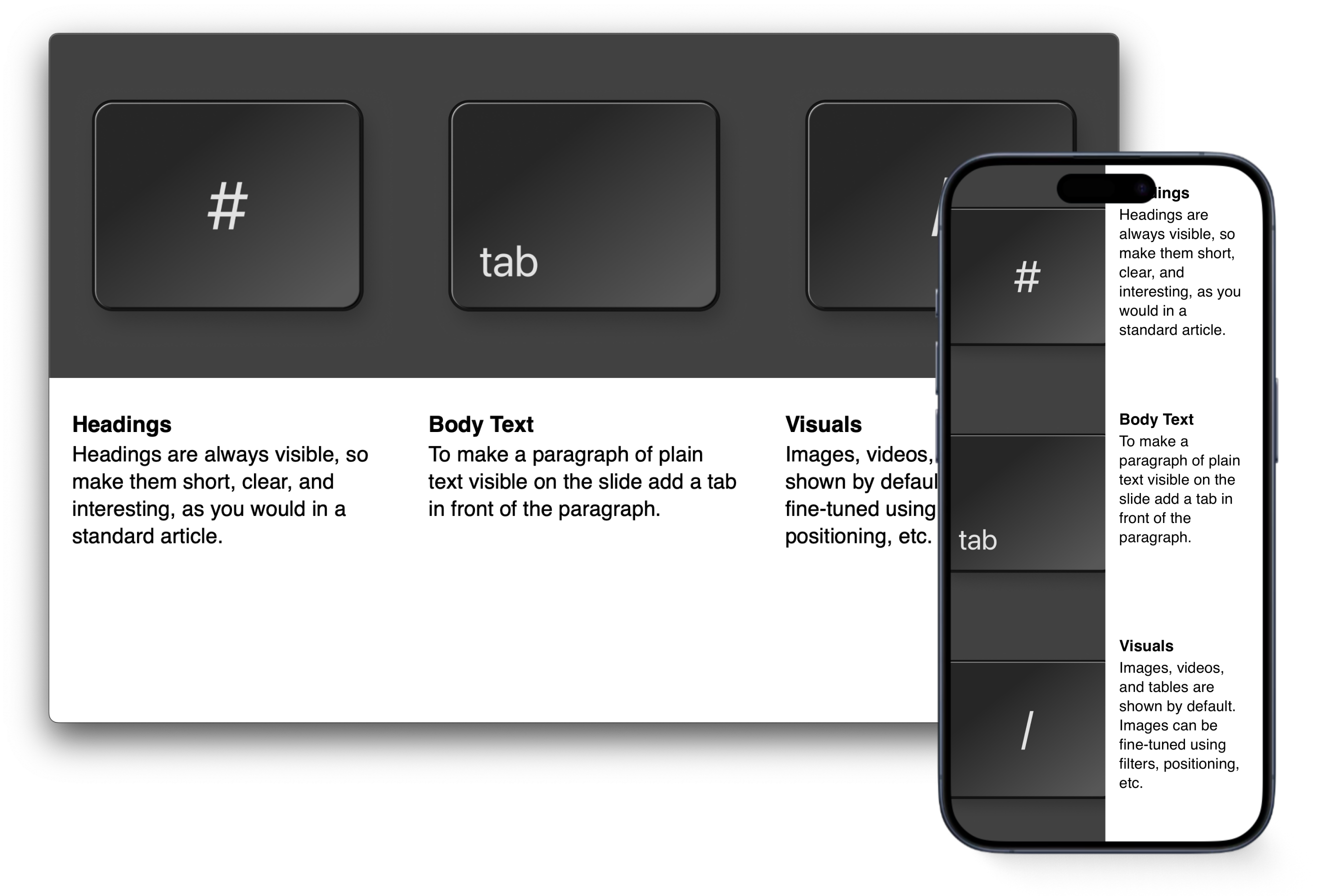
Focus Mode
iA Writer’s signature feature allows you to focus on one sentence or paragraph at a time. How does it work?
Style Check
Easily spot fillers, redundancies, or clichés that might be creeping into your text. Cut it down to the essentials. You can also create custom patterns to highlight expressions that you want to avoid.
Syntax Highlight
Pinpoint awkward verbs, repetitive nouns, or excessive use of certain parts of speech. How does it help?
Live Preview
Watch your work take shape in beautiful templates, all in real-time.1 Or you can choose to work fully focused in the Editor while Preview remains on call.
Multi-Platform
Available for Mac, iPhone, iPad, and Windows devices, Writer allows writers to pickup right where they left off, even on the run! Seeing is believing, Here’s a quick tour of Writer:

Get Started
Registration deadlines for 2026 challenges are quickly approaching. Please be sure to check out the NYC Midnight website for more details.
You can learn more about Writer’s dedicated Fountain template and how you can maximize screenwriting productivity in Writer here.

Download your free iA Writer trial
-
In 2023 we even added support for Fountain files. Seasoned screenwriters are likely already familiar with Fountain, a plain text syntax that leverages the strength of Markdown and is tailored for screenwriters. ↩
The post NYC Midnight and iA Partner Again appeared first on iA.
]]>The post Popping-Up in Roppongi appeared first on iA.
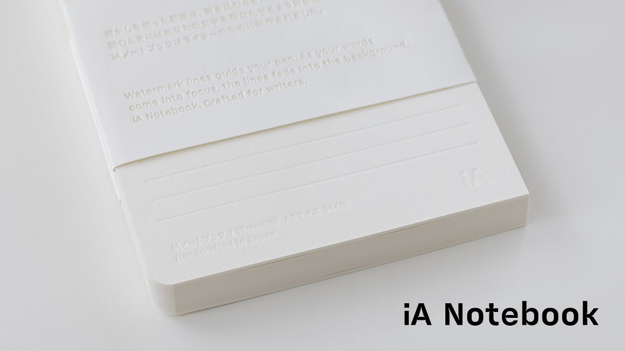
]]>This is our second collaboration with Tsutaya. After T-SITE Daikanyama, the Notebook now appears in another well-known Tokyo location: Roppongi Hills. Right around the corner from our new office.1


If you are nearby, stop in and try it out. You can buy the iA Notebook right there. If you don’t want to carry it home, it’s also available from our online store, or the growing number of physical stores around the world.
If you miss this one, there will be more opportunities. The sales and distribution of iA Notebook has been growing organically since its launch, and we’re continuing to show it in places that care about books, paper, and use.
Pop-up store period
Saturday, January 31 – Friday, February 13, 2026
Location
Roppongi Tsutaya Bookstore
1F entrance platform, Tokyo
The next pop-up at Tsutaya is planned for March, another one is planned for June. If you run a bookstore or a shop and are interested in featuring the iA Notebook, please get in touch.
* * *
-
We’re moving from Bakurocho to Roppongi in March, which describes almost a perfect circle. iA’s first office was in Nishi-Azabu (2005). We then moved to Harajuku in 2007, to Shibuya in 2010, and to Bakurocho in 2017, and we’re moving back to Roppongi, right next to our first Nishi-Azabu office. ↩
The post Popping-Up in Roppongi appeared first on iA.
]]>The post The 2025 iA Award Winners appeared first on iA.
]]>A big thank you to everyone who submitted work this year. We enjoyed meeting you and learning more about who you are and what you do. To us it’s less about who wins but who you are and what you do with our work. By seeing your work, learn much more than just what is in your text.
In Season One, we learned that emotion, impact, and logic should guide our judgment. This year, we returned to the same criteria. Each submission was reviewed carefully, and the team voted one by one. Regardless of topic or format, what mattered most when reading was the experience itself. How did this piece make us feel? Time to unveil our two winners.
Writing Award
Dustin Parker, The Future Smells Like Paper
Dustin’s piece received a unanimous vote from the team. It’s an almost perfect ode to imperfection, to the analog living alongside progress, and to the human touch.
Reality isn’t just what exists. It’s what resists.
There was no decorative formatting to sway us, no fancy fonts, no images, no framing. It arrived as raw text in the body of an email (you don’t need to be published somewhere to apply to our awards), and its impact was immediate. His writing is both careful and clear:
Spotify didn’t kill vinyl. It made people realize what vinyl offered that streaming didn’t. The crackle and pop aren’t impediments to the music. They’re proof of physical interaction, a needle tracing a groove in a specific moment in time. High-resolution photography made people fall back in love with film. Text messages made handwritten letters precious. The best technology doesn’t eliminate the analog. It clarifies what made the analog irreplaceable in the first place.
We found ourselves nodding in agreement while reading The Future Smells Like Paper. We build software, continuously refine our apps, live and work fully within the digital world. And yet, a few years ago, we felt the need to create a paper counterpart to our work: the iA Notebook. It is the handmade—and by nature imperfect—sibling of iA Writer. We love using it daily, just as we use Writer. Each serves a different purpose.
Progress isn’t about eliminating friction. It’s about eliminating the wrong friction while preserving the friction that makes us human. Print the thing you claim to care about. Sign your name in ink that bleeds a little. Send a letter that takes three days. Scribble notes on whatever paper you can find. Let objects become evidence that you meant it.
The pen still leaks. I still choose it.
You can find the full version of The Future Smells Like Paper on Dot By Dot.
Presentation Award
Audrey Tang, Democracy in the Age of AI
A few months ago, in the middle of summer, a presentation on Mastodon caught our attention. The text was in Chinese but the design was immediately familiar: the Tokyo theme from iA Presenter, supported by our Web Sharing tool.
We always enjoy seeing our apps used in the wild. When presentations are shared publicly via Sharing, we often pass them along. This one was even more encouraging than usual.
The person behind the presentation was Audrey Tang: civic technologist, former Digital Minister of Taiwan, and a global speaker many of our users already know well. After we shared the original Chinese version, AI 時代下的民主, Audrey kindly replied with a link to an English version so our community could follow along more easily.
Audrey didn’t apply for the iA Awards. Still, we couldn’t get the presentation out of our minds. So we decided to name it Best Presentation of 2025. Not because of the topic alone, but because this presentation is a lesson in storytelling.


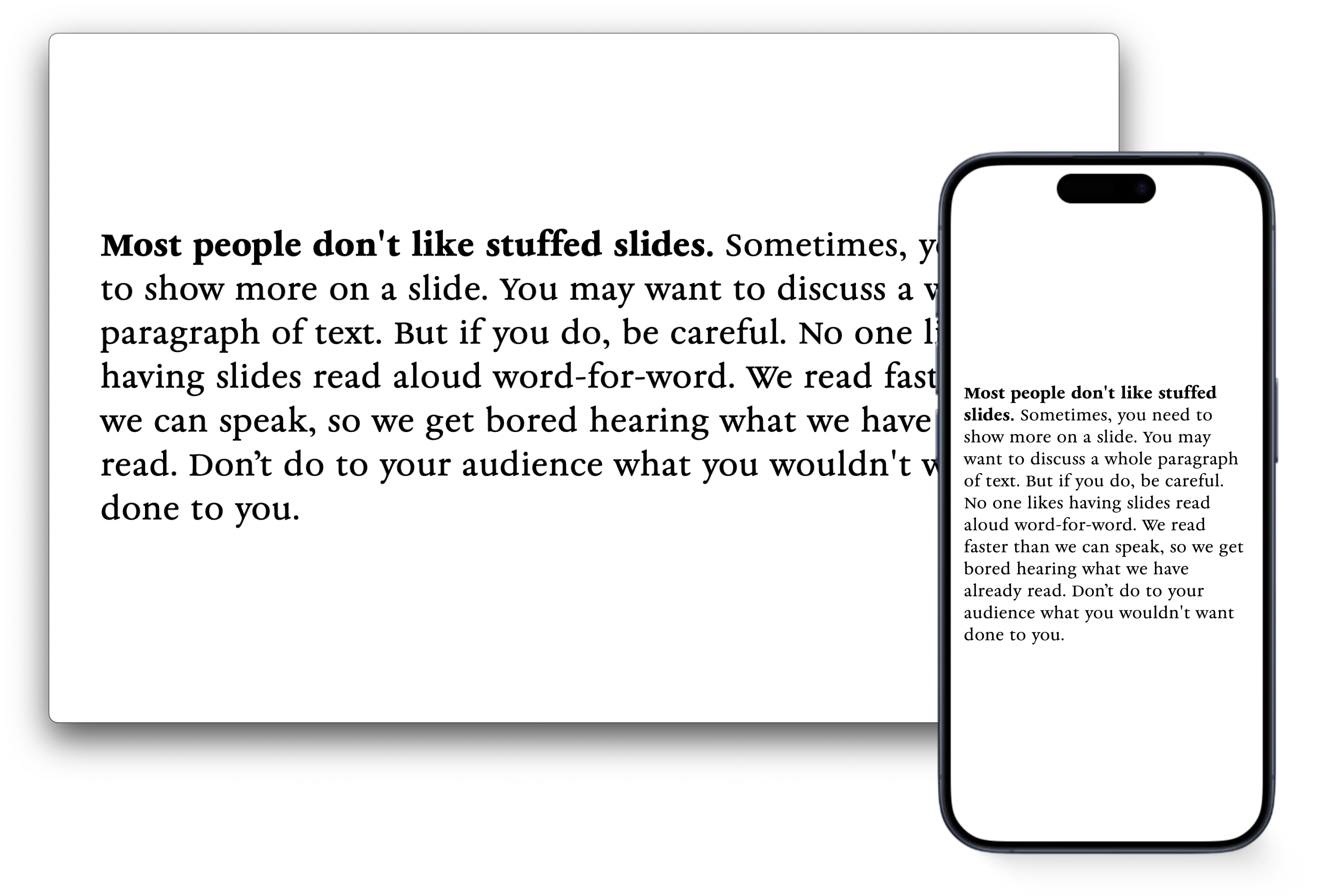
No overload of images. No bullet-point noise. Just a clear narrative, carefully paced, with each slide doing exactly what it needs to do. Very few metaphors are used, and they stay with you all along the talk. The text is reduced to what’s essential. There’s rhythm. There’s space. There’s an emotional arc.
Many people feel that with the rapid advance of AI, our future is like a car with only a gas pedal and a brake. We can either floor it toward some unknown “Singularity” utopia, or we can slam on the brakes for fear of a dystopian future…
The ‘Following’ feed creates a ‘For Us’ reality… But ‘For You’ is different. Everyone lives in a hyper-personalized world, tailored just for them…
The AI behind it is a parasitic AI. Its sole purpose is to learn what keeps you addicted and glues you to the screen…
So-called ‘social networks’ have largely become an infrastructure for outrage.
We flipped the incentive for ‘going viral.’ Instead of rewarding the most extreme statements, we rewarded the statements that built the most consensus…
The bigger challenge is the horizontal problem: ensuring a world full of different humans and AIs can cooperate peacefully…
Authoritarianism is a pyramid. Democracy must be a network…
A decentralized, symbiotic architecture is our defense…
In Silicon Valley, you often hear the phrase, ‘Singularity is Near.’ But I’m here to tell you: ‘Plurality is Here.’
The future is not singular; it is plural.
It’s not a slide deck trying to replace a speaker. It’s a presentation designed to support a strong message. This is what we’ve argued for over the years, taken to an extreme: slides should serve the story, not compete with it.
So even if this comes as a surprise: Congratulations, Audrey, and thank you for letting us share your work with our community. You can find below both versions of the presentation:
- Democracy in the Age of AI, the English version
- The original one in Chinese: AI 時代下的民主
See You Next Year
Once again, reading through our users’ work was both a pleasure and an honor. We’re grateful for your submissions and for all the feedback many of you share with us throughout the year, whether by email or on social media. Hearing from you, in all its forms, is a constant reminder of why we do what we do.
Thanks to Web Sharing for Presenter, seeing presentations here and there on social media with a wide range of authors and topics makes us incredibly proud. It also made us realize something: next year, the iA Awards shouldn’t only be about personal submissions. They should also be about recognition: pointing to work we encounter and feel deserves to be seen.
The next edition is already on the horizon. If you haven’t applied in the past two years, consider this an invitation. If you know someone worth to shine a light on, this will be your chance to nominate them. And to those who have been with us from the beginning: thank you. We appreciate your continued trust and curiosity, and we look forward to seeing what you’ll bring in 2026.
The post The 2025 iA Award Winners appeared first on iA.
]]>The post The 2025 iA Recap appeared first on iA.
]]>In 2025, iA turned twenty, and iA Writer turned fifteen. During our Winterfest, we took the opportunity to look back on iA’s history, revisiting those years highlighting memorable blog posts from different periods. If you missed it, you can still pick up your gifts and take some time to revisit two decades of iA with us: iA Winterfest 2025.
Notebook, A Year of Recognition
iA Notebook won awards and toured fairs, a rare year of recognition for a product that stays resolutely analog. The Notebook received several honors, including the Red Dot “Best of the Best” Award for Product Design 2025 and the Japan Stationery Award. We showed the Notebook at trade and design fairs in Tokyo, San Fracisco, New York, and in a pop-up store at Tsutaya Books Daikanyama.


Feedback from the fairs led to a new batch of iA Notebook with a black board, improving contrast under different light conditions. Our latest Notebook video went viral. The distribution of the Notebook expanded, with wider availability in the United States and Europe through local resellers, including a series of museums such as SF MOMA and Kunstmuseum Basel.
Presenter in your Pocket
In autumn, we launched Presenter on iOS, a presentation tool that works on a phone without compromise. You can write, edit, refine, and present anywhere, on any screen, without losing focus or your mind. Together with this iPhone and iPad release, the latest version 1.5 of Presenter offers a cleaner default theme and refined typography. Presenter is now available on the App Store for both the Mac and iOS.

Web Sharing, released during Winterfest last year, continued to gain traction. Seeing presentations shared and viewed in the wild has been rewarding. Audrey Tang is using it regularily.
We released the beta version of Charts in Presenter. The ability to display markdown based charts had been requested more often than any other feature. You can now join the beta.


Fifteen Years of iA Writer
iA Writer moves in the opposite direction of most apps. While products usually grow slower and heavier under feature creep, for 15 years, we keept stripping things back, making the app simpler, more focused, and faster to use. On Windows, we released an update with faster startup, a redesigned interface aligned with Windows 11, full-width preview, smarter snippets, improved statistics, simpler notes and commenting. You can read more about it in the release post.
For Mac, iPhone, and iPad, version 7.3 came with an Authorship overhaul, showing who wrote what and what wrote what. As announced in the final days of Winterfest 2025, Authorship will also arrive in iA Writer for Windows, next year.
This year, the team was invited to WWDC as an Apple Design Award finalist. A rare, unexpected and welcome recognition after 15 years of steady work. Creating something innovative, simple, functional, and joyful once is hard. Maintaining that standard—over 15 years and 1,745 updates—is even harder. It takes restraint. Patience. Care.
That’s why this nomination means something different than it would have meant 15 years ago. An app launched in 2010 is being recognized in 2025 for setting the standard. Whether it wins gold, silver, or just a handshake—we celebrate this as a win for true, lasting quality and dedication.
Beyond Our Products
Just a few days ago, a project we had been shaping for years quietly went live: iA Account, our new customer platform is available for everyone who purchases Presenter directly from us. Next year, we will extend iA Account support to the App Store versions of all our apps. This will finally allow you to try our iPad and iPhone apps before buying, and buy organizational and educational accounts across all apps. iA Account removes technical barriers when using our apps on managed Macs for companies and schools. It will help us offering cross platform purchases, make purchasing packaes simpler and tie our apps together.
We went deeper into sharing experience and craft through Maker’s Knowledge, from conference talks to podcasts.
We invested in tutorials and onboarding and held user interviews to better understand our customers. Hearing directly from you shaped how we think about the next steps, and we plan to continue this effort next year.
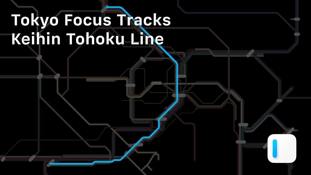
Our YouTube channel offers Tokyo Focus Tracks, a typographic video series as a tribute to the city where iA was born. Three videos are live, with more on the way.
We strengthen our committment to promote great writing and storytelling. This year again, we were sponsored the NYC Midnight writing challenges and we held the second edition of the iA Awards. You can still submit your text or presentation until December 31st. We will announce the winners in January 2026.
Closing
As we close 2025, we would like to thank our customers. Thank you for using our tools, for writing to us, and for spending part of your year with iA.
The team will take a break from December 31st to January 4th. We wish you a calm and steady start to the year of the Fire Horse. See you in 2026.

The post The 2025 iA Recap appeared first on iA.
]]>The post Charts in Slides appeared first on iA.
]]>Charts have existed in Presenter from the start, but we hid them. Early versions were technically ready, but they didn’t work. We tried to dress them up, but design is not just how it looks…
Early iterations encouraged the kind of tinkering Presenter is designed to avoid. Adding features is easy, but making them work takes time.
How it started
When we revisited charts after our template update, our first instinct was to clean up the CSS and offer as many chart types as possible. Users could then choose the right one for each occasion.
Adding lots of choice and letting the user decide is a popular way to design apps. It’s the opposite way of how we usually do things. And yet, this time it seemed the right thing to do. Modern charting frameworks make it easy to offer 500 chart types, and more options look like more fun. Too many options, of course, was exactly the problem we couldn’t name.
What we learned
Most chart types add noise rather than clarity. We had to decide what’s useful. We’ve designed charts, tables, and infographics for years, but meeting Nick Desbarats at Smashing Conference this year and later reading his book, Practical Charts pushed us to strip everything back to first principles. It provided the clarity and structure for what we had assumed.
The eye opener: A small number of chart types cover most real use cases. Bar and line charts do most of the work. Even the popular pie charts only work under strict conditions. Many popular formats look impressive but make accurate reading harder. That sounded awfully familiar. So we did what we do best: We built charts around strong defaults and clear limits.
- Fewer chart types.
- Quiet colors.
- Layout constraints that keep charts readable across screen sizes.
- Limits on how many charts fit on a slide, because dense layouts reliably break charts.
Instead of adding a big library, we chose to offer the basics of how charts and responsive slides work. Giving a limited choice forces us to think about the story we want to tell and how to tell it best. Moving forward, we will, step by step, add new features, building on user needs, carefully, slowly, to not overcharge the feature and turn it into a procrastination thirst trap.


Better Table Support
Charts require clean data, which led us to a new, more powerful table editor. This wasn’t just a utility update, it was an opportunity to bring auto-formatting Markdown tables, a long-standing goal, closer to reality. Try it out and let us know where it can be sharper. Push it, break it, and tell us what’s missing. We are going deep on Markdown tables, and once they are polished, they will be available across all our apps.


Try it
Charts in Presenter are now in beta. They are straight forward, simple and of-the-charts fast. This is the moment to try them and tell us how to improve them. Your feedback will help us getting them ready for the premiere in January.
- Join iA Presenter Beta
The post Charts in Slides appeared first on iA.
]]>The post Introducing iA Account appeared first on iA.
]]>License codes are easy to lose and hard to manage. As Presenter grew, more support time went into finding, verifying, and resending codes. At the same time, we prepared releases for iPad and iPhone. The App Store does not support license codes at all.
Because of this, we are moving iA Presenter to iA Account. Signing in is simple. Enter your email address. We’ll send you a six-digit one-time code. Enter it and you are signed in. Your account is synced to all your Apple devices using iCloud Keychain.
iA Account is available today for everyone who buys Presenter directly from iA. If you are already using Presenter, we’ll send an email to remind you what address you used to purchase your license. Older versions of Presenter will stop accepting license codes soon. To keep using the app, install the latest update.
Next year, we will add iA Account to the App Store versions of all our apps. This will let you try our iPad and iPhone apps before you buy, allow us to offer education discounts, and remove barriers to using our apps on managed Macs in companies and schools. And it will let us ship new features, reduce support friction, and make our apps work seamlessly together.
Existing purchases will carry over to iA Account automatically. With one account, you will be able to manage all iA apps in one place, whether you bought them on the App Store or directly from us.
The post Introducing iA Account appeared first on iA.
]]>The post iA Winterfest 2025 appeared first on iA.
]]>This year, iA turns twenty, and we’re marking the moment with 20 sets of wallpapers, each tied to a story that shaped us. Each set comes in versions that span the full day, calm during work hours, wild like dreams when the night drifts. One set unlocks every day. The last five hint at what’s coming next year.
21st-25th: Preview 2026
- Charts for iA Presenter. They are built in-app, generated from Markdown tables or CSV files. We’ve spent the last few months making them off-the-charts fast and faster. If you want to get a sneak peek, they are now in beta. Sign up to try them out. Read the debut post for more.
- iA Account will ship across all our apps. With iA Account, verification for our apps works via email. Download, activation, de- and reactivation is quick and easy. It’s available next week for those who purchased Presenter from us directly. Next year, we will bring iA Account to all our apps on the App Store. You’ll be able to try our iPad and iPhone apps before you buy. Read our announcement post to learn more.
- Authorship for Windows. It is one of our most loved features. Applying signature colors to AI-generated text, explained the feature without using too many words: replace placeholders with what you truly think and feel. Next year, finally, authorship will be available in iA Writer for Windows.
- Outline. We’ve been working on this forever. We refactored half the app to make it the smoothest, simplest, and most efficient outline function possible.
- New templates for iA Writer, with an all-new UI and custom fonts.
20th: iAI
The iA Notebook has been 10 years in the making. We announced it in 2023, launched it in 2024, and sold out our first batches in no time. In 2025 we won the Red Dot ‘Best of Best’ award, the Japan Stationery of the Year award and showed it at museums and trade shows around the world. Good things come in threes, and so Apple invited us to Cupertino as an Apple Design Award finalist. Meanwhile iA Writer for Windows got its Leopard update that made it faster and smoother. iA Writer for macOS, iPadOS, and iOS doubled down on its strategy with AI: separating human and machine authorship visually and technically (instead of integrating ChatGPT like everybody else). Our 2025 recap has the full story. iA Presenter now has an iPhone and an iPad app with much simpler, cleaner templates, and it will offer charts very soon. Our wallpapers for 2025 are a tribute to iA Notebook. Those who like to read tea leaves might see something in there or not. Make sure you don’t miss out on our love letter to markdown and the beautifully typographic Tokyo Focus Tracks.
19th: Time wasted on PowerPoint divided by 111
If you work at an office, statistically, you spend between seven and nine hours a day in PowerPoint, Word, Excel, and email, each. In one week you write an average of 111 emails, five Word documents, three spreadsheets, and one presentation. Is a presentation 111 times more important or 111 times valuable than an email? No. Presentaions are wasting our time by focing us to be designers. Finding assets, logos, images, match CI/CD requirements and formatting each element on every slides individually is a complete productivity killer. So, we set out to make presentations as focused as writing an email. iA started working on Presenter before COVID. In 2022, we openly discussed, explained, announced, and openly asked for your thoughts on pricing it. The Mac version launched in 2023. Without a responsive experience and the ability to share presentations as a text and slide hybrid, it did not yet fully convey the idea that drove the app. This year, we added charts, which also made us rethink tables.
18th: Lasers and Presents
In 2022, we added wikilinks to iA Writer. The majority of note-taking apps support linking documents. Upon popular demand, we added the feature so people could use iA Writer in their preferred mix of apps. It required a lot of heavy lifting, and we had to make sure that it kept the app laser-fast and that it stayed invisible to those who still just wanted to write. In the same year, we announced our next app, iA Presenter. We looked more closely at emoji, and in November we lifted the veil on iA Presenter. We asked you about how you’d price our app. Designing Presenter, and how design demands presence and ends up as a gift of time, made us think about presents and presence, design and time. In the tradition of presents for Christmas, we offered a letter template for iA Writer.
17th: May we Have Your Attention?
In 2021, first out of curiosity, then out of necessity, Oliver started looking into ADHD and how it works. He told his wife that someone should think about ADHD-friendly software. Ideally, by someone that knows ADHD from within. She paused and said, almost puzzled, that he had been doing exactly that for twelve years. Only then did it sink in. iA Writer was not just a general app for focus. It was software made by people with ADHD, for people with ADHD. In all our work on focus, that fact had quietly slipped through the cracks. A writing app that works for the easily distracted works even better for those who can focus without special tricks. Looking into who uses our apps, we discovered that a growing number of teachers and students use iA Writer, since, step by step Markdown became a standard at University. In the same year, we took another shot at discussing the pricing of software. This time, we aimed at our colleagues who compare the value of software to coffee. Our point was: software is not a cup of coffee. It’s a coffee machine. We ended the year on topic with a recipe on how to end procrastination. And this is why, representing the year 2021, we offer a 24h set of focused wallpapers.
16th: Drawing lines
In 2020, we spent a lot of time sharpening boundaries. We improved how PDFs work in Writer, with a new preview, better web publishing, and improved editing. We introduced Style Check to help writers see patterns, not mistakes. At the same time, we were vocal about the conditions under which software is made and sold. We wrote about monopolies, Apple, and Epic, reflected on subscription or no subscription, and revisited what it really means to think different. We questioned why the companies that made most money on Apple platforms were not paying the Apple tax. The kerfuffle with Epic ended with Apple cutting commissions from 30 to 15 percent for small developers. Last but not least, we shipped Style Check to Windows.
15th: Ethics, sound, and stability
In 2019, we slowed down and looked sideways. We wrote on ethics and ethics, as a daily design practice. We explored music in writing, rhythm, pacing, and how sound shapes concentration. We refined iA Writer with a new PDF preview and new typography preferences. In the same year, iA Writer was named MacStories App of the Year. Less noise, more trust.
14th: A glass of iced water in hell
In 2018 we kickstarted iA Writer for Windows. Steve Jobs had promised that bringing iTunes for Windows would be “like giving a glass of ice water to somebody in hell.” We wanted to deliver that promise and bring focus to Windows for the first time since Word 2.0. Unfortunately, someone had to go to hell to deliver that glass, and coming from macOS, dealing with Windows frameworks was an ice-cold shower. No clear UI standards, tons of hacks to get around the many limitations in terms of spell check, linguistic tools, typographic limitations, and performance hogs. On Windows 11, Microsoft basically abandoned its native text view. On the other hand, Windows made it easier to offer folding and outline features, and we tested some features that iA Writer users in the Apple world are still waiting for. The good news is that 2026 is the year when we bring all of our apps closer together. More on that after the 20th. Somewhat inspired by the great Alan Kay, 2018 was the year when we got back into blogging. In January alone, we wrote a prophetic piece about AI five years before ChatGPT, took a shot at the ideal paragraph, procrastinated about procrastination, hammered Facebook three months before the Cambridge Analytica scandal, wrote about money, power and time, sending traffic to the App Store, the need to make bots identifiable, and a second piece on AI. In February we explained how how blogging could save the world, added tabs to our Mac app, went head-to-head with MS Word, looked at how the West was turning into China, wrote about Ethics and Aesthetics, added tags in Writer, and ended with Word Export and a Typographic Christmas. The year was a pull-up exercise in blogging and updates, looking far into the future.
13th: Duo Space and Syntax Highlight
2017! Monospace had been the only choice in iA Writer for seven years. In monospaced fonts every character has the same width, which slows down the reading speed. It supports focused writing. Technically, monospacing is a remnant of mechanical typewriters and their equally spaced hammers. Its wide letters like w, m, or Æ get squeezed, narrow ones float, and the text develops dark spots and white space that compress and extend the rhythm of the strokes. Duo Space keeps the discipline of mono, but corrects its most obvious flaw. Using a simple trick, some characters become one and a half units wide. On their own, they still feel restrained. When two appear next to each other, the texture opens up and the dark spots dissolve. On the way to duo, we made a Triospace (unpublished) and a Quattrospace, too. Meanwhile, our Zurich office became a place of research. Nick Denton joined us at the office in Zurich and Tokyo, for almost a year, to explore how online discussion could work beyond forums and Reddit-style threading. We discussed, built prototype after prototype, and learned a great deal from each other. Meanwhile, our work in Japan accelerated. The collaboration with Nikkei expanded quickly. We worked on their website and apps, deepening a relationship that continues to this day. In December we announced iA Writer for Windows.
12th: ICONS!
In 2016, we went down the icon rabbit hole. Because we believe that one can only understand what one makes, we made a lot of icons, we made pixel iconfonts and retro icon games, and that was a lot of work and a lot of fun. We researched how icons really work, which icons work how and why, and the result was that icons don’t work very well, except for a handful of very obvious ones. Sure, you can use icons with labels, but then why use them at all? Emboldened by our very clear insights, we got rid of a lot of icons in our writing apps and added readable menus instead. iA Writer 4 came with transclusion, the ability to add textdocuments in text documents. Our app was made for people who understand the virtue of clear text). No icons, all text and even text in text! Our beta testers nodded and clapped. What could go wrong? Our users didn’t understand transclusion (we called it “Content Blocks”, because we already foresaw that noone would want “transclusion”). More importantly, our users found that menus made our apps “look like Windows.” The lesson was, once again: Useful is not what, theoretically, works best, but what people are used to. So we took out the menus and put icons back. A couple of years later Apple added menus to iPadOS, and now that we’re all used to them, they’re not “like Windows”, but “amazing,” “gorgeous,” and “magical”. User research outside our hard core beta group may have shown all that before… Meanwhile, somewhat ironically, we did a lot of user research for a client, in Italy, England, German, the UK and in Japan for Condé Nast, a prototype of how VOGUE could work and look in the future.
11th: iA Writer 3
In 2015, we designed Web banking system for over ten banks in Switzerland, worked with Asics on the structure of their new site, and helped shaping some of Red Bull’s organisational tools. On the product side, we launched a new, even simpler version of Writer and started out on Android.
10th: Big in Japan
In 2014, two years before the next US election, it was already clear to us that after Web 2.0, misinformation and disinformation would start shaping the world at a scale we had never witnessed before. It was time to put thought into things. 2014 was one of our best years as an agency. But we saw the signs: Clients built strong in-house teams while big tech and consultancies hovered one studio after the other and occupied our space. Fjord joined Accenture in 2013, Adaptive Path joined Capital One in 2014, and Teehan+Lax’s core team moved to Facebook in late 2014. iA turned down any offers, both for the agency, and for the product. No to selling the team, no to selling our apps, no to venture capital. What did we do instead? We doubled down on our product, while building out our relationships with Japanese clients.
9th: Light and Darkness
In 2013, we worked with The Guardian, Red Bull, and Freitag. Behind the scenes, we started making type, a form of meditation that became an obsession. Our first font, iABC, was a sketch, a poetic take on the origins of letters. Designing letters we shape both the form and the space in between.
The universe is dark, and light the rare exception,
Yet neither stands alone—they shine in mutual reflection.
There’s logic to it, but getting it right is in our eye and in your hands. The first big step was creating custom fonts for iA Writer. We almost used iA Sans but chickened out and settled on a modified IBM Plex. Then came Duo, for a better gray value. Quattro followed, mostly because it looked good. Then iA Sans, iA Serif, and iA Garamond, now used in our presentation templates. iA Garamond will eventually… more on that later. Today’s wallpaper set illustrates the infinite fascination of looking at letters up close.
8th: Aftershock
2012 is represented by mix of different waves darkly blending into the curtain of Twin Peak’s Red Room. It illustrates how murderish the time after 3/11 felt to us.
In 2012, we slowly came back from the shock and we woke up to something different. iA was founded in the middle of the Web 2.0 optimism. In 2008, Obama got elected with the power of the Web. In 2012, he got reelected, but Web 2.0 was over. Closely observing online disinformation during the crisis, we knew that we were witnessing the roots of a digital mess. Technology is an amplifier, it amplifies power, and whoever is in power amplifies what serves them best. As Web designers we felt responsible. We had to do better. First, we found relief in studying type design. We made our first font, iABC, after a poetic study of the origin and meaning of letters and designed our Website using our own responsive typeface, diving into a rabbit hole of responsive typography. David Lynch, the creator of Twin Peaks, passed away in 2025. He was a master of finding beauty in darkness. This series is a tribute to a creative mind that remained “wild at heart and weird on top” until the very end. An art spirit we learned from and grew with over several decades.
7th: Shock
2011 was shaping up to be another good year. But as we were about to put the finishing touches on iA Writer for Mac, the office started shaking. In Japan, earthquakes are almost as common as rain. This one was different. We held our monitors that were shaking on our glass tables. We put them face down on the floor and stepped outside, looking at the city around us. Trains stopped, the cellphone network broke down. Everyone walked home, some for four, five, six hours. Shibuya’s skyscrapers moved in the aftershocks like poplars in the wind. Reality turned into a movie. TV, Japan’s pacifier for adults, blared with dire warnings. Again and again the tsunami rolled in, nuclear plants exploded, and we were told that we were safe. After the S waves came the alpha waves, beta waves, gamma waves. Supermarkets emptied out in 24 hours. First the toilet paper, then rice, the water, in the end even chewing gum was gone. No ads on TV. It was meant to signal readiness, humility, and hands-on leadership, but it felt staged. He looked drained, pale under the studio lights, asking us to 頑張る, to work hard and do one’s best, to strive unrelentingly in the face of difficulty. But there was nothing we or he could do. Friends and family were calling, begging us to leave the country. The days, weeks and months following 3/11 we were wandering through Twin Peaks’ Red Room, losing our minds. It was a black day in a black year, and it took some time to find words for what hit us in 2011, which is why the 7th is left black.
6th: iA Writer
2010 was a big year for us. iA Writer for iPad, our first app, hit the App Store. Having worked on iPad apps for Die Zeit and Süddeutsche Zeitung, we had a head start in design. The app was tested in our network of UX designers and typographers using literal paper prototypes. It sold so well, we hit #1 in practically every store. Hard to believe that this was already 15 years ago. We now offer apps for Mac, iOS, and Windows. There’s an Android app, but Darth Vader has frozen it in Carbonite. Since 2010, we’ve sold over three million copies. iA Writer has won several AppStore App of the Year awards. This summer it became a finalist in the Apple Design Awards. Economicaly, 2025 it is already its most successful year to date. When it launched, iA Writer had no settings, no font choice, no title bar. Instead, it introduced Reading Time, Keyboard Extension, Focus Mode, Auto Markdown, and a colored caret… features that have since become standard in many writing apps. It was the first focused Markdown writing app. To celebrate iA Writer’s simplicity, today, we offer only one wallpaper with a ıııiıııııııl modification.
5th: UXD
2009 was a year of real momentum for the iA design team. After opening our office in Zurich, we redesigned one newspaper after another. Our design team grew quickly. In the middle of the heat we created The Spectrum of User Experience, a colorful graphic that cut through the chaos of shifting design jargon at the time. It gave us a clear structure when terminology kept changing. Even now, we frame decisions through the same three lenses: Business, Technology and Design. In reality, all these notions blend into each other, which is why we now offer the original graphic in a set of super-blurred versions of the original graphic.
4th: Web Trend Map
In 2008, we scaled our Second Web Trend Map from A2 to A0. One year later the third version became the cover image of TASCHEN’s bestseller Information Graphics, followed by the Big Bang edition in 2010. The web felt wide and open, with many paths and many players. Today it is owned by a handful of corporations. Now you know why for fourth set of wallpapers we went all in on The Matrix. The Wallpapers show its signature digital rain, but made from Tokyo station names. Amber and green recall old school monochrome computer screens. The rainbow version holds on to our hope for a more vivid Internet.
3rd: Editorial Design
In 2007, we redesigned the weekly magazine DAS MAGAZIN using our 95 percent typography and 100E2R principles. Reading time rose by an order of magnitude, and visitors multiplied several times within a short period. It became our first major editorial project and led to further work for Tages-Anzeiger, Basler Zeitung, Berner Zeitung, DIE ZEIT, Süddeutsche Zeitung, Krone, Internazionale, Salzburger Nachrichten, The Guardian, and Nikkei, for whom we have shaped the core digital experience for more than a decade and continue to do so today. The third set puts the big letters of DAS MAGAZIN to use.
2nd: The Cosm of Typography
In 2006, we found that typography is one of the bridges between beautiful and functional design. In an big take that became widely quoted, we argued that Web Design is 95% typography. The second wallpaper set offers a cosm of letters.
1st: Founded in 東京
iA launched in 2005 in Nishi Azabu, Tokyo. The founding idea of iA was that it should be possible to create digital design that is both functional and beautiful. We’re starting this series with wallpapers that capture a little bit of Tokyo at different times of day. You’ll find static versions for each moment, plus a dynamic macOS version that shifts as the day moves.

A lovely present from Japan
Are you looking for Christmas shopping ideas? The new iA Notebook inspires careful writing and makes a thoughtful gift.
The post iA Winterfest 2025 appeared first on iA.
]]>The post See What AI Wrote appeared first on iA.
]]>Don’t hide what you have written with AI. Challenge it. Improve it. Write over it. To do that, you need to see what’s yours and what isn’t. iA Writer now makes that obvious. It marks, tracks, and spots AI-generated text.
We’ve had AI tracking for two years,1 but the dimmed grey tone was too quiet.2 It didn’t show what it was or what it was for. And it didn’t signal the urgency to think for yourself. It could be easily overlooked. This urgency needs to be made obvious and invite us to feel, think and say what we really mean.
Decoding the New Colors
We took a page from the AI playbook and used the visual language everyone already recognizes for generated text: the rainbow.
AI in Rainbows
Generated text now bursts onto the page in a rainbow. It looks as artificial as it is. If you proofread with Apple Intelligence or paste text from Claude, Gemini, ChatGPT, or similar, those parts will show up in color.
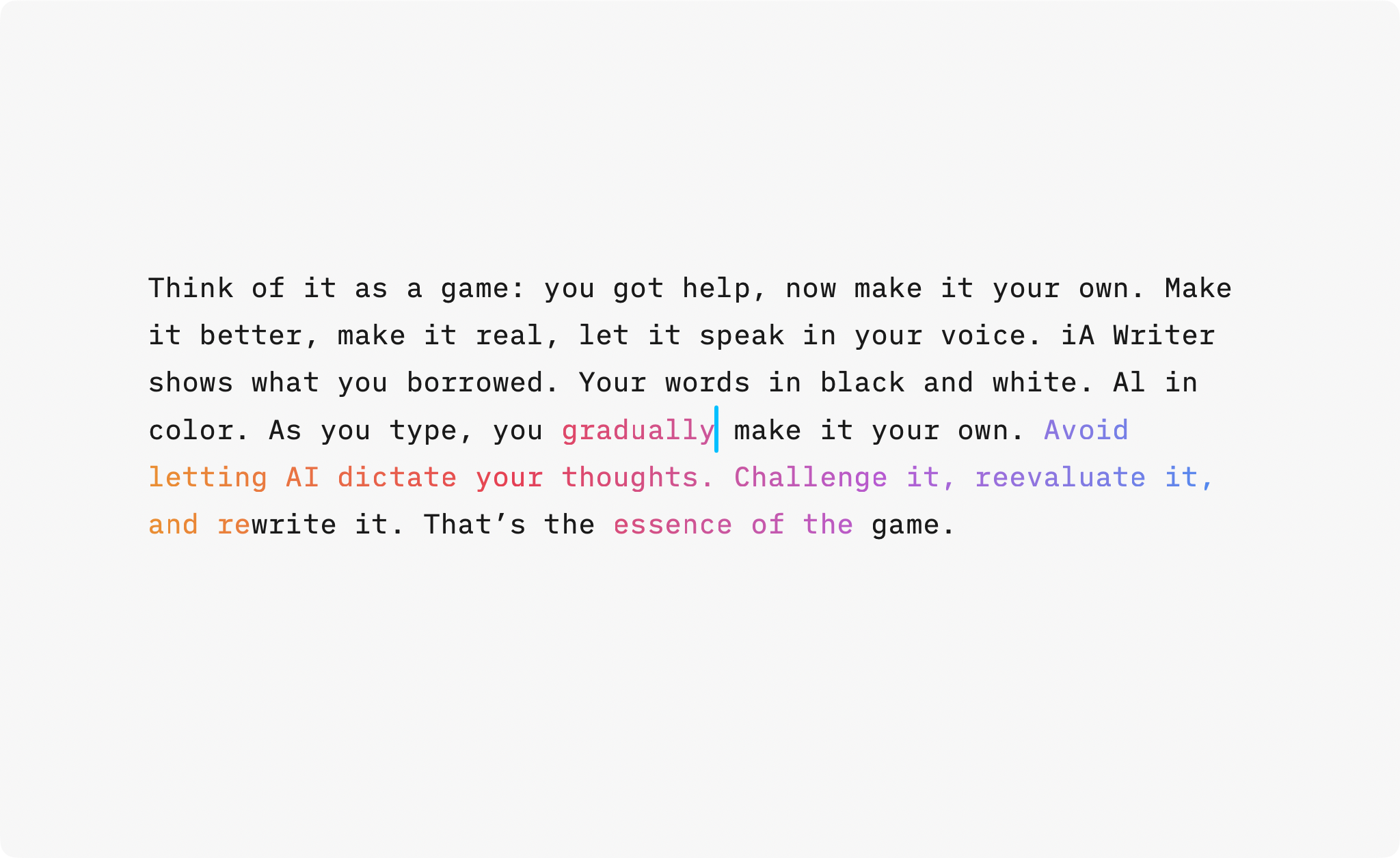
Think of it as a game: you got help, now make it your own. Make it better, make it real, let the text speak in your voice. When you return to your document, you’ll immediately see what you wrote, and what you borrowed.
Don’t let the machine speak for you. Let it push you to do better. Don’t just accept what it gives. Improve it. Make it yours.
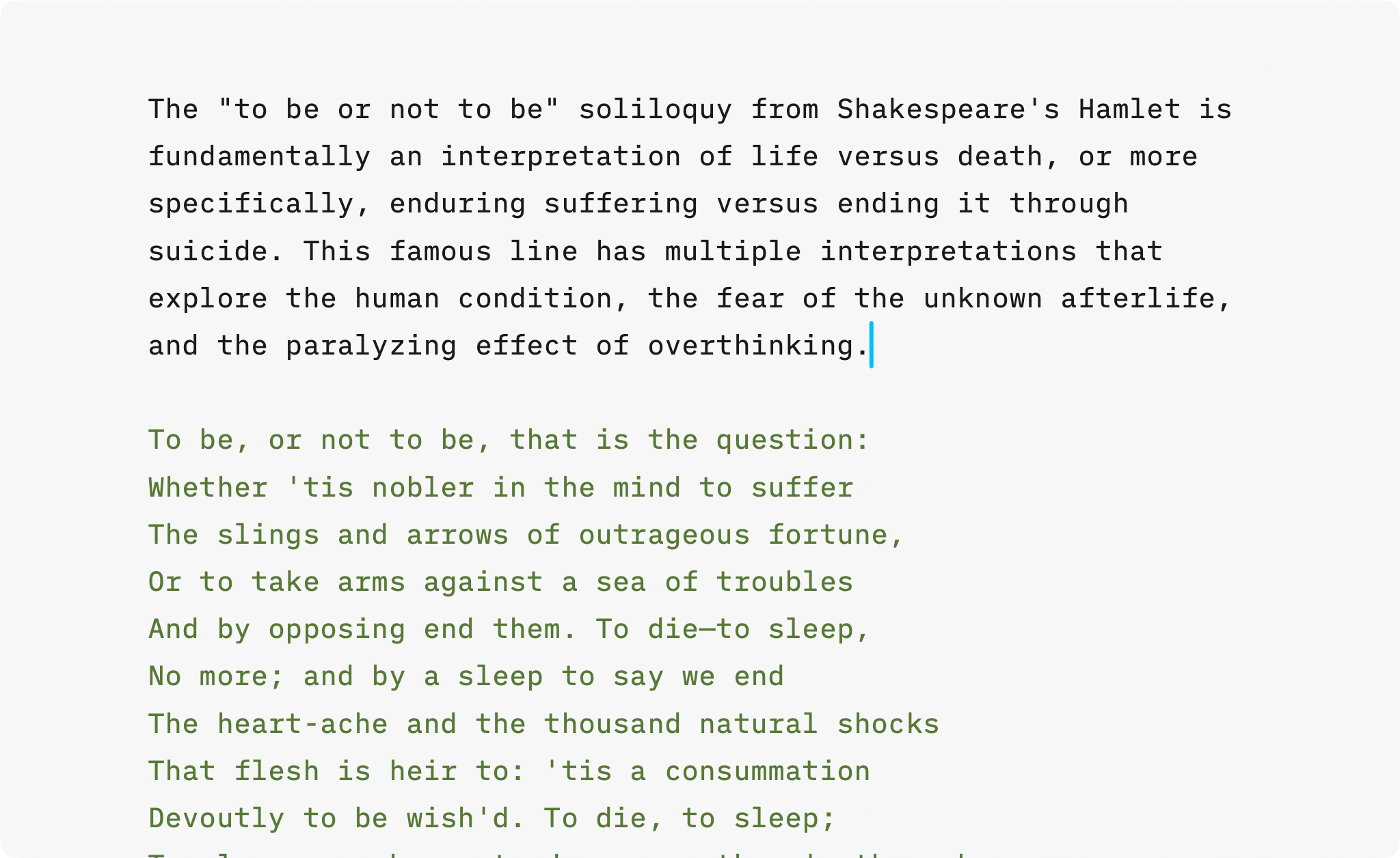
True Colors: Shakespeare and Your Friends
We’ve improved Authorship for human collaborators, too. When several people work on the same document, each author’s contributions now appear in distinct colors, making contributions instantly clear.
It helps you stay in control of your quotes. Add frequently cited authors, tag their words, and instantly see what’s yours and what’s borrowed, whether it’s from Shakespeare, a colleague, or your favorite comedian.
References Stay Dimmed
Some writers used the dimming effect to mark reference material, for example when adapting boilerplate text or a downloaded contract template. To support authorship with sources where we don’t know the exact authors, iA Writer introduces a new Reference category. Tag boilerplate text as Reference to keep it subtly dimmed while you focus on your own edits.
Paint it Black
When multiple sources, edits, or AI snippets overlap, authorship and Syntax Highlight used together can become challenging.
Use Syntax Highlight when editing. Use Authorship when reviewing. Switch as needed. Syntax Highlight helps you edit. Authorship gives you control over who wrote what.
Use the Focus menu to toggle between them. When revising, stay in Syntax Highlight to polish your prose. When reviewing or merging edits, switch to Authorship to see which passages are yours, which came from collaborators, and which are AI.
Update Today
Authorship is available now in iA Writer for iPhone, iPad, and Mac, on the App Stores. Check our support article on Authorship for more details.
-
When ChatGPT came out, we tried to imagine how the dominoes would fall. We thought that when every app rolled out its own AI, they would become indistinguishable. Eventually all apps would get sucked into the black hole of the AI embedded in the Operating Systems. Over time, even the OS itself would become irrelevant as every computer would offer the same thing. ↩
-
With Google prioritizing Gemini results, Microsoft begging to be your Copilot for life and Apple Intelligence failing you at every turn, AI is now everywhere whether we like it or not. Business consultants, drunk off the gold rush, have driven their wagon straight over the cliff. We saw this coming and thought: the less we can trust what we read, the more we need to know who wrote it. That’s why iA Writer includes Authorship, a way to mark text as written by humans or AI. ↩
The post See What AI Wrote appeared first on iA.
]]>The post The 2025 iA Awards appeared first on iA.
]]>The iA Awards are back for their second year, now becoming an annual tradition. We want to continue discovering and celebrating great writing and presentations. Show us what you created using our tools.
What we’re looking for
Writing: We accept all non-fiction and fiction, including blog posts, articles, research, academic works, lectures, short stories, novels, poems, song lyrics, and screenplays.
Presentations: A good presentation tells a good story. We’re looking for well-structured, engaging presentations.
In need of inspiration? Take a look at last year’s winners entries: iA Awards 2024.
Awards guidelines
We don’t expect you to have used iA Writer or iA Presenter exclusively. On the contrary, we love Markdown precisely because it lets you use different tools to get the job done. Just follow these guidelines to make sure that you’re eligible:
- Writing formats: Link to your work, if published. Otherwise text, Markdown, or PDF
- Presentation formats: Link to your work, if published. Otherwise PDF, video, or .iapresenter
- Number of entries: You can send two submissions: one for writing and another for a presentation
- Language: English
When and where
Submissions are open until 30 December 2025. Both winners will be announced in January 2026.
Send your submissions to [email protected]. You’re welcome to include links to your site or social media profile, which we’ll publish with the winning entries.
We look forward to reading your work!
The post The 2025 iA Awards appeared first on iA.
]]>The post From Tokyo to MOMA appeared first on iA.
]]>Your Notebook now ships from within the United States. That means faster delivery, and shipping included in the lower 48, no import steps for you. If you purchase three or more notebooks you get a discount, too.
You’d like to see and feel the notebook first? It is now on display at stores across the United States:
- SF MoMA San Francisco, CA
- The OK Store Los Angeles, CA
- Flax Pen to Paper Los Angeles, CA
- J Horton Madison, CT
- Two Hands Paperie Boulder, CO
- Bella Cucina Atlanta, GA
- Nantucket Bookworks Nantucket, MA
We added more stores in Switzerland, too. You can find iA Notebook at:
- Fondation Beyeler Museum Riehen
- Kunstmuseum Basel Basel
- museum rietberg Zürich
- einzigart Zürich
- TOKORO Zürich
- ELONI Zürich
- Büro Schoch Winterthur
- Agathe Nisple St. Gallen
- Boutique Balthazar Vevey
- Catambo Nyon
- L’Écritoire design Lausanne
More stores are coming. In Japan, it will be available at Tsutaya T-SITE Daikanyama, from November 1st until November 13th. Our store locator will always have an up-to-date list. Contact us if you are interested in selling it at your store.
Better accessibility
While our watermarked lines are a feat of design and engineering, everyone’s vision is different, and the lines can be difficult to see in certain lighting conditions.
Every Notebook now comes with a Shitajiki (writing board). Inspired by traditional Japanese writing boards, it not only makes the watermarked lines easier to see, but also provides a stable writing surface, reduces ghosting on the opposing page, prevents pages underneath from pressure marks, and helps prevent ink bleed-through.
Get it here
Customers in the contiguous United States can grab iA Notebook from our new shop at store-us.ia.net. If you’re elsewhere in the world, you’ll also get our new writing board with every purchase from store.ia.net.
The post From Tokyo to MOMA appeared first on iA.
]]>